Well, not a “drawing” per se, though I went through four pages of sketches of this comic book banner logo before I cracked open Illustrator. (Here are a couple of those, not very impressive though).
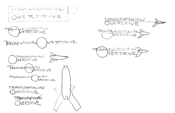
I’m still not satisfied with how this turned out … there’s some image in my mind with this logo which I haven’t been able to translate into an actual drawing, much less a realized logo.
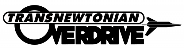
But what’s up with this logo, you may ask? Well, it’s from a 24 Hour Comics Day comic I did, way back in the day, but never finished – “Transnewtonian Overdrive: The Front”:

The “transnewtonian overdrive” proper is that little device in the last panel, an aftermarket component to our protagonists’ Porsche Hexwing staryacht (first panel) which enables them to go places where other people can’t. The idea, you see, was that in an era of faster-than-light travel, no-one would seriously be interested in the relativistic corners of our universe – but by inverting a normal hyperdrive to go just slower than the speed of light, our heroes could dive headlong into places with weird physics.
When I revisited the logo, my sketching – and looking at other logos of other comics – led me to the idea of the Hexwing cutting across the logo, with a thin line connecting it to the “O” of overdrive representing the invisible hypermass that our heroes are bungee jumping off of (and back to) to travel. I feel okay about it – the logo could be sleeker – but I can’t quite articulate what the logo as drawn is missing from the image I have in my mind. If I could “see” that, perhaps I could fix it. This will require research, I think: I didn’t figure out what was wrong with my Batman page (don’t worry! I’m not going back to it) until I looked into DC Comics’ book on coloring and lettering and realized I hadn’t properly exploited value to make different planes of the page stand out from each other. Fixing this logo will require doing some research (and, likely, coming up with my own logos for other things first, before coming back to this, so I’m not working the same piece of art over and over again).
I didn’t finish “The Front” that day – it was WAY too ambitious for 24 hours, and I think I only got 7-8 pages in. You know, in a way, I think 24 Hour Comics Day hurt my creativity as much as it helped it. It pushed my boundaries in a way I never had before, but the speed at which you have to work mean that my artwork wasn’t up to the standards that I’d set for myself with f@nu fiku. Five years after breaking my arm, when my art was still rusty, I bit off more than I could chew, and may have hurt myself more. Not sure I’d go back and change it, but if anything, I wished I’d taken on a drawing discipline like I have now.
Drawing every day forces you to get over yourself, the good and the bad, and to move on to the next day.
-the Centaur