Fortunately, the problem had a quick fix.
The problem, for those of you who browse the site in standards-compliant browsers, was that the last column of the Library’s three-column layout was not showing up in Internet Explorer – and only Internet Exporer, one of the world’s most popular and, unfortunately, least standards compliant browsers.
The solution: make the layout wider, so the max image width used in the blog does not cause the first column to widen.
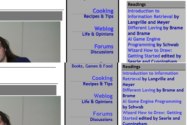
In the top half of the picture, you see Firefox 3.0.14 on the Macintosh running the (corrected) version of the Library of Dresan home page. In the bottom half, you see Internet Explorer 7 on Windows Vista, running in a VMWare partition on my Mac, from approximately the same position on the same page. From a graphical and typographical perspective they’re both doing a fairly creditable job of rendering the layout. Everything looks roughly OK.
However, they’re not doing the same job interpreting the width of the layout. I haven’t debugged the precise problem in detail – this is a voodoo quick fix – but essentially Internet Explorer interprets the widths of the columns and their spacing and padding different than Firefox. The result: images, which on Library of Dresan blogposts are always a maximum of 600 pixels wide, roll over the end of the column, also 600 pixels wide, making it jog out. You can see that in the stairstep on the second half of the image.
Part of this is my error; prior to my quick fix all browsers were showing at least slight stairstepping. But all browsers I tried – Firefox on the Mac, on Windows, and on Linux; Chrome on the Mac, on Windows, and on Linux; and even Safari on Mac and Windows – handled this correctly except IE, which widened the whole column. This made the three columns wider than the whole width of the container, and the third column had to jog halfway down the page so that it could fit, effectively becoming invisible to people just entering the site, unless they were willing to scroll a lot in the hope hidden features would leap up at them.
Now, I could have dug into CSS manuals and tried to fix this the “right” way, and indeed I plan to. However, there was a quicker, better, way: experimentation. Before I even knew for sure what was the problem I browsed to the front page of the Library on a Windows machine, downloaded the page to a local HTML file, and started hacking out parts of the file until something changed. I was very quickly able to show that there was nothing wrong with the right column itself; even reduced to a few lines and an image it wasn’t showing up.
So I then went to my test file, research, which I had gotten to work in IE before I launched the style change to the whole library. One difference between that page and the broken page I immediately noted was the fact that the images were smaller; then I started to suspect the stairstepping phenomenon. That needed a fix on all browsers, so I simply made the content column slightly wider – from 600 to 610 pixels, fixing a gaffe I shouldn’t have made in the first place – and widened the overall page from 1000 to 1024 pixels.
The result: it worked, in all browsers I have available to me right now. And, because my buddy Nathan had impressed upon me the importance of using CSS stylesheets, I was able to push the fix by simply uploading the revised stylesheet to the Library and reloading the page.
Shouldn’t have happened – I shouldn’t have made the column too narrow, Internet Explorer shouldn’t be misinterpreting the white space, I shouldn’t have pushed the template without testing it on Internet Explorer, and Blogger should have a better preview function so I could have tested it successfully offline without pushing it to the entire blog. But a quick fix was possible, because I used reasonably good site design practices, the scientific method, and a healthy supply of beans and vinegar.
-the Centaur