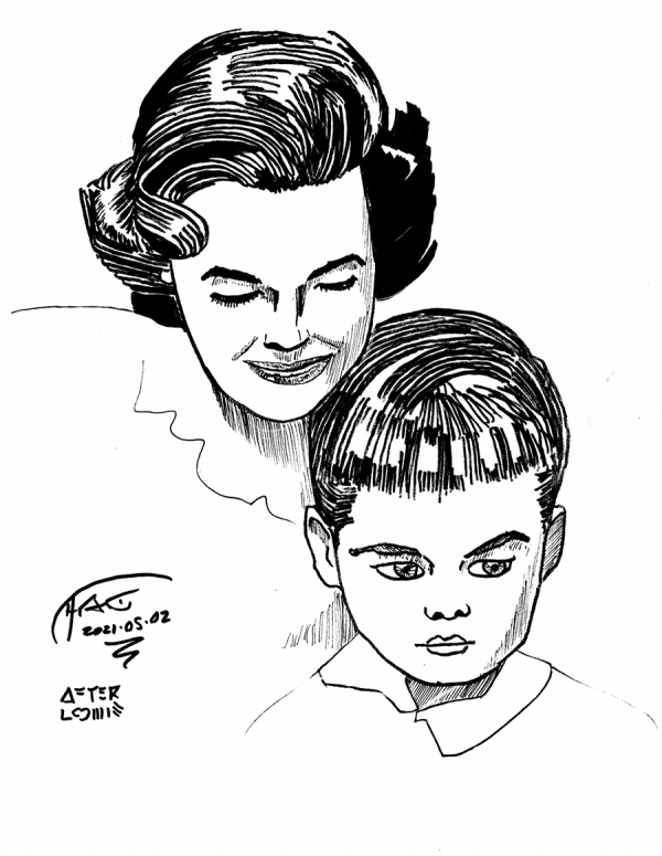
A sketch of the frontispiece of Loomis’s Drawing the Head and Hands. Not going to include a scan of the page for comparison, as you should buy Loomis’s book for that. I tried and abandoned 3-4 different half-finished roughs, finding problems like: squashed heads, bad jaw lines, squashed heads, and ennui. In the end, I flipped it upside down to get the “landscape”, then back over to get the details.
While this isn’t terrible, a few things stood out:
- First, I need to work on my patience. “Real” artists work over the entire surface that they’re rendering, and while I started to do that here, I lost patience before I reviewed the child’s eyes (though, in my defense, I was trying to do a quick sketch after those 4 false starts ate my time).
- Second, the wandering line thing I have going was in full force here: several times my lines just jumped, and while I noticed that flipping the page around to get a better angle helped, sometimes the line I drew was what I wanted, and other times it just fricking wasn’t. It’s really weird, as sometimes I can create really long, precise lines, and others … zoom across the page.
- Third, I still have trouble with the relative size of eyes, and with the fine details of nose and mouth, but especially, the size and fine details of the eyes. Also, my eyes suck. Eyebrows can use some work too.
- Fourth, and this is a general thing, my shapes are primarily 2D, not 3D. This makes everything too flat.
Another thing, not seen in the finished work, is that I noticed I was making things too symmetrical; real faces almost always have a slight yaw around the neck, and that tilt means the eyes are closer to one side or the other; this meant I often was squeezing / moving the eyes around incorrectly, trying to create the wrong amount of space. Another thing to look out for.
Also, and I’m happy about this, I’ve noticed some triangular formations around the eyes / nose (I have seen these in art books) and the lines of the mouth (not seen in art books, but you see a little of it in the shapes of the mouths in the Simpsons) as well as curved rectangles between the lower lip and curve of jaw, and to a lesser degree between eyebrow and hairline on some people. All put together, they helped me get the landscape in place better this time, making the overall thing look less borken.
But not completely. Once mirror-flipped, some of the lopsidedness is more clear, especially on the kid:
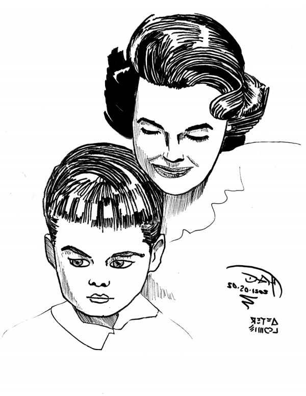
Ugh. Well, back to the drawing board.
Drawing every day.
-the Centaur