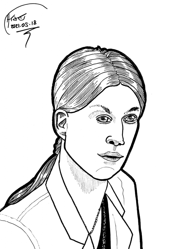
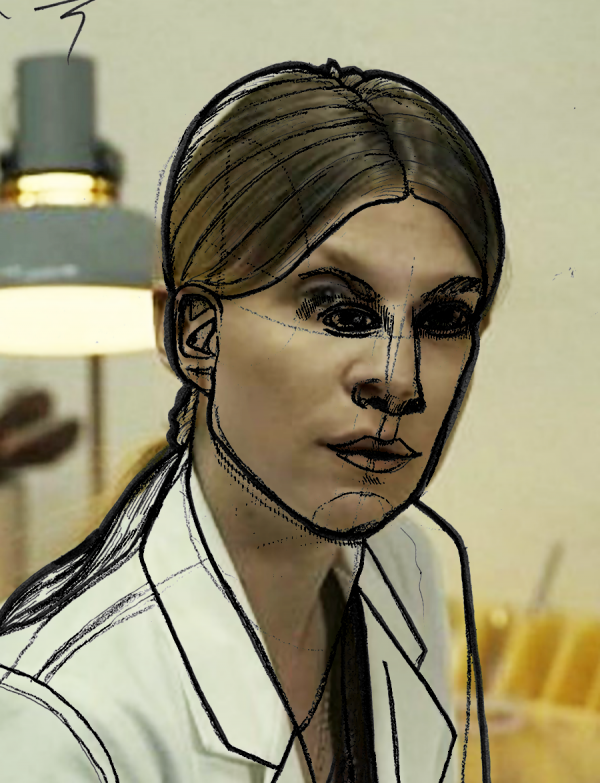
Clémence Poésy's character from Tenet. Wow, even though I tried real hard and used construction lines, it came out just terrible compared to the original:
My first thought was that I was making the jaw too long, and maybe I am, but overlaying the drawing with the construction lines made more visible, the real problem is that I got the line of the nose right, but completely gaffed the angle of the eyes (and a bit of their proportions too). There's no amount of rendering which will fix messing up the proportions this badly.
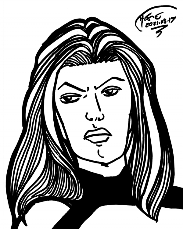
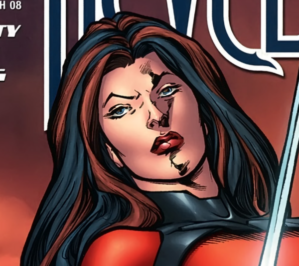
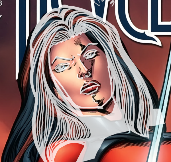
Quick sketch of Nemesis from the cover of Wildstorm: Revelations, which is sitting around in my "inspirational pictures for Porsche the Centaur's space armor" file. No roughs, but I did discard a few failed Sharpie drawings. For comparison:
Overall, I seem to have pushed the face in a bit - both the hair outer line and the hair framing her face - and missed several degrees of tilt. But the features aren't too terrible:
Roughs definitely would have helped - if you look closely, the head's not just badly tilted, but badly tilted in relation to the shoulders, and the hair is really missing a lot of body - but I have contractors coming tomorrow, so this is all we get for today's Drawing Every Day.
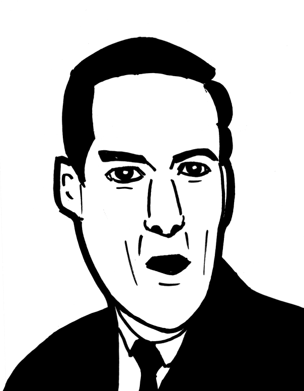
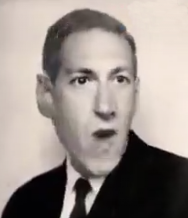
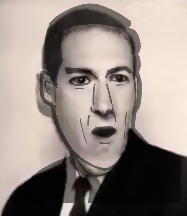
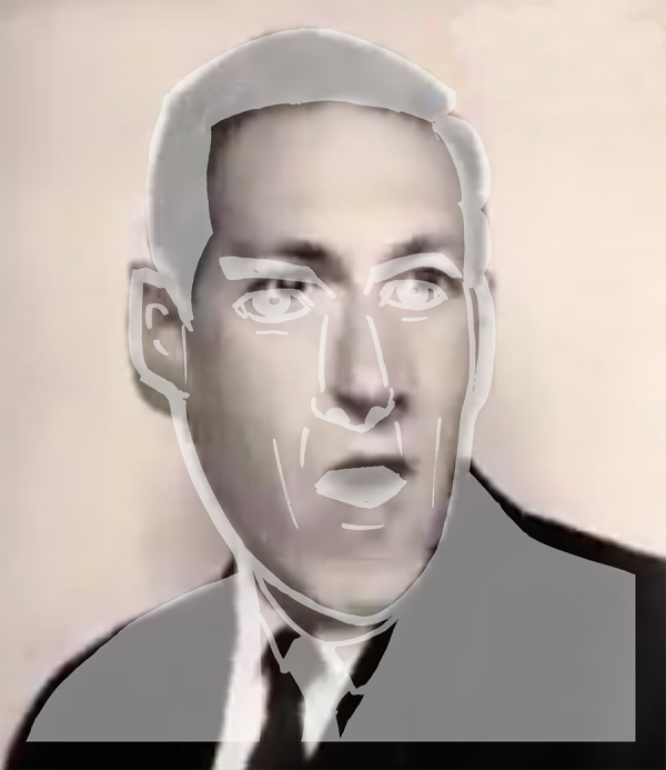
Quick Sharpie sketch of H. P. Lovecraft, deliberately trying to focus on the shape and proportions of the head, with the sketchpad held up at a good angle on my knee. Since there are few good pictures of Lovecraft, I took this still from a Rick Roll of Lovecraft generated by deep learning:
Comparing the proportions by matching the eyes, noes and mouth, it doesn't seem too terrible, though I have trouble really believing the size of people's ears and misjudge the chin. But the hair is off, so once again, this means I've put the facial features slightly in the wrong place:
Trying to match the hair, chin, and width of face, it appears that I'm less than a percent off in my overall head proportions, which is great; but that does confirm I am still putting facial features in the wrong place in the face, and that's a trickier problem to resolve without doing it lots and lots of times to get it right.
So, practice, practice, practice: by drawing every day.
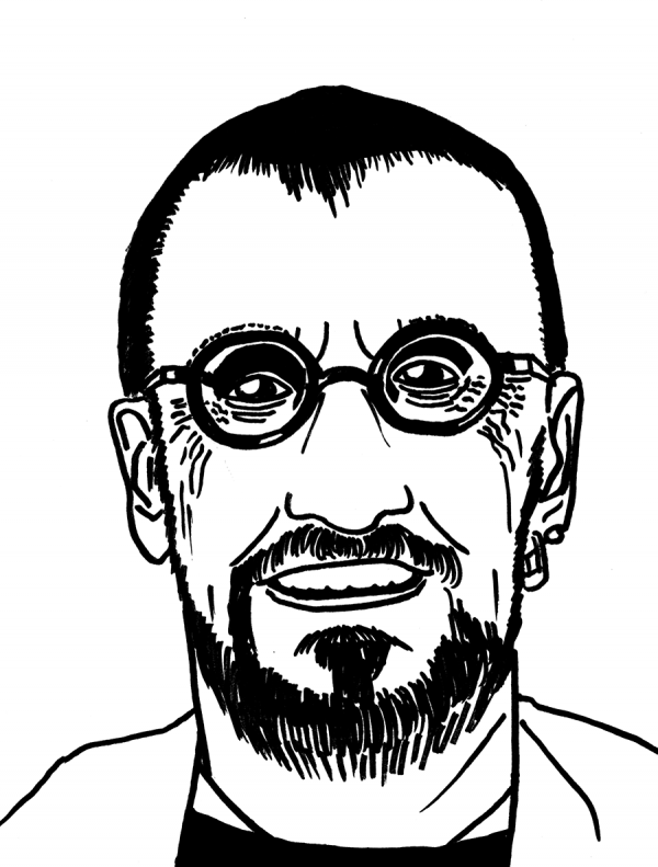
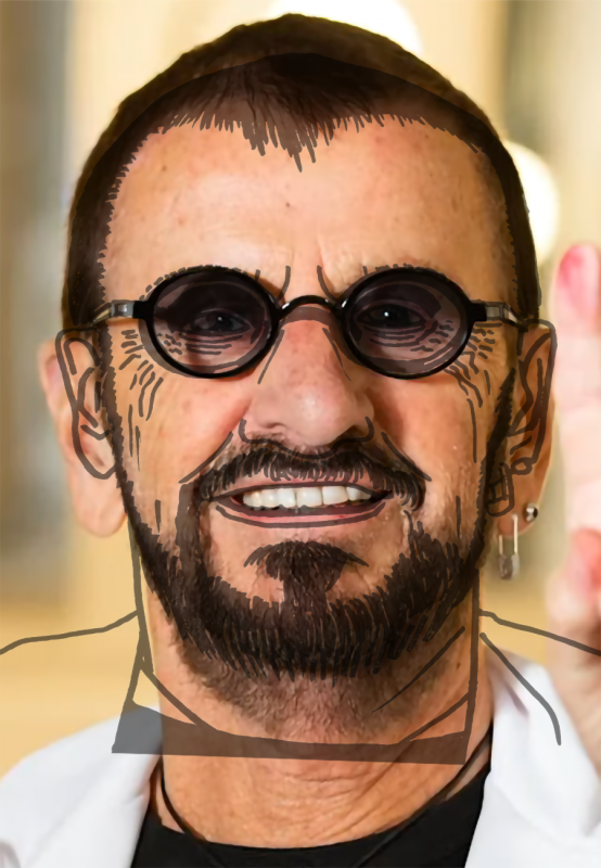
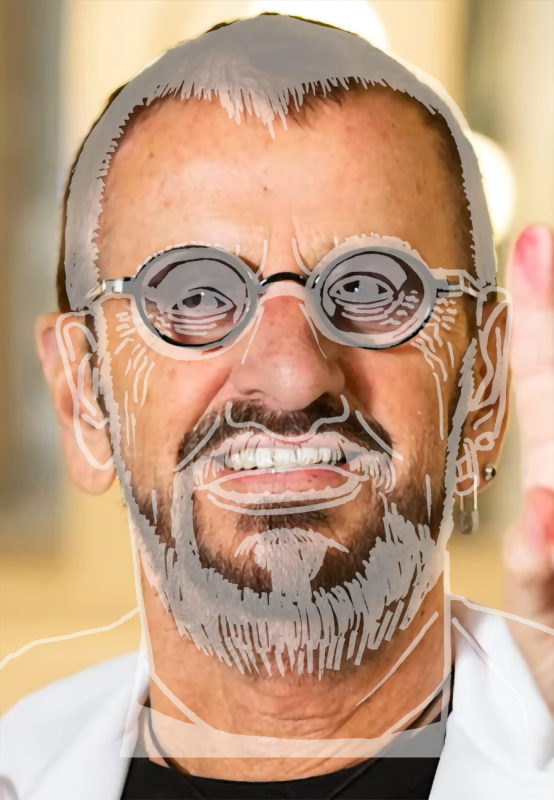
Quick Sharpie sketch (with blue pencil roughs) of Ringo Starr. Since I was stretching faces earlier, and had hypothesized that my quick sketching habit of having the pad in the lap was a bad angle, I tried to compensate by folding a tote bag to put on my knee to lift the page, trying to approximate a 90 degree angle. Let's see how I did:
According to Photoshop, I missed a ~2 degree tilt to the head (or the head I drew was tilted, same difference) and the overall head was about 10% too wide - if you measure by trying to match the eyes-nose-mouth features in the drawing:
But there the head top and shirt collar are off. Trying to match those up doesn't work very well, but matching the top of the head and the beard, we get something more like this, where the glasses and the top of the head line up, and, sort of, the beard, but the nose and mouth are pushed downward:
Still got work to do to get the proportions right. Sigh.
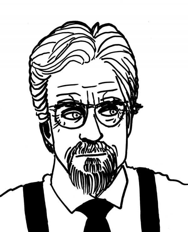
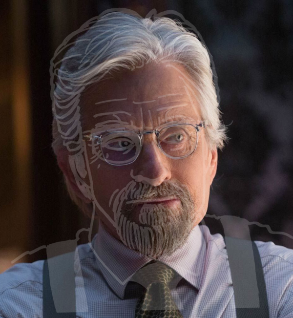
Michael Douglas as Hank Pym from the MCU - quick Sharpie sketch after non-repro blue roughs. Man, I gotta start doing these drawings earlier in the day. Again, I stretched his head - I think because the sketchpad was in my lap and was not right-angled to my view. At least, that's what I'm guessing is going on, as I've done it on a few other drawings, but it isn't consistent, as I squashed Daniel Craig.
The content of the sketch isn't terrible, but it did require (a) tilt and (b) widening in order to make it even roughly line up with Mr. Douglas's face. I think I need to be more careful about making sure the page is lined up properly - not sure that's the problem, but I'll give it a try. And look for the tilt, man!
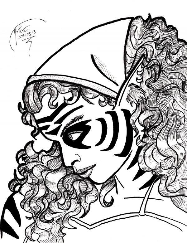
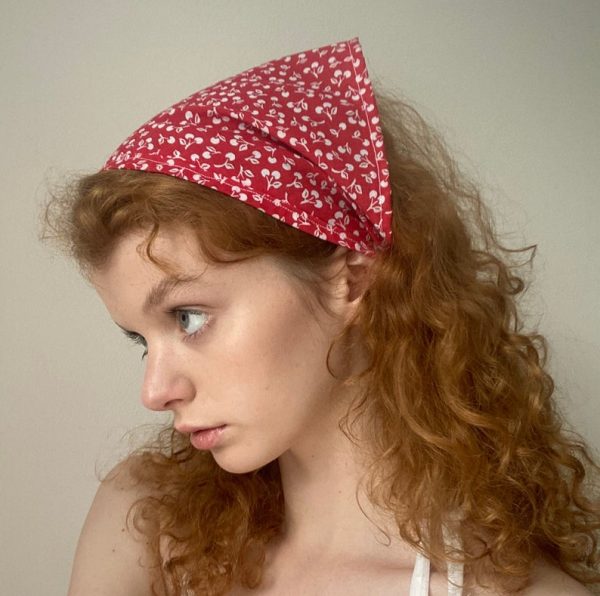
Sketch - I mean, full sketch, like with roughs and rendered inks and stuff, not a 15-minute Sharpie exercise - of Cinnamon Frost. Other than forgetting her whiskers, I think this came out well. While I did use a reference image, it's not precisely the same character (Cinnamon has way more voluminous hair, almost but not quite an afro), so it's hard to judge how well it came out with regards to proportions et al:
Mirror reflecting it, it doesn't look too bad. Looking over it, there's a little weirdness with the exposed shoulder being too far out compared to the size of the head and the shape of the chin, but in my defense, I was focusing primarily on the hair and headscarf, and the shoulders were an afterthought in the render.
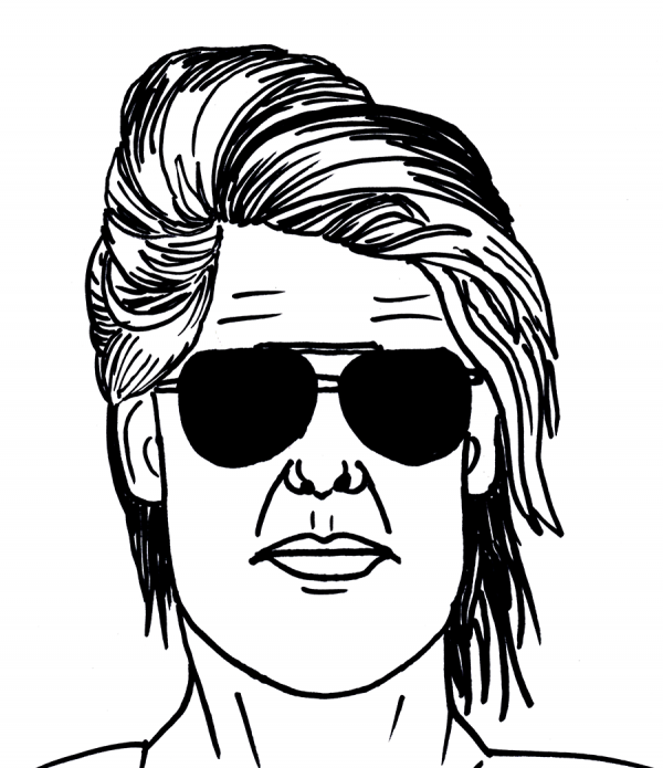
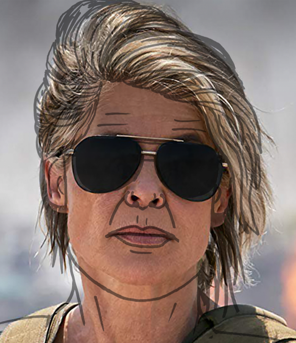
Super quick Sharpie sketch (yes, I got a new shipment of Sharpies) of Sarah Connor from Terminator: Dark Fate. What happened to her jaw, man? Wow.
No easy way to make this one line up, even with distortion to try to make the proportions better. I can chalk part of that up to quick sketching with no roughs - once that Sharpie line is down, it's down - but there's also missing that tilt to the head, and squnching the features of the face.
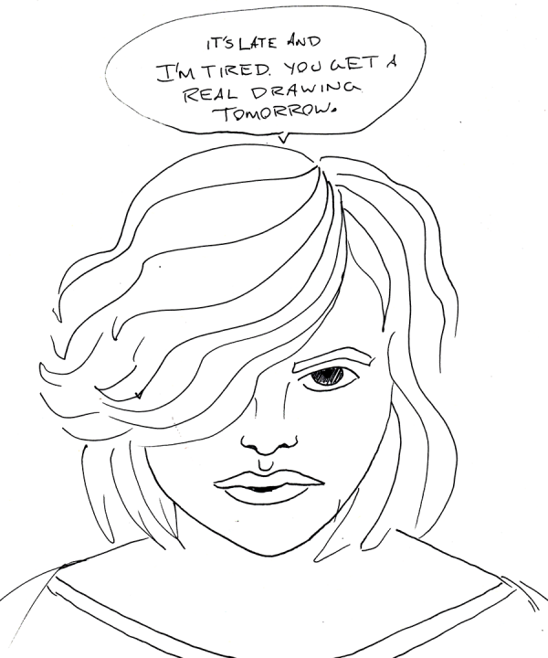
I would call this a quick sketch of Scarlett Johansson from Lucy, but I am so tired I actually started fading as I was doing my quick sketch, so I quit that and did an even quicker scribble. Real drawing tomorrow.
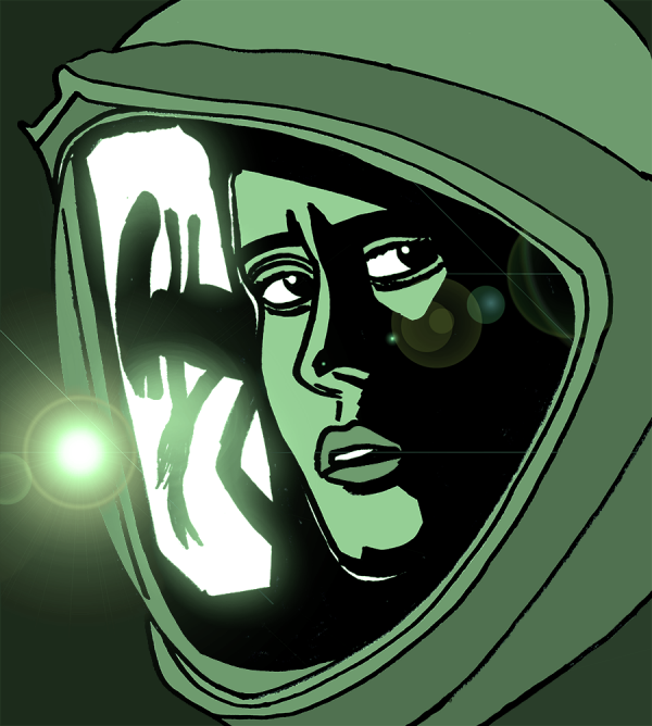
Quick Sharpie sketch of the cover of the Alien: Isolation game, run through Photoshop to create the lens flare - and, secondarily, the background greys needed to make the lens flare pop, and the green photo filter to recreate the overall look. I made the mistake of rotating the head and helmet as I drew it, but, hey, that was easily fixed in Photoshop too. Overall, it's rough and sloppy, but not too bad, though the original face shows a lot more fear, especially in the eyes and a little bit in the shape of the mouth:
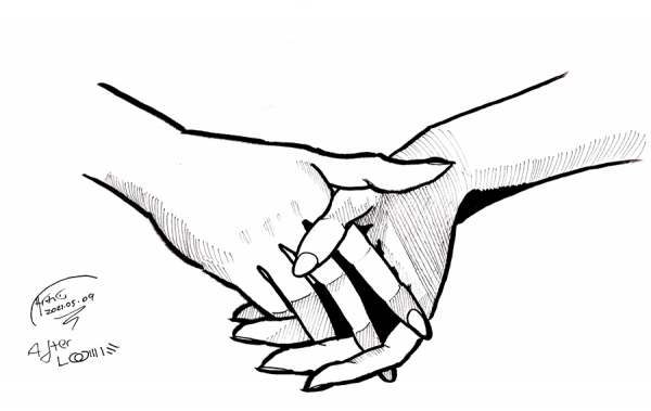
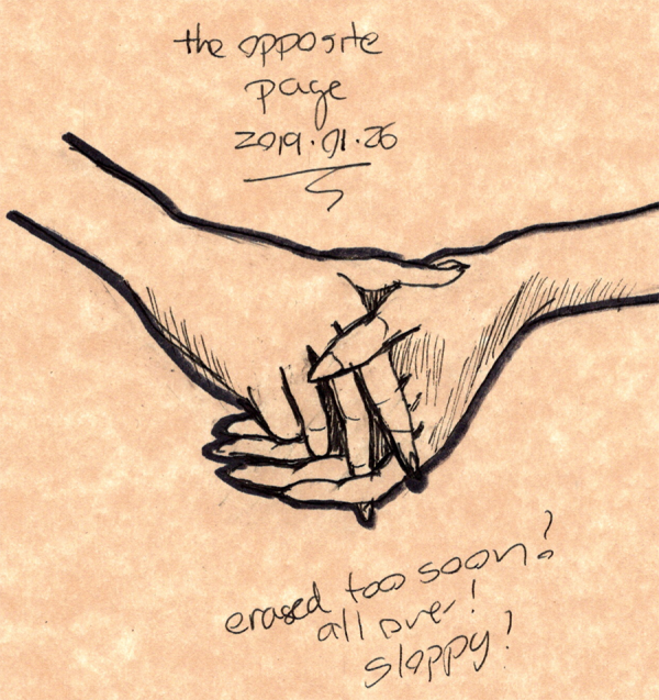
Clasped hands from the title page of Drawing the Head and Hands by Andrew Loomis. While this was from a full drawing after pencil roughs, I did simplify the rendering to use just five primary levels of value (white, black, two levels of crosshatching, plus the ink outlines of course) to make it easier on me.
The outcome: not ... terrible, but not great. I'm not going to include a scan of the original as it is inside the book, but for comparison, here's my attempt at this drawing from two and a quarter years ago:
Admittedly, this drawing was much smaller than the new one, but the old one is still pretty sloppy. It does have a nice energy to it, and the dark outlines I use as a crutch make the old drawing pop.
Still, both of these fail to catch something about the barely visible palm of the left hand (in this picture, the left hand is on the right side of the drawing, and the palm is just barely visible at the edge of the index finger) which shows up perfectly fine in Loomis's drawing with just a few lines. This is definitely one of those times where flipping the drawing 180 makes it easier to see the true shape.
Maybe that's a sign of a really good drawing: it can look better when rotated or mirror reflected than the original. I sure have a long way to get there.
Tired, could stay up later to finish a full drawing, but then, I've been having trouble getting to sleep once in bed when I do that, and I don't want to have another bout of awake-till-6am insomnia. Here's a quick sketch to tide you over - with a brush pen, since I seem to have exhausted all my Sharpies.
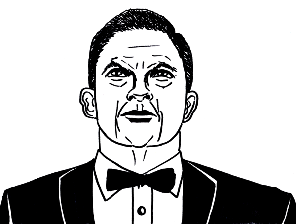
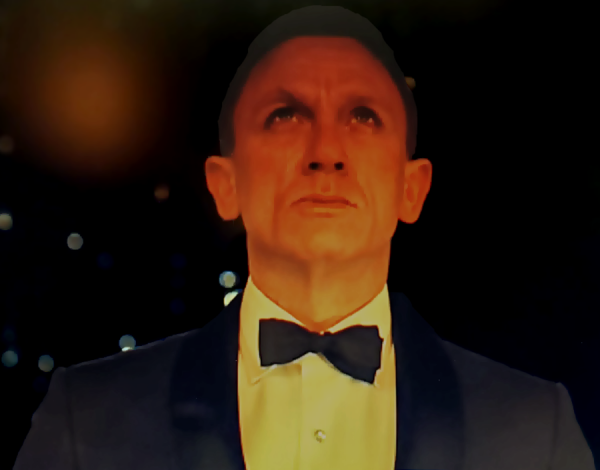
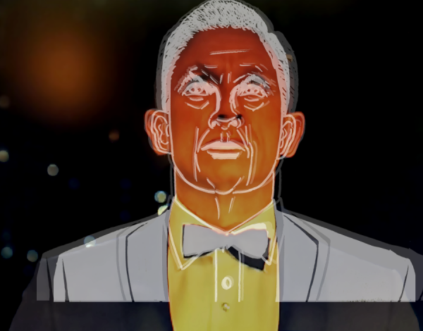
Quick Sharpie Sketch of James Bond from the very best Bond movie, the 50th anniversary special Skyfall . Eh, meh. To me, it's recognizable as James Bond, but not as Daniel Craig:
I'm sure I'm missing some fine details, but one big problem is that the proportions are uneven. Handling this by roughly matching height and shrinking the width to fit, the neck, collar and tie proportions are roughly 15% too wide, whereas the ears are about 5% too wide:
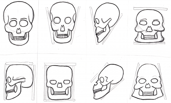
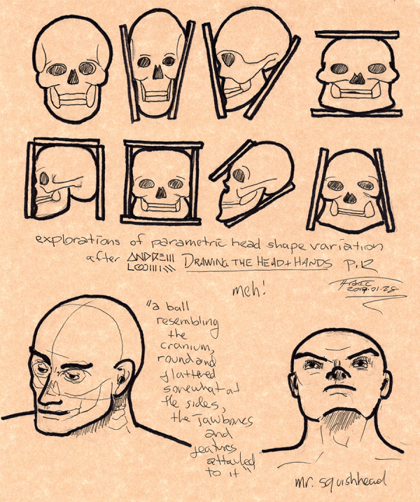
Sketching (pencil and ink) skulls from Andrew Loomis's Drawing the Head and Hands. This seemed familiar, and as it turns out, checking through my files, I had actually tried this exercise of rebooting my drawing skills before, in early 2019, without the forcing function of "Drawing Every Day".
In some ways, I seem to be getting better, but in others, I feel I am getting worse. I know I'm specifically optimizing for quantity over quality, and on top of that, optimizing for enforcing the habit and getting over my embarrassment over doing a good rendering - using a Sharpie if I have to - but still, some things just seem worse to me now. I know I was limited by the above to what I could carry with me (back in the days when I did this over lunch, usually out) and that I'm cheating on the above by explicitly using extra-dark lines to emphasize the outlines, which is a crutch I am trying to stop leaning on; but still, compared to my recent drawings, I feel like I was getting closer in some ways to what I want.
I skipped the hands and cartooning sketches this time through the exercises, though I may loop back to them. Nevertheless, I can see good things and bad things about my more realistic earlier renders. The renders are definitely nicer than the quick Sharpie sketches, but, for example, the eyes below are too big compared to the original, and the hair is if anything too large. Clearly, I need to keep up the practice.
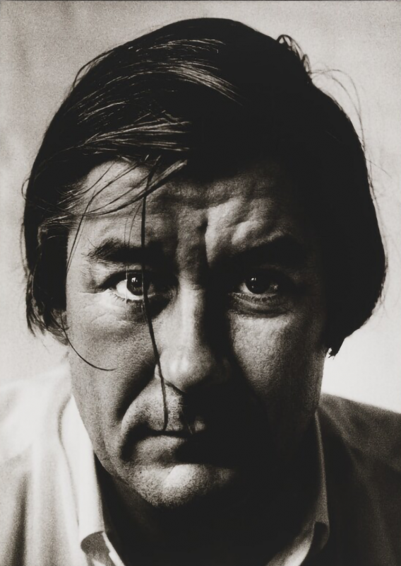
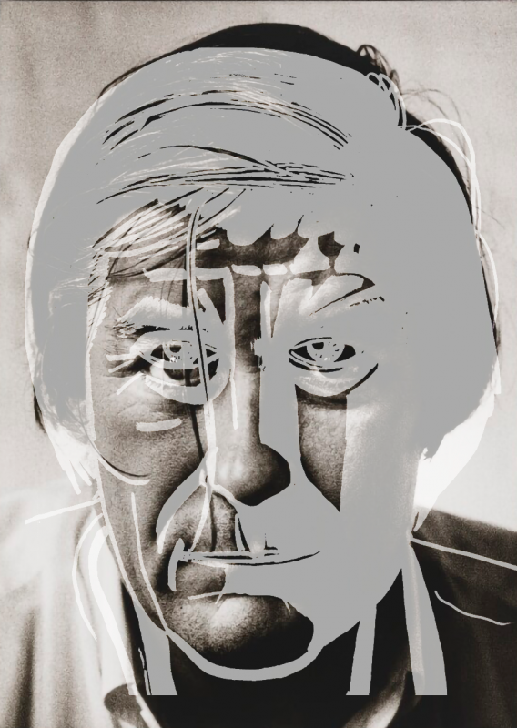
Quick Sharpie sketch of Patrick McGrath as photographed by Sally Soames, taken from the book Writers. (Mostly because I didn't have time to do a full start on the next page of Drawing the Head and Hands). No roughs or anything; just a straight sketch. While there are obvious errors, the hardest part was figuring out what to render as black or white against this fairly dark black and white photograph:
A direct comparison shows there's no easy way to line up what I drew with what was actually there. The nose and mouth fit best, leaving the hair and chin almost not terrible, but the cheeks are lopsided, the eyes too high, the forehead just ... wrong ... and the left shoulder shoved down while the right shoulder is up, I think because the hair came down too far. Not sure how I missed that, but it's just way off.
Also that weird "1 line out of 3-5 goes kazoo" is in full force, though in reality it's more like 1 line out of 20-30, lulling me into a false sense of security before the chin goes all wonky just when I think I've got it all under control.
This is why roughs are important. Next time (when I'm not already up late due to work).
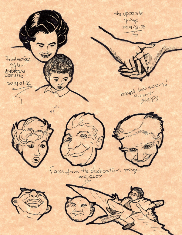
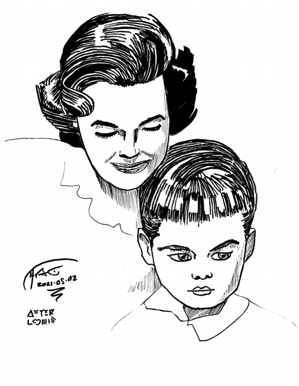
A sketch of the frontispiece of Loomis's Drawing the Head and Hands. Not going to include a scan of the page for comparison, as you should buy Loomis's book for that. I tried and abandoned 3-4 different half-finished roughs, finding problems like: squashed heads, bad jaw lines, squashed heads, and ennui. In the end, I flipped it upside down to get the "landscape", then back over to get the details.
While this isn't terrible, a few things stood out:
First, I need to work on my patience. "Real" artists work over the entire surface that they're rendering, and while I started to do that here, I lost patience before I reviewed the child's eyes (though, in my defense, I was trying to do a quick sketch after those 4 false starts ate my time).
Second, the wandering line thing I have going was in full force here: several times my lines just jumped, and while I noticed that flipping the page around to get a better angle helped, sometimes the line I drew was what I wanted, and other times it just fricking wasn't. It's really weird, as sometimes I can create really long, precise lines, and others ... zoom across the page.
Third, I still have trouble with the relative size of eyes, and with the fine details of nose and mouth, but especially, the size and fine details of the eyes. Also, my eyes suck. Eyebrows can use some work too.
Fourth, and this is a general thing, my shapes are primarily 2D, not 3D. This makes everything too flat.
Another thing, not seen in the finished work, is that I noticed I was making things too symmetrical; real faces almost always have a slight yaw around the neck, and that tilt means the eyes are closer to one side or the other; this meant I often was squeezing / moving the eyes around incorrectly, trying to create the wrong amount of space. Another thing to look out for.
Also, and I'm happy about this, I've noticed some triangular formations around the eyes / nose (I have seen these in art books) and the lines of the mouth (not seen in art books, but you see a little of it in the shapes of the mouths in the Simpsons) as well as curved rectangles between the lower lip and curve of jaw, and to a lesser degree between eyebrow and hairline on some people. All put together, they helped me get the landscape in place better this time, making the overall thing look less borken.
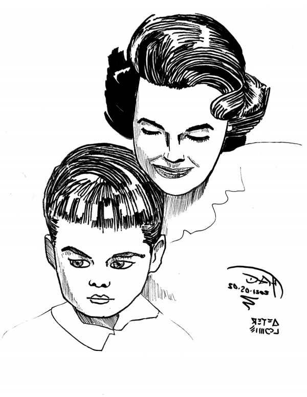
But not completely. Once mirror-flipped, some of the lopsidedness is more clear, especially on the kid:
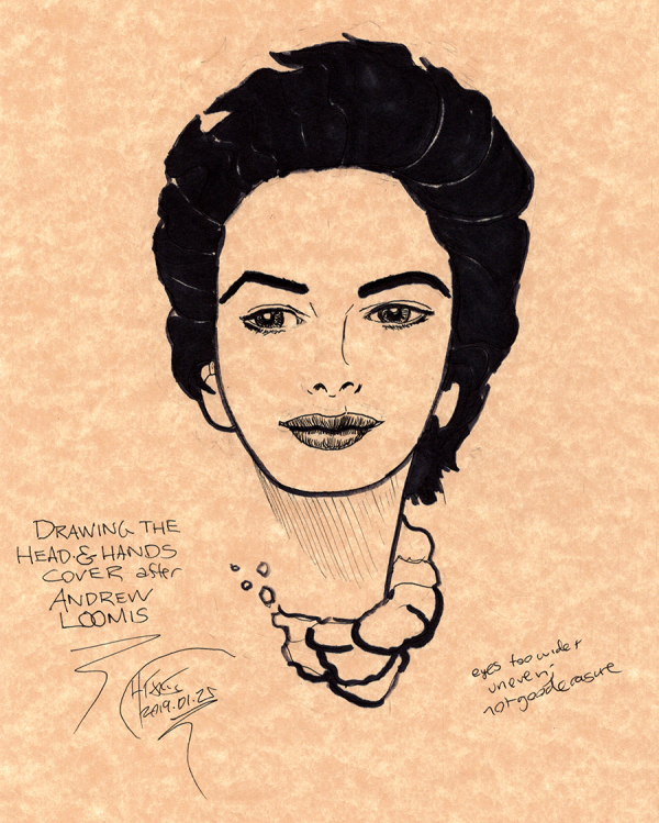
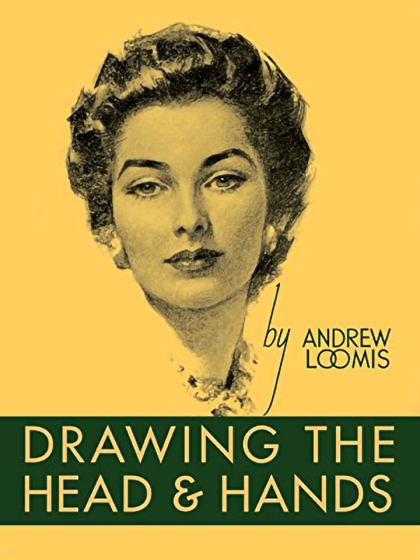
Quick Sharpie sketch of the cover of Drawing the Head and Hands by Andrew Loomis. Whenever I'm having trouble grokking something, I usually do best if I go back to the beginning and review my fundamentals, so I searched through my collection of drawing books and started with this one. I like Loomis's work: while it is old school, he draws well and communicates well about how to draw. In this case, I'm going to try to methodically go through the book, as I started to a while back with his Figure Drawing For All It's Worth, which is perhaps my second favorite art book after Wizard's How to Draw: Getting Started.
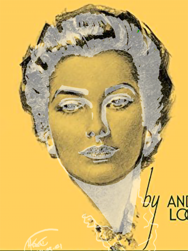
In this case, I haven't even cracked open the book, or even tried roughs: to free up some time to chill on my Saturday night, I just started with a quick Sharpie sketch to warm up based on the cover. It's tricky, as you need to make bolder choices on what is shade or not when using a Sharpie, and Loomis is using several levels of value here. Nevertheless, the result is ... not terrible, though Sharpie resolution limits the drawing, and I missed some delicateness of the face's features. But on a closer, side-by-side inspection, you can see some of the flaws more clearly:
Lining up the nose and mouth (which matched best, shown in light grey above) revealed three or four things right off. First, I had missed a tilt to the head (corrected in the side-by-side above). Second, I had made the mouth too small and high compared to the jaw (in the correction, this shows up as the jaw being too low, but the real problem was the reverse, as I started with the jaw; the eyes being too high is another part of this overall misestimation of facial features). Third, the hair is too small, showing I'm decent locally, but not great at getting the overall page distances - what I call the "landscape" - correct. This means a feature may be OK, but their relationships may be bad.
Fourth, I'm still having control problems on drawing lines. You can see this most easily with the left eyebrow. Three out of four of my lines land where I want them to, and the fourth seems to pop to a wholly different place. Perhaps this is just a need for practice, practice, practice, but given that I have a history of RSI issues, I plan to keep an eye on this.
Nevertheless, I enjoy the Sharpie sketches, because they're quick, you have to commit, and you get near-immediate feedback about whether the ideas you're trying are working, as opposed to various forms of full render, where I can get lost in the trees without realizing I've set the forest on fire.
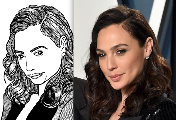
Not quite so quick sketch of Gal Gadot, roughed in non-repro blue. I have to say, I'm not so happy with this one: the thing I do where the face gets squashed is full in force here, this time even drawing the hair down on it. And this is with me working on the face proportions a few times to avoid that.
Even flipping it upside down didn't help. The problems are clearer to see here:
The hair's too big at top and too small at bottom and the whole face gets pulled down and to the left. Again I think experimenting with tracing might be a good thing to do here to help me re-learn the landscape, and now that Camp Nano is over perhaps I can do that.
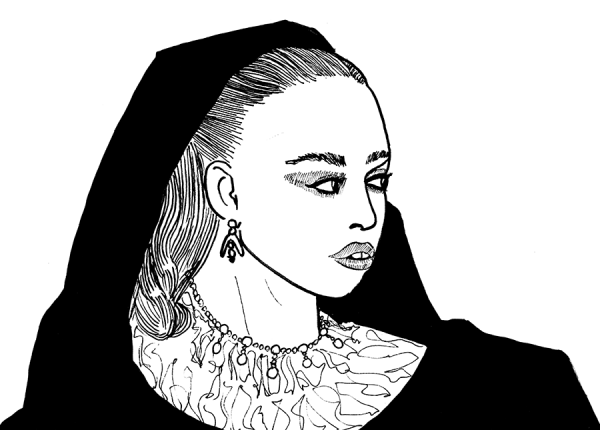
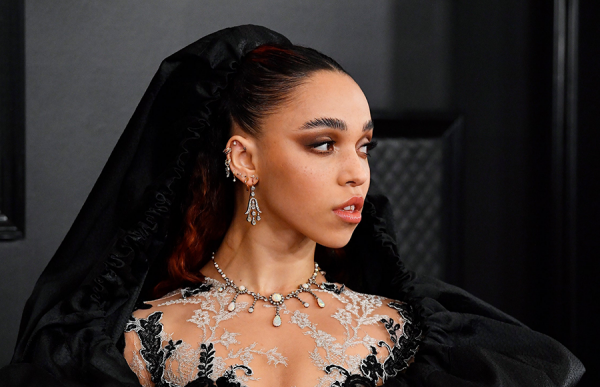
Quick sketch of FKA Twigs. Despite my best efforts redrawing the face 2-3 times in non-repro blue, her features swam towards the bottom right of her face, and her jaw isn't angular enough. Features being good relative to each other but poor with respect to the face seem to be one of my problems. This one might be a good candidate for a trace of the picture in vellum to see the difference between the lines I drew and the lines that are actually there (insofar as lines exist in pictures, which they sorta don't).
Drawing every day.
-the Centaur
P.S. 300+ words so far, will try to push a little bit more before crashing. Only ~2700 words to go for the month.


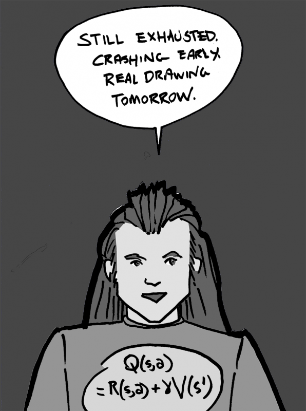 Mostly vaccine recovered, but didn't sleep well. Pretty tired, crashing out early.
Drawing every day.
-the Centaur
Mostly vaccine recovered, but didn't sleep well. Pretty tired, crashing out early.
Drawing every day.
-the Centaur 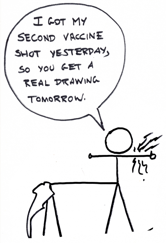


 Quick sketch of FKA Twigs. Despite my best efforts redrawing the face 2-3 times in non-repro blue, her features swam towards the bottom right of her face, and her jaw isn't angular enough. Features being good relative to each other but poor with respect to the face seem to be one of my problems. This one might be a good candidate for a trace of the picture in vellum to see the difference between the lines I drew and the lines that are actually there (insofar as lines exist in pictures, which they sorta don't).
 Drawing every day.
-the Centaur
P.S. 300+ words so far, will try to push a little bit more before crashing. Only ~2700 words to go for the month.
Drawing every day.
-the Centaur
P.S. 300+ words so far, will try to push a little bit more before crashing. Only ~2700 words to go for the month.