
Sunday, March 29, 2009
Renewing the Library
Recently I started to notice that the design of the Library is getting long in the tooth. One friend who was a web designer commented that it looked very "old Internet". I've watched another friend innovate on his blog design while mine was staying still. Work on my wife's web site made me revisit some of my choices, adding a description and picture but making few other changes. I know the site needs a redesign because I have a lot more material coming out soon, but the final trigger was when I couldn't attend a talk and looked up one of the authors to learn more about their work - I think it was Oren Etzioni - and I was struck by his straightforward site design which enabled me to quickly find out what he was working on.
SO, I'm redesigning the Library.
I'm an artist in addition to an author and researcher, so simply gutting the site and making it simpler wasn't my goal: I have specific ideas about what I want the site to look like, and I started designing a new one. Partway through that redesign, I noticed that I was doing a fair amount of research work - examining other blogs that I admired, investigating blog widgets, investigating CSS and HTML advances, researching color theory and design principles - but not blogging any of it. In fact, come to think of it, typically when people redesign their sites they put all their work under a bushel, trying to hide their planned change until the last possible moment, possibly exposing it to a few trusted users in beta or with an alternate link prior to springing it on the world as if freshly formed and fully new.
Well, phooey on that. The thought process that a web designer goes through producing a web site is interesting (well, to other web site designers, anyway) and provides a valuable resource to other designers doing their work. I wished that other people had blogged the process that they went through and the alternatives they explored, as it would help me make my own choices - but you know what? I don't control other people. I only control me. And if someone else hasn't filled the gap, then it's my own responsibility to come up with something to meet my needs.
SO, I'm going to blog the redesign of my blog. How "meta".
There's far too much to put into a single blog entry, so I'll start off going over the thought process that led to the design in more detail, then explain my strategy. The first thing that I did was look at other web sites that I admire. Earlier when working on my wife's web site I found a number of beautiful looking blogs, but when I started the redesign, I started my search over, focusing on sites of artificial intelligence researchers, bloggers, writers, and artists, trying to find ones I instinctively admired with interesting ideas, features or appearances that I could steal. Some of these included:
- Oren Etzioni's Home Page: Quickly Present What You Are Doing
An "old school" (not that there's anything wrong with that) web site from an academic researcher, it has an "old style nav bar" up top that quickly tells you how to find his publications. Below that is text which points you to his research projects and most cited publications. From this I gleaned:- Organize your work into logical areas
- Make navigation between areas easy
- Put things people want up up front
- Rough Type by Nicholas Carr: Put Your Content Front and Center
Featuring a straightforward design that gets you straight to his content, Rough Type also has an author blurb and a pointer to his most famous article, "Is Google Making Us Stupid?" and his book "The Big Switch" The key points I gleaned from the site:- Get your content out front and center
- Tell people who you are
- Point them to your best work
- Vast and Infinite by Gordon Shippey: Show the Author, Try Fun Features
Written by an old buddy from Georgia Tech, Vast and Infinite isn't that different from Rough Type. However, he's constantly innovating, adding a site bio and author picture, tweaking his banner, adding shared items and flickr gadgets and more, whereas my blog tends to stand still. The lessons from this:- Show people your picture
- Keep your content front and center (sound familiar?)
- Trying out new technologies generates interest in the site
- Home Page of Jim Davies: Show the Author, Organize Your Site Logically
Jim Davies is another academic researcher, with a much more modern site. Like Oren Etzioni, he has a navbar, but also a large picture, a more detailed description, and links to his art, store and blog. Unlike Oren, each area of the site seems a little more organized, without the duplicated links to publications and the odd inclusion of news articles in his personal page. Jim takes this further by having extra blogs just for rants and links. My takehomes were:- An academic site can have a modern design
- Showing people your picture creates interest
- Don't be afraid to segregate content into areas
- Marvin Minsky and John McCarthy: Tell People About Your Work, and Share It
Two of the greats in artificial intelligence have interesting sites filled with lots of content. Both start with a description of them and their work and then continue with many, many links to their most prominent work. Minsky puts up chapters of his most recent book; McCarthy includes a lot of narrative that gives context. What I like:- Tell people what your site is about using narrative
- Put work you are interested in front and center
- Fill your site with lots of content
- Greg Egan's Home Page: Fill Your Site With Lots of Content, and Share Your Research
Greg Egan is an author I admire primarily for his novel Permutation City and his short story Dark Integers, though I have more of his books in the queue. His site's layout is a little harder to read than some of the others, but it is filled with pointers to all of his work, to the research that he did to create the work, and applets and essays related to his work. The takehome from this firehose is:- Fill your site with lots of content
- Share the research you did on how you produced your work
- Don't be afraid to promote your work by showing it to people
There was one more site that kicked this all off, which I will hold in my pocket for a minute while I talk about opinions.
Unlike Jacob Nielsen, I don't have research backing up these conclusions: they're really just guesses about what makes these site work, or, worse, just my opinions about what it is that that I like about these sites. What's dangerous about opinions is that recent scientific work seems to indicate that they're often post-hoc explanations of our instinctive reactions, and they're often wrong. So, to combat this tendency, I looked at other resources that specialize in information about good design of web sites to try to get information about what I "should" do. I don't pretend I've absorbed all the information in these sites, but am simply including them to show you the kinds of things that I looked at:
- Jacob Nielsen's UseIt.com: Make your site fast, simple and standards based
Jacob Nielsen's site on web site usability is so simple it hurts my eyes. I don't like to actually look at it, but I do like the ideas. He's got a breakdown of recent news on the right and fixed web site content on the left; the idea of the breakdown is good but seems opposed to my goal to work with Western left-to-right reading. Jacob points out that he uses no graphics because he's not a graphic designer, and that's fair; but since his site is unpleasant for me to read I only loosely follow his recommendations. But one cool thing about his site: if I resize the browser his content stays divided more or less the way he's put it because the structure is so simple and well designed. - But What Are Standards? W3C and Webmonkey
The W3C is the official source of standards for the web like HTML and CSS, but I've always found their standards hard to read (and I've read many, many of them over the years). The new site redesign they're testing seems to make it easier to navigate to find things like the CSS Standard, but it is still hard to read and lacking the practical, let's get started advice that I want. Back in the early days of the web, I used Webmonkey as a source of good tutorials, but the site seems crufty and broken - trying to narrow in on the CSS tutorials got me nothing. I have a number of offline books, however, and am a whiz at reverse-engineering web pages, so when I get to the CSS articles I will detail what I learn and what sources I use. - CSS in Practice: FaceFirst.us and CSS Zen Garden
I know the designer of FaceFirst.us, a social networking site, and in exchange for me beta testing his site he turned around and gave me a tutorial on how he uses CSS in his process to ease his site design. In short, like Nielsen, he recommends separating the "bones" of the site from the content using CSS id's and classes. One example he showed me was the CSS Zen Garden, which has fixed content that is modified radically just by stylesheets. - But What Did Your Thesis Advisors Do? Ashwin Ram and Janet Kolodner
I also dug into what Ashwin Ram, my thesis advisor, and Janet Kolodner, a member of my thesis committee and my original advisor, did with their web pages. Both Ashwin and Janet have profile pages back at the College of Computing, but they also have richer pages elsewhere with more detailed content. I have no intention of slavishly copying what my thesis advisors are doing, but as far as the research part of my web is concerned they're similar people solving similar problems whose solutions are worth looking at and adapting for my own use - why, yes, my Ph.D. was in the case-based reasoning tradition, why do you ask? On that note, it occurs to me to look at other colleagues' web sites, like Michael Cox's site.
Standards, shmandards, cool sites and web lights - all well and good. My brain exploded, however, when I saw Warren Ellis's web site (billed as a blog for mature adults, so it's occasionally NSFW - be warned). In my mind, Warren's site had a number of great features:
- Show the Author's Name:
The author's name is hugely printed across the top - so you immediately know who this is, as opposed to say my dumb blog where my name is printed in 2 point type. And Warren's domain name is also his own name plus dot com, so that he can actually show his name and site name in the same logo. - Keep the Text to the Left:
The text of all the articles is corraled to the left margin so they can be PRINTED, aligned to the top of the page so it dives into the header and is immediately visible. Almost as if Warren's site was designed knowing that the majority of the people who read the English language read it from left to right, therefore the text should appear where their eyes go. This pattern, plus the pattern of the rest of his design, is consistent with putting the good stuff in the F-shaped heat map that typical users eyes take when scanning your page. - Use the Middle of the Page:
There is a bar of links in the MIDDLE of his page, immediately to the right of the articles, which puts it close to the golden ratio of the horizontal space of his site design (as viewed on my monitor). This "linkbar", held in place by CSS wizardry and a black magic compact with the Old Ones, contains permanent site features that most need to be linked - message board, mailing list, comics, his novel, his agents, and his bio inline. Think of it as sexier version of Jacob Nielsen's "Permanent Content" box. - Put Sparkly Things to the Far Right:
Beyond the linkbar are all the cool fun site features like a search bar, podcasts, images and other nonsense, which are fun to look at but less important. On my site, some of these are on the right, or even at the very bottom of the page; on other people's sites they appear on the left, distracting Western readers from the article and possibly shoving the right ends of the articles over the printable width of the page. Ellis' contract with Cthulhu and the hellish powers of the W3C enable him to safely corral these fun elements to the right where they belong.
The linkbar was the most mindblowing thing. It eats into the banner. It's readily visible. It leaves the text on the left, but it's close enough to be visible on most monitors. The whole site is 997 pixels wide, so it will fit on a typical 2009 web screen, but if your screen is smaller, first you lose the fun sidebar, then the important linkbar, and only then do you lose the text. Even better, since the linkbar CSSes its way into the banner, the size of the site is controlled by the header image so it won't get wider. So your Nielsen-style variable content is always visible on the left, and your important fixed content is always on the right, and God willing it will never get hosed by someone resizing their window. Once I saw that, I decided I'd done enough work researching, and it was time to start redesigning.
SO my first step is to unashamedly steal Warren Ellis's linkbar.
Immediately I sent out my secret agents out to download his HTML and CSS and transport it to my secret lab so I can take it apart piece by piece until it has no secrets left. Of course, some of Warren Ellis' choices won't work for me, so I will have to do a lot to adapt the ideas he and his team used in his site design. And simply imitating the form of Warren's site won't be successful, any more than just making a movie just like Star Wars called Sky Battles would be immediately successful. (Battlestar Galactica fans, take note: while I loved the show, I think it's fair to say that it took the reinvention of the show to really produce a success, which was based on making the show interesting in its own right and not copying Star Wars).
The outer form of his site is the product of his inner success - he is a popular, prolific author with a message board, mailing list and weekly online comic he uses to promote his other writing and books, which makes the prominent placement of the message board agents and books highly important in the linkbar. Starting a message board and getting an agent won't help me. I, in contrast, am a jack of all trades - developer, researcher, writer, artist - using this blog as a tool to force me to stop being a perfectionist, complete my work, and put it out in front of people. So my goal is to make sure this website displays my content, prominently surfaces the areas of interest I work in, and has a few flashy features to attract attention to individual items of more permanent interest.
In upcoming articles I will detail my original constraints for the blog version of Library of Dresan and why those constraints failed as the site evolved over time, my goals for the new site design, what I think I understand about how wide to make your web pages and where to put your content (and where I got those crazy ideas) my move to the use of CSS and my attempts to make the site work well on screen, on printers and phones, my attempts to better exploit Blogger, Flickr and other web gadgets, and the work that I'm doing investigating color theory and generating the new art assets that will make up the site.
Hopefully you'll enjoy the process, and when it's done, that you'll enjoy the site more.
-the Centaur
Labels: Development, Webworks
Friday, March 27, 2009
Shooting from the hip versus shooting straight
But even I have my limits. When I was reading over the article again and realized that I consistently spelled Allen Ginsberg as Alan Ginsburg, even though I copyedited it and checked it against the Wikipedia article, I found I had to go back and fix the article.
And I also fixed the "quites".
Oh well. I suppose that no matter how much you try to make yourself commit to publishing over polishing, there's some amount of polish that must be done ... sooner or later, published or not. If there are real mistakes, you gotta fix 'em.
Han still shot first, though.
-the Centaur
Labels: Dragon Writers, Webworks
Comments:
Thursday, March 26, 2009
Why I Write
I saw the best minds of my generation destroyed by
madness, starving hysterical naked,
dragging themselves through the negro streets at
dawn looking for an angry fix,
angelheaded hipsters burning for the ancient
heavenly connection to the starry dynamo in the
machinery of night,
who poverty and tatters and hollow-eyed and high
sat up smoking in the supernatural darkness of
cold-water flats floating across the tops of cities
contemplating jazz...
It goes on in this vein for a while, containing challenging material for the late 1950's which led to obscenity trials and quite a bit of controversy.
I was reminded of the poem when I went to the City Lights Bookshop recently, a liberal bookstore with its own rich history that was influential in nurturing the Beat generation of poets. Pictures of Ginsberg adorn its walls, including one in which he clutches what at the time was his only bowl.
And that started me thinking about what Ginsberg might say if we had a chance to meet and he could read some of my work. And that made me realize that I'm not trying to do what Ginsberg was trying to do at all.
Ginsberg's work was raw, powerful, lyrical. He experimented with form, filled it with deep emotion, and used it to catapult the secret frustration, struggles and shame of a repressed generation straight out into the light, exposing drinking and drugs and sexuality and homosexuality and protest and jazz to a world that wasn't quite ready to receive it for precisely the same reason that it desperately needed to hear it.
Sometimes that needs to be done, but I don't care about doing that at all.
I want my work to be honest, but I'm not interested in throwing things in people's faces to wake them up. I believe in illuminating worlds that are rarely seen, but only to create interest, not to expose secrets. I do feel deep emotion, but often drain it from my work because rage blinds me from seeing my opponent's point of view. I rarely experiment with form and often when I do, I regret it. Where Ginsberg was raw, powerful, and lyrical, I try to be smooth, balanced and direct.
But that's a post-hoc analysis, derived from what I like about Ginsberg and how it differs from what I write. It isn't the first thing that came to mind about my writing, which was: I write what I like.
I like to write stories that I like to read. I write science fiction because I enjoy hard science, space opera(*), Star Trek and Star Wars too. I write urban fantasy because I like Anita Blake and Mercy Thomson, and Interview with the Vampire and Buffy the Vampire Slayer too.
I constantly have stories running through my head, more than I could ever write down. I've written many, many short stories and novels, only a few of which have gotten published or seen the light of day, but that's slowly changing as I put more effort into publishing.
But at the end of the day that doesn't matter, because I can still read my stories. I'm not writing to make other people happy. I'm not writing to change the world. I'm writing to produce more of what I like to read.
That, and my head would explode if I stopped writing.
I hope some more of my writing will get published, that you all get to read it, and that some of you enjoy it. Until then, please enjoy this blog ... which I write for the same reason I write science fiction: I enjoy having blog posts to read and will continue to produce more of them that I like.
-the Centaur
(*) I fully understand that categorizing Larry Niven as "space opera" will be construed as a terrible insult by people who don't understand the difference between the kind of SF that he wrote and the kind Hal Clement wrote. Uncharitably, these are probably the same people who insist on the distinction between "sci fi" and "science fiction" or draw some mental distinction between "Trekkies" and "Trekkers", and they can all just go away. For everyone still reading, Larry Niven is one of my favorite authors, but if your stories include hyperdrives, you're writing space opera and not hard science fiction, even if your space opera is filled with real hard SF elements.
Labels: Dragon Writers, Webworks
Comments:
An Age Mistaken

Today, for the first time in my life, someone called me "old man".
It's not the first time someone's guessed my age wrong. When I was about sixteen, I and a friend went to a restaurant in a theme park; he was mistaken for a twenty-five year old and I was mistaken for twelve. Six and a half years ago, I was mistaken for an eighteen year old by the woman who would later become my wife. Her sister tried to warn her off on the grounds she was cradle robbing, but she persisted and found out we were close to the same age.
Today, however, was the first day that miscalculation happened in the other direction. I was at the Game Developer's Conference in San Francisco, leaving an impromptu get-together at Firewood Cafe in the Metreon, a cascading series of dinners and discussions first with with a group of colleagues and then with some onlookers who were drawn in. On the way back to the Minna Street Garage, I passed the normal mix of badged game developers, predatory homeless people, and disinterested San Franciscans ... and then saw the kid.
My first moment of awareness of him was his demonstrative toss of a Starbucks cup, chucking it out onto a surprisingly clean street in a deliberate, almost belligerent act of littering. He hefted his wide, white skateboard, I took in his black shorts and jacket, and mentally categorized him as young, rumpled, and possibly homeless. The word "punk" popped uncharitably to my mind and I tried to quash it.
As he, I, and the woman walking ahead of us passed the glass wall of Mel's Diner, he tracked to the left, hugging the gentle inward curve of glass as if to go in the door when it was clear from his walk and attitude that he had no desire whatsoever to go inside. He had to pause briefly as the woman opened the door, and I passed him. As I did, he called out:
"Can you spare any change, old man?"
I've given forty-one dollars to panhandlers and street musicians over the past four days. I didn't give him a dime.
-the Centaur
Labels: We Call It Living
Comments:
Tuesday, March 24, 2009
Frost Moon Revised
In the meantime, I have returned to work on Blood Rock, the sequel, now at 100,000 words and going strong. I suspect I'm closing in on the end here; the current word count includes a lot of notes that will be chopped in the final draft, so hopefully this will come in at under 120,000 words.
As I mentioned before, I have already started work on the sequels, Liquid Fire and Hex Code. I have ideas for many more in this series, and plan to keep doing them as long as they're fun. I'll put up more information when I do the site redesign, hopefully in April.
-the Centaur
Labels: Dakota Frost, Dragon Writers
Comments:

Wednesday, March 04, 2009
National Pound Cake Day and More
kibbeh / kibbeOk, Hytham, thanks for writing the entry. But let's clear up a few things:
minced meat dish with almonds.
the damn Lebbos think that's a 'national' dish..well, fuck that. It's origins are North African... and yeah, it's taste-o!
- I don't know what dish you're referring to, but kibbey as made in Lebanon does not contain almonds. In Syria they sometimes put pine nuts in it, but in Lebanon a more typical recipe is: meat (lamb or mutton, or top round beef), bur'ghul (crushed wheat), minced onions, salt, black pepper, cumin, cinnamon. Occasionally people add minced red peppers, allspice or mixed spice, and when I make it I do try those from time to time. No almonds, unless you are talking about stuffed kibbey balls, which can contain almonds - in the filling, not in the kibbey, and saying kibbey requires almonds is like saying pizza requires anchovies just because you liked your mom's anchovy calzones.
- "Lebbos"?
- Look, I don't care if the dish originated on Mars, it's still the national dish of Lebanon in that we eat it raw more than just about anyone else. More generally, EVERYONE in the Middle East region has their own version of what EVERYONE ELSE eats, relabeled with their own names - good luck figuring out who invented what. If you paid attention to the cuisine of the region rather than practicing some form of "my guys are the best" cultural imperialism, you'd find that out immediately.
- On the note of "my guys are the best" cultural imperialism, I reject it in all its forms. Send me your recipe - if it's better, it's better!
- Yes, it is tasty!
Comments:
Monday, March 02, 2009
Pound Cake: One Pound Each of Butter, Sugar, Flour and Eggs

I enjoy a couple of slices of pound cake and milk as a late night dessert, but have difficulty finding pound cake that meets my standards. Forget the "loaf cakes" made by the big commercial bakeries: they're not bad, but they're not what I'm talking about.

I'm talking about ring pound cakes. My neighbors made a dense, dry pound cake around Christmastime that was very good, but my favorites growing up were cakes you could get from Ingles: ring-shaped, light-textured, with a fluffy yellow center wrapped in a dark brown crust.
Usually there's only one store in any given region that makes these, the others sticking to loaf cakes. As I moved from Greenville, South Carolina, I found Kroger in Atlanta and later Safeway in San Jose had cakes that were similar, with slight variations in density and crust.
But there's something wrong in our modern commercial paradise: in the pursuit of the dollar or fashion businessmen tweak their good products until they become crappy and then discontinue them. I'm sure that's happened to all of you; and sure enough it happened to my pound cake.
First, Safeway started selling them only as half rings. Then they cut back on quantity. Then they replaced them entirely with "vanilla loafs" pre-cut entirely too thin. Whole Foods had decent-flavored loaf cakes, but they too have started pre-slicing them and cutting back on quantity.
I don't know what people have against pound cakes, but I can't find them locally baked, not even at bakeries - only icing-covered disasters, pudding cakes, and other variants, or alternatively Entenman's not-bad-but-not-good-enough butter loaves.
So, I am working on a pound cake recipe.
I made my first pound cake years ago, back in Atlanta. I was using the approximate "one pound" recipe: a pound of sugar, eggs, butter and flour. I didn't have a motorized mixer, and the hand mixing and stirring didn't cut it. It's fair to say this was a total FAIL. The flavor and crust were good, but the texture was dense as a brick and it was too hard to eat.
More recently, I tried again. I had planned to try this with sugar first, then introduce Splenda on the next cake, but dumb me forgot to buy sugar thinking we had some, which I discovered halfway through prepping the recipe. I adapted the recipe primarily from "Butter Sugar Flour Eggs" with a little help from the 1997 "Joy of Cooking":
- One pound of unbleached allpurpose flour
- One pound of eggs, separated
- One pound of butter
- Two and a half cups of Splenda baking sugar
- 1/4tsp vanilla flavoring
- "Just a pinch" of nutmeg and cinnamon
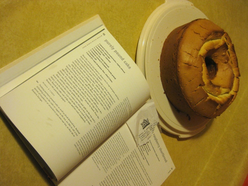
That's right, all of the shots of pound cake shown in this article were from my first try of this recipe. It was a beautiful looking cake. The texture of this cake was slightly dense, but smooth and serviceable. The crust was very slightly dry but serviceable. The flavor I have to say was poor - it was in the right ballpark, one might even say it tasted right, but it had a chemical aftertaste. And I'm sad to say I don't think it was the Splenda ... I may have simply added too much vanilla extract.
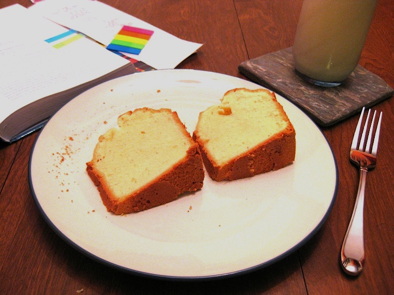
I've been consuming this cake for a while for my late night reading sessions, but I finally broke down and got the Whole Foods cake for comparison, having one slice of each. Ah, drat - the Whole Foods cake was much better, both in texture and in flavor, though it didn't rise to the level of the long lost Ingles, Kroger or Safeway ring cake.

Oh well. Better luck next time.
-the Centaur
Labels: Pound Cake, The Killer Cookbook of Marie Curie, We Call It Living
Comments:
1 lb butter (1 box salted)
1 lb sugar (2-2/3c)
1 lb eggs (~8xl)
1 lb flour (4c)
ingredients should be room temp.
beat and beat and beat the butter.
add sugar and beat and beat again.
add eggs and beat gently until the egg yolks are broken into small pieces.
add flour and fold or mix until ingredients are just mixed smooth - don't over beat.
put into a well greased bundt pan and bake at 325 for 1 hr 10 min...depends on the oven. check at one hour.
 : 5:35 AM
Sunday, March 01, 2009
Clutterhound
- Someone who takes joy from excessively collecting a lot of different things.
- Someone who wouldn't be caught dead reading Real Simple magazine.
- Anthony Francis
Labels: We Call It Living
Comments:
The Weird Way I Think
Recently I found out the way I think seems damn peculiar to most people. One friend blogs about my "amazingly weird way of looking at life", another said the same thing at dinner, and my wife is amused that in "in the centaur universe, everything catches on fire, then has to be banned" - referring to a thought experiment I frequently use to think about public policy.
It's hard to see how you think, so it's hard to know what makes my thinking weird. William James said that thinking about thinking is like trying to turn up the lights in a room to see the darkness. But maybe I can look at the way other people think and try to see how I'm different from normal people - or similar to "weird" people, like "geeks".
Sometimes "geek" is a dirty word. There's a whole overlapping set - "nerds" are socially awkward, "geeks" are obsessivley interested in the technical details of a subject, "fans" let that thing take over their whole lives. But while few people I know are comfortable being called "nerds", many are comfortable being called "fans" or "geeks".
You don't have to be a nerd or geek to be a fan: there are plenty of football fans who wouldn't miss their favorite team, and plenty of baseball fans who wouldn't miss a game no matter who was playing. And you don't have to be interested in sports or scifi to be a geek: there are plenty of sound system geeks, though they prefer to be called audiophiles.
But a lot of people who self-identify as geeks mean something more than being obsessed with a subject; instead they mean people who think about things other people don't think about. A couple of uber-geeks I know put it best when they said a true geek is someone who doesn't filter thoughts out.
My friend Henry best epitomizes this: when I toss out some safe-sounding generalization, he works hard to find a specific example that breaks it. For example, in arguing about the tax code, I said "there's nothing wrong with just being rich" - to which Henry said, "there's some dollar value one man could have, say one hundred trillion, that you would see as a threat."
This led me to my current thinking about public policy. My first instinct is that the government should not regulate anything - but my favorite counterexample to my own argument is "if something sets people on fire, we might have to ban it." Some things can cause so much harm that we may have to be pre-emptive; most things don't, so we should let them alone.
As another example, virtually every law is enforced at the point of a gun, so every law passed is an evil, and must be balanced by a some greater good. Most people don't want to think about that, and get evasive or even angry when you remind them. In their minds the laws they like must be good, and therefore can't be associated with any kind of bad.
I don't want to go down the rabbit hole of politics right now because it's a charged topic. More importantly, I'm not a perfect "geek" - there are probably a lot of things that I don't like to think about that are my own blind spots. So I could be wrong about the above - and finding out how you are wrong is something I've noticed a lot of people don't like to do.
I started paying attention to this when I began digging into science more deeply - not just the history and philosophy of science, but the writings of practicing scientists, particularly Richard Feynman. Then I started to see that the bulk of the history of human thought was people clinging to ideas that are almost certainly wrong.
In my view, this applies to everyone - Christians, atheists, physicists, astrologers, New Agers, reductionists. People don't hold ideas because they think they're wrong; they hold them because they seem to work. The more convinced you are, the more likely you have fooled yourself; the more aware you are of how your thinking can fail, the safer you are.
It's hard, and often painful, to think of the ways in which you can be wrong. I can irritate people who are complaining about some horrid event during their day when I ask, "why do you think the cashier acted that way towards you"? Rather than getting angry, seek first to understand why the other person is doing what they're doing, and how you contributed to it.
This really offends a few friends of mine who are "conservatives". They get angry when I ask questions about how our policies contribute towards people's attitudes towards us. But to me they're living in a fantasy world in which actions have no consequences - a fantasy no better than the "liberal" one in which there are no real villains with irreconciable differences.
Another thing I reject is reasoning from appearances. There's a huge swath of common sense thinking we can't do without. But there's also a huge swath where the appearance of things around us is just wrong. Appearances tell us the passage of time is fixed, the Earth is flat, and the sun goes around it - but none of those things are true.
It's important to understand the models behind the appearances - even though we know the models can be wrong, they're better than trying to reason from the illusion. When you go deep down this path, a lot of what happens in the world seems obvious - and the light of the Earth shining on the darkened face of the Moon takes on new meaning.
This can lead you into traps. To me it is seemed obvious that Meteor Crater in Arizona was caused by an impact: the sedimentary rock layers have been tilted onto their sides. How could anyone have thought this was a volcano? But then I went to Hawaii, and saw the side of a volcano eroded away, with the same pattern, this time deposited by multiple eruptions.
But if you are on guard, this model-based way of thinking can be very rewarding. Feynman claimed that anyone who didn't find quantum mechanics weird didn't understand it; but if you understand it really deeply you start to see it has to be that way. Many other issues, from free will to consciousness to relativity, also start to seem clear once you dig into them.
I still don't know what the weird way I think is. I'm sure many people think the same way I do, while others don't. I'm sure much of what I think about how I think is wrong, just like much of the rest of what I know could also be wrong. But those few odd comments made by my friends were certainly a good source of inspiration for thinking about thinking.
Hopefully this let some light into a darkened room, but not so much it catches on fire.
-the Centaur
Labels: Philosophy
Comments:
So very true.
Patterns are also really useful for developmental purposes. The brain makes sense of its sensory input by organizing around similarities and differences. Those structures are what make language possible, but they also make us prone to hold some extremely silly beliefs.
To me, most things eventually come down to competency vs mastery. Most people stop at the former because it's "good enough." We can do our jobs and pay our bills and drink our beer on weekends. But we only experience real happiness in fleeting moments of reflection. To look deeper into our own thought processes is difficult, but probably necessary for those who hope to achieve any real mastery of anything in life.
And the cool thing is that, achieving mastery in one area makes us better able to see through the patterns that prevent us from achieving it in others.
Learning can stagnate into pattern or it can accelerate into application. Post a Comment
![]()
 By day, Anthony Francis makes computers smarter; by night he writes science fiction and draws comic books. He lives in San Jose with his wife and cats but his heart will always belong in Atlanta.
Comments: