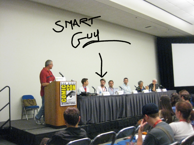
Sunday, March 14, 2010
Anonymous Commenting Disabled

Sorry, commenters, but the signal-to-noise ratio of anonymous comments was approaching zero. :-( It was getting to the point I almost rejected some real though short comments because they were looking like the spam comments I was getting - I apologize if I dinged a real person by accident. But when you don't know who's sending a gift, you never know what's inside the wrapper.
-the Centaur
Pictured is my cousin Bryan Norman, receiving a joke gift of a mailbox at last Christmas's White Elephant gift exchange - though I dispute the Wikipedia article, I lived 38 years in the Southeastern United States and never heard it called a "Yankee swap" - always "White Elephant" or the less-politically-correct "Chinese Christmas".
Labels: Webworks
Saturday, February 20, 2010
The Last Hurrahs of Blogger FTP and Earthlink
Labels: Webworks
Comments:
Tuesday, February 09, 2010
Has Blogger *ALREADY* Discontinued FTP?
Testy Testerton from Testtown, Testania. Test. Test.
Labels: Webworks
Comments:
I want people to know about it so they don't have to mess up their sites... but I think I'm too late. Post a Comment

Saturday, January 30, 2010
I'm very depressed...
This one, the one I post on the most, won't. And there's no good workaround yet, though I am looking into it.
*sigh*.
I'm pretty sure I *can* do this - keep the Library of Dresan site completely static HTML pages so that there's no software on it to hack - but the existing FTP blogging clients seem pretty niche. And using WordPress or MovableType in this mode will, as I understand it, require that I set up WordPress on my laptop or desktop and write some software to rewrite the files and FTP them up to the site. You know, the feature Blogger handled automatically for me.
*sigh*
-the Centaur
Labels: Development, Webworks
Comments:
Wednesday, January 27, 2010
Blogger FAIL
In evaluating the investment needed to continue supporting FTP, we have decided that we could not justify diverting further engineering resources away from building new features for all users. For that reason, we are announcing today that we will no longer support FTP publishing in Blogger after March 26, 2010. We realize that this will not necessarily be welcome news for some users, and we are committed to making the transition as seamless as possible.Looks like it's time to find a new blogging provider.
-the Centaur
Labels: Development, Webworks
Comments:
Monday, January 18, 2010
Spam comments: the new black.
Labels: Webworks
Comments:
Thursday, January 14, 2010
Qumana FAIL
-the Centaur
Labels: Webworks
Comments:
Making Blogging Easier, Part I
So I want to blog more, ideally approaching one a day. If I was just tossing up blog entries for filler, like I sometimes do, that wouldn't be a problem; however, I'd like to put up more substantive articles. But I find that putting up more substantive articles takes a lot of time - so keep up the pace I need to improve my process.
I already have trained myself to use Blogger more efficiently, use tools like Qumana to make it easier to access Blogger while offline, and am experimenting with AndroBlogger in an attempt to make it easy to post while, well, anywhere I've got my Nexus One. But there are still barriers to putting up entries.
One barrier is my process. Note the last paragraph? It has four links. I like to put in links to topics I reference, so a certain amount of time is taken up finding appropriate web pages and linking them in. There isn't much I can do about this except not go down the rabbit hole - ideally, I'd like to post a short paragraph about each link, but that's too much detail.
Another barrier are my goals. One of my friends, Jim Davies, thinks that blog posts should have pictures - and I agree, though I can't immediately find the blog post in which he said it - perhaps that means we discussed it aloud. So ANYWAY, there was another chunk of time wasted trying to find a link. Where was I? Ah. The barriers of my goals.
If I want to blog an article with a picture, the picture needs to be on the web. But I try to avoid linked images for copyright reasons (and to prevent brittleness in case the target takes it down; for embedded Youtubes, which, well, there isn't a good substitute for yet). So I need to upload the image to MY site, a chore I currently do with the Cyberduck ftp client.
And here the constraints get harder: in precisely the same way I don't let iTunes tell me where to put songs, I choose not to use Blogger's interface because I have scheme for posting images which predates Blogger and which I will continue to use after Blogger is gone: http://www.dresan.com/images/imagename.jpg, which is simple and easy to remember.
What's worse, my cameras take images at huge resolutions, so I need to shrink and resize the images to fit in the width that fits on my website. For a variety of reasons, I go with 800x600 or 600x800, in a standard block of HTML which shrinks the image, adds a link to the source of the image, and ads some alt text.
So now I've put on myself a huge set of constraints which makes the simple task of putting up images on my website a chore - get the picture, resize it, start Cyberduck, upload it, write the two lines of HTML gloop necessary to display it, and then and only then see the preview so I can see I made a mistake. There has to be a better way.
Enter UNIX shell scripting, Python and the ImageMagick toolkit.
The first thing that I did to make my life easier was to auto-generate the stanza of text that displays the image. I mean, it's the same thing each time - an anchor tag pointing to the image, with alt text, then the img tag itself, with the same alt text, sizing and border information, like this:
<a href="http://www.dresan.com/images/image.jpg">
  <img border="0" width="600" alt="some alt text"
  src="http://www.dresan.com/images/image.jpg" /></a>
So why write ALL of that every time? Why not just write the changes and let the computer do it for you? SO I wrote a piece of code in Python which does just that, produces that text for me:
#!/usr/bin/python
import sys

TEXT= """
<a href="%s"><img border="0" width="600" alt="%s" src="%s" /></a>
"""
if len(sys.argv) < 3:
  print "usage: %s image alt text" % sys.argv[0]
else:
  image = "http://www.dresan.com/images/%s" % sys.argv[1]
  alt = ' '.join(sys.argv[2:])
  print TEXT % (image, alt, image, alt)
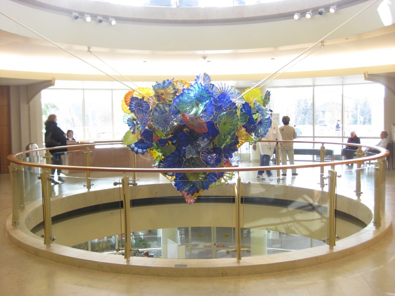
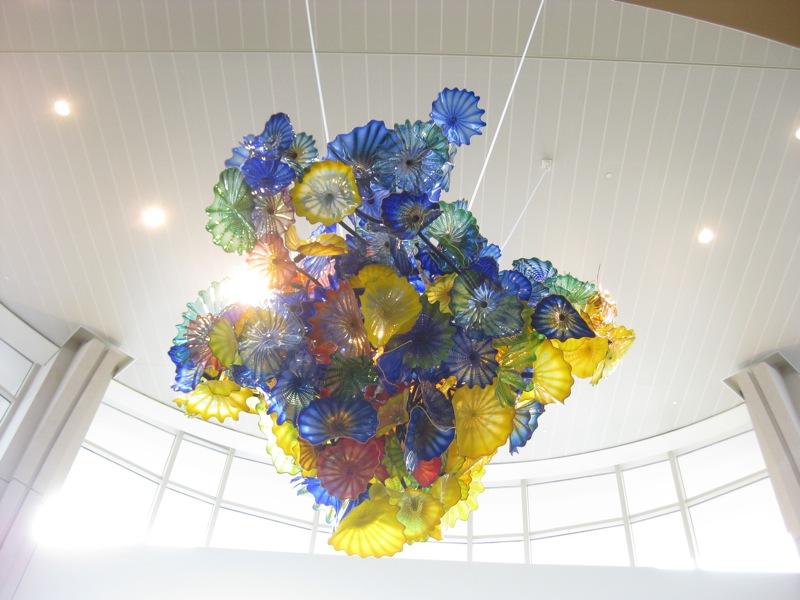
I'm not going to turn this into a Python tutorial, so, briefly, all this does is check to make sure I specify a filename and some alt text, stuffs it into a template, and prints it out so I can cut and paste. Here's an example of that in operation, turning chihuly.jpg and "chihuly art at palo alto medical foundation" into a stanza of HTML (spaces added for readability):
centaur@Deliverance (Wed Jan 13, 22:48:25) [520] ~/Development/Workspace/Webworks:
$ ./imagelink.py chihuly.jpg chihuly art at palo alto medical foundation

<a href="http://www.dresan.com/images/chihuly.jpg">
  <img border="0" width="600"
  alt="chihuly art at palo alto medical foundation"
  src="http://www.dresan.com/images/chihuly.jpg" /></a>
That saves me several minutes of typing each time. This is one of the great Programmer's Virtues: laziness - making the computer do something you don't want to do for yourself. The maybe thirty minutes I've spent tweaking that little script have paid off not just in the time that I saved typing, but in the extra blog posts that I've done because they were easier to do.
In the next installment (or two, depending), I'll write a tool to shrink the images to size with ImageMagick and upload them automatically with UNIX tools, and discuss some of the other tools and organization schemes I use which make it easier for me to collect the images and keep them organized - schemes that work even if you switch between operating systems.
-the Centaur
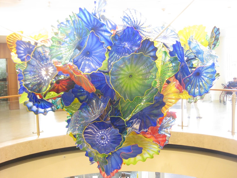
The images are Chihuly glass sculptures hanging in the Mountain View campus of the Palo Alto Medical Foundation.
Labels: Webworks
Comments:
I am also concerned with copyright issues.
My solution to the problem is to use wikimedia commons, which has a huge DB of images you can use. So if I'm typing about monks, I just type "monk" into the commons search engine, and select a picture. I then use the blogger interface to get it up there.
If I'm writing about something unimageable, I look at their featured pictures. An irrelevant picture is better than an irrelevant one. Post a Comment
AndroBlog FAIL
Labels: Webworks
Comments:
Wednesday, January 13, 2010
Testing AndroBlogger
Labels: Webworks
Comments:
Testing AndroBlogger
Labels: Webworks
Comments:
Tuesday, January 05, 2010
The Year of Blogging Dangerously
So, here's a simpler set of New Year's resolutions, goals, what have you:
- Establish a weekly pattern of exercise, including some karate
- Set aside some time each month to do art in addition to writing
- Post to this blog on the average once a day, measured each week
In other news, Warren Ellis has already blogged 365 times since January 1st. Damn him.
-the Centaur
Labels: We Call It Living, Webworks
Comments:
Friday, November 20, 2009
Shameless Filler
Labels: We Call It Living, Webworks
Comments:
Saturday, November 07, 2009
Latest Spam WTF
Anonymous has left a new comment on your post "Why I Write":
I can not participate now in discussion - it is very occupied. I will be released - I will necessarily express the opinion. [url=DELETED]acheter levitra[/url] This rather good idea is necessary just by the way
Publish this comment.
Reject this comment.
Moderate comments for this blog.
The deleted URL is to a French eBay site, "acheter levitra" is French for "buy Levitra," which is a brand name of Vardenafil, which is, of course, a Viagra clone. So this is essentially random pseudo-English text with a "buy Viagra" link, depending on the 1% of people who click on such links and the 1% of people who buy to pay for the cost of putting this spam on my blog. Charming.
Comment reeejected.
-the Centaur
UPDATE: I got a similar post of with a less obvious spam form, targeting one of the more popular pages on my blog (can you say pooound cake?):
"I found this site using [url=http://google.com]google.com[/url] And i want to thank you for your work. You have done really very good site. Great work, great site! Thank you! Sorry for offtopic"
But the [url=XXX]TEXT[/url] pattern was a dead giveaway. A search on Google for ["[url=http://google.com]google.com[/url]"] - note that's the '[url.../url]' thing in double quotes; the outermost brackets are the syntax you use to indicate a chunk of text is a query, like [centaur] - SO anyway, a search on Google for that nonsense revealed that the exact text of that comment has appeared elsewhere. So this is just more comment spam, trying to see if comments are unmoderated here.
Comment flattering! But reeejected.
Labels: Development, Webworks
Comments:
Tuesday, November 03, 2009
Let's Give This Thing a Shot
So, for the month of November, when I'm supposed to be writing 50,000 words of Liquid Fire ... I will blog once a day. So far, so good ... 3 days, 3 posts. Here's to committment - meh.
-the Centaur
Labels: Webworks
Comments:
Wednesday, October 14, 2009
Fast Push That Emergency Fix
The problem, for those of you who browse the site in standards-compliant browsers, was that the last column of the Library's three-column layout was not showing up in Internet Explorer - and only Internet Exporer, one of the world's most popular and, unfortunately, least standards compliant browsers.
The solution: make the layout wider, so the max image width used in the blog does not cause the first column to widen.
In the top half of the picture, you see Firefox 3.0.14 on the Macintosh running the (corrected) version of the Library of Dresan home page. In the bottom half, you see Internet Explorer 7 on Windows Vista, running in a VMWare partition on my Mac, from approximately the same position on the same page. From a graphical and typographical perspective they're both doing a fairly creditable job of rendering the layout. Everything looks roughly OK.
However, they're not doing the same job interpreting the width of the layout. I haven't debugged the precise problem in detail - this is a voodoo quick fix - but essentially Internet Explorer interprets the widths of the columns and their spacing and padding different than Firefox. The result: images, which on Library of Dresan blogposts are always a maximum of 600 pixels wide, roll over the end of the column, also 600 pixels wide, making it jog out. You can see that in the stairstep on the second half of the image.
Part of this is my error; prior to my quick fix all browsers were showing at least slight stairstepping. But all browsers I tried - Firefox on the Mac, on Windows, and on Linux; Chrome on the Mac, on Windows, and on Linux; and even Safari on Mac and Windows - handled this correctly except IE, which widened the whole column. This made the three columns wider than the whole width of the container, and the third column had to jog halfway down the page so that it could fit, effectively becoming invisible to people just entering the site, unless they were willing to scroll a lot in the hope hidden features would leap up at them.
Now, I could have dug into CSS manuals and tried to fix this the "right" way, and indeed I plan to. However, there was a quicker, better, way: experimentation. Before I even knew for sure what was the problem I browsed to the front page of the Library on a Windows machine, downloaded the page to a local HTML file, and started hacking out parts of the file until something changed. I was very quickly able to show that there was nothing wrong with the right column itself; even reduced to a few lines and an image it wasn't showing up.
So I then went to my test file, research, which I had gotten to work in IE before I launched the style change to the whole library. One difference between that page and the broken page I immediately noted was the fact that the images were smaller; then I started to suspect the stairstepping phenomenon. That needed a fix on all browsers, so I simply made the content column slightly wider - from 600 to 610 pixels, fixing a gaffe I shouldn't have made in the first place - and widened the overall page from 1000 to 1024 pixels.
The result: it worked, in all browsers I have available to me right now. And, because my buddy Nathan had impressed upon me the importance of using CSS stylesheets, I was able to push the fix by simply uploading the revised stylesheet to the Library and reloading the page.
Shouldn't have happened - I shouldn't have made the column too narrow, Internet Explorer shouldn't be misinterpreting the white space, I shouldn't have pushed the template without testing it on Internet Explorer, and Blogger should have a better preview function so I could have tested it successfully offline without pushing it to the entire blog. But a quick fix was possible, because I used reasonably good site design practices, the scientific method, and a healthy supply of beans and vinegar.
-the Centaur
Labels: Development, Webworks
Comments:
Curse you, Internet Explorer...
Grrr...
UPDATE: The template looks as intended in Firefox AND Chrome for Mac AND for Windows AND for Linux, and for Safari for Windows and Mac as well. Grrr...
Labels: Development, Webworks
Comments:
Launch early, launch often
I realized that I was waiting until the overhaul was "perfect" and that was putting the overhaul on hold. I've read too many things recently - about the telegraph, the transcontinental railroad, even about creation of Google - in which immense success came from plucky people who didn't wait until things were perfect, or even necessarily known to be possible, before they threw their ideas up on the wall to see if they stuck.
So, I know my new template is not done, but it looks better than what I had before, and more importantly is more navigable. More work to do ... but for now, complain, and I'll fix it.
-the Centaur
Labels: Development, Webworks
Comments:
Thursday, September 24, 2009
Answer: Edit Your Subject, or Be Sad
P.S. In reference to this post and this post.
Labels: Webworks
Comments:
Re: [The Library of Dresan] I forget you can post directly from email...
Comments:
I forget you can post directly from email...
Comments:
Saturday, September 05, 2009
Test Post
Labels: Webworks
Comments:
Sunday, August 02, 2009
Amazon has a Garage
A few quick searches on Google seemed to indicate the answer was yes, but I didn't get a definitive answer until I got to Amazon and searched for the part number.
Amazon, surprisingly enough, had a form where you could indicate the year, make and model of your vehicle, against which it would check the part in question. But then it said something more: it said, "sign in to check this part against vehicles in your garage."
HFS.
I signed in, and frankly it was a bit of a bear to navigate to a point where I found "my garage". Essentially, I had to start looking for parts again, enter a vehicle, and then I found it automatically saved that information to "my garage".
This is definitely a "hidden feature": Amazon could make that more discoverable, and I haven't yet found any information on this feature online or on their site or on its help features. This may be an oversight, or the feature could be in development.
Once a vehicle was entered, though, it was relatively easy to add more information about the trim and features of my car, and Amazon then gave me a complete list of the parts they sold for my car - all 2,156 of them, at last count.
I've said it before, and I'll say it again: I'm glad I own Amazon stock. I bought it *after* the Internet crash convinced that ten years from now they'd still be going places, and they haven't proved me wrong yet.
Keep up the good work, Jeff.
-the Centaur
Labels: Webworks
Comments:
Sunday, July 26, 2009
I can be an idiot sometimes

I can be such an idiot sometimes ... or, put in other words, the right way to solve a problem is often much, much easier than the wrong way.
For example, if you're doing woodworking, you may use a modern steel clamp to hold a part tight to work on it. That sounds good and does the job. Of course, when you need to change the position of the part you must unscrew it, reposition the part and rescrew the clamp.
So far, so good ... but, according to David Petersen, the author of Mouse Guard, there is a better way. Petersen researched medieval woodworking equipment for his Eisner-award winning comic and found there was a simpler scheme involving a foot pedal and a lever, which had equal gripping power but could release and reapply pressure in seconds just by lifting your foot.
Moral: newer and more complex is not always better.
Fast forward eight hundred and fifty years. Robert Kroese, a colleague at the Search Engine That Starts With A G, has his own book that he's working on, and an associated web site Mercury Falls. On that site he has a form to enter an email list, and I thought, what a great idea! I should have a form where someone can send me an email list on the Dakota Frost site.
So I started looking into it. To make the form work, you need not only a web form, which is easy to set up, but also some kind of server program on the back end which can accept the results of the form and a database to store it.
Historically, I've had bad luck with scripts and databases on my web sites: Earthlink / Mindspring basically welched on the scripting features of their web hosting that I was paying for, and my next provider, Tophosting, screwed up one of my databases.
So I was hesitant, and I started thinking. Then it hit me...

... there was a simpler way.
Instead of creating a form and the backend plumbing that goes with it, I should use the existing plumbing I had to achieve the same effect. What plumbing was already in place? A web site, a hosting provider, an ability to forward emails to a given address ... and a mail client with filters.

To make this work, I went to the GoDaddy control panel for Dakota Frost and set up a forwarding email: contact at dakota frost dot com. I had that sent to one of my catchall email accounts, and in Gmail I then set up a filter which collected all those email addresses into a single folder. Bam: problem solved.
Even if I want to do something more complex, this solution still works, as long as I keep looking at simple tools that are already available. For example, if I want an official email address list as a separate file, I could always download those email messages to the mail client of my choice, filter the messages to a folder, and grep over the email addresses in the file. For the scale at which I need to do it right now, the problem is still solved.
Moral of the story: the more you overthink the plumbing, the easier it is to stop up the drain. Keep it simple, and things should just keep flowing without effort.
Or, to translate this back into development speak: there are two kinds of solutions: solutions which are easy to think up, but take a lot of coding effort to make work, and solutions which require thought, but which can be implemented in staggeringly small amounts of code.
In this one, we have an extreme example: to make this problem work the "no thinking way" would require an HTML form, a CGI script, a database, and considerable configuration on the server side of my hosting provider. To make this problem work the "no effort way" required some thought, but in the end less configuration of my hosting provider and a few minutes setting up some email filters.
You see the same thing in software libraries: really good libraries don't take a lot of code, but that doesn't mean that they didn't take a lot of work. What happened behind the scenes was a lot of thought, wherein the library author searched the space of possible designs until he found a great one before ever publishing the library. You as the consumer don't see that effort, no matter how short or long it took: you only see the pure, parsimonious, elegant efficient piece of code that remains.
If you don't put thought into what you're doing, you might try it sometime. You'd be surprised how little thought can get you substantially improved results.
-the Centaur
Labels: Dakota Frost, Development, Webworks
Comments:
Sunday, May 31, 2009
The Singularity is Now
Comments:
Friday, May 29, 2009
UPDATE: But if you mistype something in your smartphone, Blogger does something weird with it ... I accidentally typed an upside down exclamation point after the "HFS" above (not sure why) and it translated that to "HFS?", which should have been "HFS!". Probably this is a language encoding issue or something similar.
Labels: Webworks
Comments:
Wednesday, May 06, 2009
Recreating Artistic Accidents

The Library of Dresan logo is an example of this: as I recall, I played around with larger logos in varying degrees of transparency and shading but didn't like them. I then made a smaller, shrunken copy of the logo, intending to delete the original once I had the little one positioned. However, I found I liked the small logo superimposed on the larger one so much it became the basis of the logo design you see above. The left-to-right fade is another happy accident I capitalized on - I was trying for a flat fade and hit the wrong setting.
When I was satisfied with this logo and look I then made specialized logos for various areas of the site - most of which you never see because they're off in obscure corners like Research. To make the name of each area stand out, I swapped my name onto the top and the area description to the bottom, requiring the change in the font size you see below in the Research logo. In some respects I liked this logo even better than the original Library logo, but didn't use it on my main site because I thought it made my name too prominent.

But recently as I was redesigning the site I was playing around with a prototype that was in the Research space, and looking at the logo I decided to take the recommendations of all those people who have suggested putting your name prominently on your own site (I know, duh, I shouldn't have needed Jacob Nielsen and Ayn Rand to tell me that, but at least now I've come around). But I had a problem: I no longer had the original source file from which I generated these logos.
Actually, that's not quite true. At first all I thought I had were the finished image files, which had glows which made them hard to edit in Painter or Photoshop. But eventually I dug around and found the original Xara files. But that was a problem: Xara doesn't work on the Mac, unless you're willing to compile it yourself.
So I tried Xara on my Windows Vista partition, and then found I didn't have the fonts I needed - in particular, Caeldera and Papyrus. Oddly, these fonts which I use so much were not embedded in my huge font library I've built up over the years - apparently they were put on some earlier system as part of a program which I didn't install on my Boot Camp Vista partition.
I struggled with the Xara files on Windows Vista for a while, then eventually decided to recreate the logo on the Mac in Corel Painter XI, a program I love but which is no more a vector graphics program than Xara is a natural media program. My results were mixed, as you can see below:

The Mac version of Papyrus had different sized capital letters, making the logo come out the wrong size. Worse, Painter had fewer options for playing with transparencies and glows, making it harder to experiment with the glow around the letters to get it right - causing the background to be too saturated and the black text to come out too blocky. Even worse still, I did this logo on my laptop, only to find out later its color balance was off.
But at home, my wife's computer has Windows Vista with the right version of Papyrus, and I was able to find a free version of Caeldera to fill in for the one in the huge font library I've built up on my primary laptop. Corel Painter is wonderful, I love Photoshop, and Adobe Illustrator is great, but for speed there's nothing like Xara. In less than thirty minutes I had essentially recreated the Research logo and saved it in a happy vector form that I can easily modify in the future. It isn't perfectly what I want, but it is easily modifiable; and so in mere minutes I modified it to serve as a new logo for the site, which you can see below:

The moral of the story? Taking advantage of happy accidents is great ... but make sure you write down the steps that got you there and capture all your dependencies, or recreating your accident later may make you rather sad.
-the Centaur
Comments:
Saturday, April 25, 2009
Internet Meme: Create your Google Profile NOW
Go to Google right now and type "me" into the search box. You'll be given a chance to secure your name as Google knows it, and create a profile, a starting point, which you can "encourage" Google to give to people rather than allowing them to hunt around randomly.You can follow this handy link to this feature.
I hereby declare this an internet meme: forward this to your friends, and post a link to your profile on your blog. My profile can be found here.
-the Centaur
Labels: Webworks
Comments:
Not enough hours in the day, redux...
Recently I started work on redesigning the templates for the Library, and in my giant Mongo death Todo list I have an entry "blog updates to library". But I never got around to writing the article, because I kept on getting confused about what to write first.
Then I realized that's part of my problem. The point of blogging the redesign of the Library was to expose the thought process that normally goes into the redesign of any web site, rather than hiding all of the hard work behind the covers, springing it fully formed onto the world, and proclaiming: "See! Doesn't it smell better?"
So here's the thought process that was blocking me from writing articles on the Library:
- Anthony looks at Todo list, sees entry "Blog Update" and tries to figure out what to do with this horribly underspecified action item with no clear next action. Somewhere out in cyberspace, David Allen kills himself, then spins in his grave.
- Anthony decides "I've got a prototype for the new design of Library now! I just need to post the darn thing and get on with it!"
- Anthony starts work on cleaning up his Blogger template. During this process he finds he needs to figure out precisely what his Blogger template is doing, as he no longer remembers and the code is poorly documented.
- Anthony comes up with a clever way of visualizing how his Blogger template works which itself is probably worth blogging about.
- Then Anthony realizes that he doesn't know whether the design works well with Internet Explorer on Windows, or Chrome, or on small screens (notwithstanding my desire to support only large screens), or on super large desktop screens with different sized fonts.
- This leads to more questions: What browsers should this work well on? How should I test this? What if there are fundamental incompatibilities between IE and Firefox?
- Well, shazbot. I decide, screw it, let's just fix a small page somewhere and update that. So I update the Research page, which already needed an overhaul of its research statement.
- Anthony finds a system to help him test and prototype his content which is worthy of blogging about in its own right.
- The textual update goes swimmingly, but updating the CSS and HTML proves more of a bear, especially comparing Internet Explorer and Firefox.
- Anthony's system for updating the content starts to show failures which are worthy of blogging about in their own right.
- Well, shoot, now what do I do?
But the point of this blogging exercise is NOT to go off and hide and try to figure these things out, then come back smiling with a solution. Instead, when I get stumped, that is a serious decision point in the development process and I'm SUPPOSED to write an article which says, here's what's on my plate, and boy did I get stumped.
So this is that article. And just articulating the things going through my mind gave me a sequence of things to do: now I can blog each of the elements on that list and show how I encountered the problem, how I tackled it, and how I got to a solution.
-Anthony
Labels: Development, We Call It Living, Webworks
Comments:
Monday, April 20, 2009
Podmena Traffica Test?
Finally I decided to track it down, and while I don't know for sure I've now heard a good hypothesis:
There seem to be some strange spam emails doing the rounds, with a body text of "podmena traffica test".. what gives? It makes a bit more sense if you transliterate it into Cyrillic, which leaves you with a Russlish phrase "подмена трафика тест" and that simply translates as "spoofing traffic test".
Trying to verify his logic: Romanizing "podmena traffica test" gets me "подмена траффица тест", as predicted, and translating that back to English gets "substitution traffitsa test" which is close enough.
The specifics of the message I'm seeing don't match the description in that blog post, but it's enough to make me think that the author has nailed it: it's a Russian spammer testing out addresses and more importantly web servers.
Mystery solved! Now quit it, spammer guys.
-the Centaur
Update: I keep getting this spam. I have now received this spam almost 60 times in the last month, according to Gmail.
Labels: Development, Webworks
Comments:
Sunday, April 19, 2009
Twitter? What's that?
I use Google Reader to follow a variety of blogs, including Lifehacker, so I knew that there was a Twitter Gadget for Gmail Labs's Gadget feature (specifically the Add Gadget by Url feature). If you haven't used Gmail Labs or the Gadget feature, don't worry; the Twitter Gadget site has detailed installation instructions.
Once I close the Twitter window, I don't open it again for weeks or months. I'd hoped that widget would help me twitter more, but, alas, the real important and functional features of Gmail - labels, chat, etc - push the Twitter client way, way down to the bottom of the page, so I rarely see it. TwitterGadget also has an iGoogle widget, but I rarely use iGoogle. So I'm still not plugged in to this thing in any meaningful sense.
But, well, occasionally I do twitter, but how can I surface this information to the rest of you who don't twitter? The Library of Dresan is supposed to be the primary repository of all my information - you shouldn't have to go to twitter.com to find out what I'm up to. Fortunately, Twitter has a variety of widgets, including one for Blogger. I've experimentally added this to my blog - making the need for a redesign even more pressing.
But, for now, I'm ready to, uh, tweet.
-the Centaur
Labels: Webworks
Comments:
Why I Use Transparent Terminal Windows
Combined with the microscopic fonts I like, this makes my screen hard to read for others; one of my collaborators used to insist I make the windows opaque and increase the font size so he could see them. So why do I do this? Even the Mac OS X tips page that tells you how says it "has no serious purpose" except to make your windows look pretty.
Well, I beg to differ. This screenshot shows why:
Here, I'm working on some Python code to automatically generate a list of labels for my web site. I've never used the Python ftp library before ... so I just Google'd the Python ftp protocol, found the Python doc page, and began prototyping my code straight at the Python prompt, looking through the terminal window to see the sample code beneath it.
Mmmm. Composity goodness, captured via Mac's Command-Shift-3 screenshot keystroke and edited with Preview. If you program at the command line you should try it - your eyes train up pretty quickly to ignore whatever's behind the terminal unless you need it.
-the Centaur
Labels: Development, Webworks
Comments:
Friday, April 17, 2009
Blog Labels at the Library: The Not-So-Dewey Decimal System
Blogger lets you categorize your blog entries with tags - like Development, Pound Cake or what have you. However, they don't provide an easy way to put these labels into your web page if your site is not hosted on a Blogger server, which the Library of Dresan is not. I've played around with this a bit, but have not yet figured out how to do it.
But the directory structure of the labeled blogs is simple - just the subdirectory "labels" and a bunch of eponymous files like "Mission to Mars.html" or "Sith Park.html". So I'm going to put these labels up myself right now, and write a 10-line or so Python program that will do it for me later.
To make things easy, I've added an index.html to the labels directory, so you can just navigate to it to see the current list of labels. For historical interest, here's what I've got right now:
- Artworks: Essays or announcements about my and my wife's art.
- Book Review: Um, what it says.
- Dakota Frost: Essays about the Dakota Frost series.
- Development: Software development.
- Dragon Writers: Creative writing and my friends in the writing life.
- Edgeworks: My circle of friends, the Edge.
- Hard Science: Essays on science.
- Hard Science: Essays on general science, usually physics.
- Intelligence: Essays on cognitive science and artificial intelligence.
- Mission to Mars: The Mars Desert Research Station.
- Philosophy: Essays about my personal philosophy.
- Politics: Commentary on politics.
- Pound Cake: My efforts to create a good homemade version of my fourth-most-favorite
food. - Restaurant Reviews: If all the tags were named like this then I wouldn't need to write
clever descriptions, now would I? - Sith Park: Science fiction fandom
- Taidoka: Studies of Taido, my favorite martial art.
- The Break: When I broke my arm.
- The Cats: Small, and covered in fur.
- This Guy Called Jesus: On Christianity.
- We Call It Living: My life.
- Webworks: Announcements about this family of websites, like this post.
-the Centaur
Update: removed the image for this post after investigating the license and finding it was a GNU-style "poison" license that required GNUification of the entire post. Sorry, Richard, I appreciate your efforts to make things available to the world but you don't get my blog entries in exchange. I can take my own dang photos.
Labels: Webworks
Comments:
Sunday, April 12, 2009
How Wide Should Your Website Be?
I remember reading an article (I don't remember where) that pointed out with browser sidebars and chrome, the width of the page could be far less than monitor width. I measured it on my circa-2000 screen and I found that I had about 800 pixels of width for the web page. So that led to the design of the Library: 800 pixels of width, 600 for the main content and 200 for the sidebar. The banner itself was a little over 1000 pixels so that it didn't end abruptly if the user made their screen wider.
But that was almost ten years ago. Does that logic still hold?
Many people view the web on laptops and phones. Dealing with phone resolution will require more than just dealing with screen widths, so I'll return to it in a later article when I tackle the CSSification of the Library. But a quick search suggests that typical laptop screen widths range from the 1024x768 XGA standard to the 1440x900 WXGA+ widescreen standard. There are some people who have smaller laptop screens, of course, but they are in the minority. Conversely, screens do get larger: for example, for many years I owned a glorious Toshiba Satellite laptop with a 1600x1200 screen. But on those larger screens users often use smaller windows for their browsers: for example, on this MacBook Pro, with a 1440x900 screen, I'm only using a little more than 1200 pixels for the browser window - and typically I use narrower windows.
So something more than 800 and less than 1400 appears to be a good guess. Discussion on the web seems to indicate people are starting to give up on the 800 width and moving to 900 or more, but rarely more than 1024.
Digging around, I found more articles with the same idea - Mario Sanchez argues the goal of web site width is to avoid horizontal scrolling, and recommends you design your web site for 800 pixels, with a layout that works well at 1024. Jacob Nielsen recommends straight out to optimize your site for 1024, but not to design for a specific size and let your layout be "liquid", changing width for your users's monitor sizes. Personally I think this breaks down if you have images to display, though I reserve the right to be convinced otherwise by CSS wizardry at a later time.
All of the above are opinions, of course; what about the evidence that they're based on? The Steam Hardware Survey put out by Valve Corporation suggests that 95% of users use screens of 1024 pixels or wider, with fully 50% at 1024x768, 1280x1024, or 1440x1900. Similarly, the Browser Display Statistics analysis by W3 Schools indicate 36% of users have a display resolution of 1024x768 ... and 57% have higher. Update: I checked the Library's own stats, and found that Google Analytics does indeed track screen resolutions. Less than 5% of all users had a resolution less than 1024x768, and only 1.5% had a resolution less than 800x600. Of that, 0.5% were listed as no resolution, leaving 1% at 640x480. Those numbers will come back later...
Take all that with a grain of salt given that some significant percentage use browser screens larger than their monitor resolution - Nielsen points out in the same article I mentioned above that as resolutions get staggeringly large (he predicts 5000x3000 in the future) users begin to display multiple side by side windows. True enough, at the Search Engine That Starts With a G, all of my officemates have dual monitors with aggregate resolution of 2400x1920, but none of us typically displays a browser window larger than half the screen - 1200 pixels, minus chrome or subtracted width to see other windows underneath.
So that leaves me with the feeling that Nielsen and Sanchez are essentially right. My personal take on it for the Library is:
- Your website should display well in no more than 1024 pixels of width. You may use a "liquid" layout that can expand to use more space, but it should not require more than 1024 pixels to display.
- The essential content of your web site should fit into the leftmost 800 pixels of width. If you are displaying graphics or images or have a lot of site widgets, some of these features may scroll off to the right on an 800x600 screen. Don't put anything essential on the right. Your mileage may vary if you are creating a web site for right-to-left languages, of course.
- Make sure your "liquid" layouts don't break down on very wide or narrow screens. A user who displays a very wide window on a 2400 pixel wide screen should not see all your paragraphs turn into long marching lines of text - these can become hard to read. Similar problems can happen when a screen is squeezed very small - for example, Wikipedia used to display terribly on certain mobile phones, creating vast blank spaces for the user to navigate through.
The new design for the Library uses around 1000 pixels, with the leftmost 600 for text (to satisfy the 1% of people who are still stuck at 640x480), the next 200 for site navigation (for the less than 5% stuck at 800x600), and the remaining 200 for everything (and everyone) else: search boxes, author pictures, and Flickr badges; in short, anything less important than the articles and navigation features. Technically this is not a "liquid" layout, but hopefully this will be something the vast number of users can enjoy with little scrolling, and something that other users can appreciate without feeling left out.
-the Centaur
Labels: Development, Webworks
Comments:
Sunday, March 29, 2009
Renewing the Library
Recently I started to notice that the design of the Library is getting long in the tooth. One friend who was a web designer commented that it looked very "old Internet". I've watched another friend innovate on his blog design while mine was staying still. Work on my wife's web site made me revisit some of my choices, adding a description and picture but making few other changes. I know the site needs a redesign because I have a lot more material coming out soon, but the final trigger was when I couldn't attend a talk and looked up one of the authors to learn more about their work - I think it was Oren Etzioni - and I was struck by his straightforward site design which enabled me to quickly find out what he was working on.
SO, I'm redesigning the Library.
I'm an artist in addition to an author and researcher, so simply gutting the site and making it simpler wasn't my goal: I have specific ideas about what I want the site to look like, and I started designing a new one. Partway through that redesign, I noticed that I was doing a fair amount of research work - examining other blogs that I admired, investigating blog widgets, investigating CSS and HTML advances, researching color theory and design principles - but not blogging any of it. In fact, come to think of it, typically when people redesign their sites they put all their work under a bushel, trying to hide their planned change until the last possible moment, possibly exposing it to a few trusted users in beta or with an alternate link prior to springing it on the world as if freshly formed and fully new.
Well, phooey on that. The thought process that a web designer goes through producing a web site is interesting (well, to other web site designers, anyway) and provides a valuable resource to other designers doing their work. I wished that other people had blogged the process that they went through and the alternatives they explored, as it would help me make my own choices - but you know what? I don't control other people. I only control me. And if someone else hasn't filled the gap, then it's my own responsibility to come up with something to meet my needs.
SO, I'm going to blog the redesign of my blog. How "meta".
There's far too much to put into a single blog entry, so I'll start off going over the thought process that led to the design in more detail, then explain my strategy. The first thing that I did was look at other web sites that I admire. Earlier when working on my wife's web site I found a number of beautiful looking blogs, but when I started the redesign, I started my search over, focusing on sites of artificial intelligence researchers, bloggers, writers, and artists, trying to find ones I instinctively admired with interesting ideas, features or appearances that I could steal. Some of these included:
- Oren Etzioni's Home Page: Quickly Present What You Are Doing
An "old school" (not that there's anything wrong with that) web site from an academic researcher, it has an "old style nav bar" up top that quickly tells you how to find his publications. Below that is text which points you to his research projects and most cited publications. From this I gleaned:- Organize your work into logical areas
- Make navigation between areas easy
- Put things people want up up front
- Rough Type by Nicholas Carr: Put Your Content Front and Center
Featuring a straightforward design that gets you straight to his content, Rough Type also has an author blurb and a pointer to his most famous article, "Is Google Making Us Stupid?" and his book "The Big Switch" The key points I gleaned from the site:- Get your content out front and center
- Tell people who you are
- Point them to your best work
- Vast and Infinite by Gordon Shippey: Show the Author, Try Fun Features
Written by an old buddy from Georgia Tech, Vast and Infinite isn't that different from Rough Type. However, he's constantly innovating, adding a site bio and author picture, tweaking his banner, adding shared items and flickr gadgets and more, whereas my blog tends to stand still. The lessons from this:- Show people your picture
- Keep your content front and center (sound familiar?)
- Trying out new technologies generates interest in the site
- Home Page of Jim Davies: Show the Author, Organize Your Site Logically
Jim Davies is another academic researcher, with a much more modern site. Like Oren Etzioni, he has a navbar, but also a large picture, a more detailed description, and links to his art, store and blog. Unlike Oren, each area of the site seems a little more organized, without the duplicated links to publications and the odd inclusion of news articles in his personal page. Jim takes this further by having extra blogs just for rants and links. My takehomes were:- An academic site can have a modern design
- Showing people your picture creates interest
- Don't be afraid to segregate content into areas
- Marvin Minsky and John McCarthy: Tell People About Your Work, and Share It
Two of the greats in artificial intelligence have interesting sites filled with lots of content. Both start with a description of them and their work and then continue with many, many links to their most prominent work. Minsky puts up chapters of his most recent book; McCarthy includes a lot of narrative that gives context. What I like:- Tell people what your site is about using narrative
- Put work you are interested in front and center
- Fill your site with lots of content
- Greg Egan's Home Page: Fill Your Site With Lots of Content, and Share Your Research
Greg Egan is an author I admire primarily for his novel Permutation City and his short story Dark Integers, though I have more of his books in the queue. His site's layout is a little harder to read than some of the others, but it is filled with pointers to all of his work, to the research that he did to create the work, and applets and essays related to his work. The takehome from this firehose is:- Fill your site with lots of content
- Share the research you did on how you produced your work
- Don't be afraid to promote your work by showing it to people
There was one more site that kicked this all off, which I will hold in my pocket for a minute while I talk about opinions.
Unlike Jacob Nielsen, I don't have research backing up these conclusions: they're really just guesses about what makes these site work, or, worse, just my opinions about what it is that that I like about these sites. What's dangerous about opinions is that recent scientific work seems to indicate that they're often post-hoc explanations of our instinctive reactions, and they're often wrong. So, to combat this tendency, I looked at other resources that specialize in information about good design of web sites to try to get information about what I "should" do. I don't pretend I've absorbed all the information in these sites, but am simply including them to show you the kinds of things that I looked at:
- Jacob Nielsen's UseIt.com: Make your site fast, simple and standards based
Jacob Nielsen's site on web site usability is so simple it hurts my eyes. I don't like to actually look at it, but I do like the ideas. He's got a breakdown of recent news on the right and fixed web site content on the left; the idea of the breakdown is good but seems opposed to my goal to work with Western left-to-right reading. Jacob points out that he uses no graphics because he's not a graphic designer, and that's fair; but since his site is unpleasant for me to read I only loosely follow his recommendations. But one cool thing about his site: if I resize the browser his content stays divided more or less the way he's put it because the structure is so simple and well designed. - But What Are Standards? W3C and Webmonkey
The W3C is the official source of standards for the web like HTML and CSS, but I've always found their standards hard to read (and I've read many, many of them over the years). The new site redesign they're testing seems to make it easier to navigate to find things like the CSS Standard, but it is still hard to read and lacking the practical, let's get started advice that I want. Back in the early days of the web, I used Webmonkey as a source of good tutorials, but the site seems crufty and broken - trying to narrow in on the CSS tutorials got me nothing. I have a number of offline books, however, and am a whiz at reverse-engineering web pages, so when I get to the CSS articles I will detail what I learn and what sources I use. - CSS in Practice: FaceFirst.us and CSS Zen Garden
I know the designer of FaceFirst.us, a social networking site, and in exchange for me beta testing his site he turned around and gave me a tutorial on how he uses CSS in his process to ease his site design. In short, like Nielsen, he recommends separating the "bones" of the site from the content using CSS id's and classes. One example he showed me was the CSS Zen Garden, which has fixed content that is modified radically just by stylesheets. - But What Did Your Thesis Advisors Do? Ashwin Ram and Janet Kolodner
I also dug into what Ashwin Ram, my thesis advisor, and Janet Kolodner, a member of my thesis committee and my original advisor, did with their web pages. Both Ashwin and Janet have profile pages back at the College of Computing, but they also have richer pages elsewhere with more detailed content. I have no intention of slavishly copying what my thesis advisors are doing, but as far as the research part of my web is concerned they're similar people solving similar problems whose solutions are worth looking at and adapting for my own use - why, yes, my Ph.D. was in the case-based reasoning tradition, why do you ask? On that note, it occurs to me to look at other colleagues' web sites, like Michael Cox's site.
Standards, shmandards, cool sites and web lights - all well and good. My brain exploded, however, when I saw Warren Ellis's web site (billed as a blog for mature adults, so it's occasionally NSFW - be warned). In my mind, Warren's site had a number of great features:
- Show the Author's Name:
The author's name is hugely printed across the top - so you immediately know who this is, as opposed to say my dumb blog where my name is printed in 2 point type. And Warren's domain name is also his own name plus dot com, so that he can actually show his name and site name in the same logo. - Keep the Text to the Left:
The text of all the articles is corraled to the left margin so they can be PRINTED, aligned to the top of the page so it dives into the header and is immediately visible. Almost as if Warren's site was designed knowing that the majority of the people who read the English language read it from left to right, therefore the text should appear where their eyes go. This pattern, plus the pattern of the rest of his design, is consistent with putting the good stuff in the F-shaped heat map that typical users eyes take when scanning your page. - Use the Middle of the Page:
There is a bar of links in the MIDDLE of his page, immediately to the right of the articles, which puts it close to the golden ratio of the horizontal space of his site design (as viewed on my monitor). This "linkbar", held in place by CSS wizardry and a black magic compact with the Old Ones, contains permanent site features that most need to be linked - message board, mailing list, comics, his novel, his agents, and his bio inline. Think of it as sexier version of Jacob Nielsen's "Permanent Content" box. - Put Sparkly Things to the Far Right:
Beyond the linkbar are all the cool fun site features like a search bar, podcasts, images and other nonsense, which are fun to look at but less important. On my site, some of these are on the right, or even at the very bottom of the page; on other people's sites they appear on the left, distracting Western readers from the article and possibly shoving the right ends of the articles over the printable width of the page. Ellis' contract with Cthulhu and the hellish powers of the W3C enable him to safely corral these fun elements to the right where they belong.
The linkbar was the most mindblowing thing. It eats into the banner. It's readily visible. It leaves the text on the left, but it's close enough to be visible on most monitors. The whole site is 997 pixels wide, so it will fit on a typical 2009 web screen, but if your screen is smaller, first you lose the fun sidebar, then the important linkbar, and only then do you lose the text. Even better, since the linkbar CSSes its way into the banner, the size of the site is controlled by the header image so it won't get wider. So your Nielsen-style variable content is always visible on the left, and your important fixed content is always on the right, and God willing it will never get hosed by someone resizing their window. Once I saw that, I decided I'd done enough work researching, and it was time to start redesigning.
SO my first step is to unashamedly steal Warren Ellis's linkbar.
Immediately I sent out my secret agents out to download his HTML and CSS and transport it to my secret lab so I can take it apart piece by piece until it has no secrets left. Of course, some of Warren Ellis' choices won't work for me, so I will have to do a lot to adapt the ideas he and his team used in his site design. And simply imitating the form of Warren's site won't be successful, any more than just making a movie just like Star Wars called Sky Battles would be immediately successful. (Battlestar Galactica fans, take note: while I loved the show, I think it's fair to say that it took the reinvention of the show to really produce a success, which was based on making the show interesting in its own right and not copying Star Wars).
The outer form of his site is the product of his inner success - he is a popular, prolific author with a message board, mailing list and weekly online comic he uses to promote his other writing and books, which makes the prominent placement of the message board agents and books highly important in the linkbar. Starting a message board and getting an agent won't help me. I, in contrast, am a jack of all trades - developer, researcher, writer, artist - using this blog as a tool to force me to stop being a perfectionist, complete my work, and put it out in front of people. So my goal is to make sure this website displays my content, prominently surfaces the areas of interest I work in, and has a few flashy features to attract attention to individual items of more permanent interest.
In upcoming articles I will detail my original constraints for the blog version of Library of Dresan and why those constraints failed as the site evolved over time, my goals for the new site design, what I think I understand about how wide to make your web pages and where to put your content (and where I got those crazy ideas) my move to the use of CSS and my attempts to make the site work well on screen, on printers and phones, my attempts to better exploit Blogger, Flickr and other web gadgets, and the work that I'm doing investigating color theory and generating the new art assets that will make up the site.
Hopefully you'll enjoy the process, and when it's done, that you'll enjoy the site more.
-the Centaur
Labels: Development, Webworks
Comments:
Friday, March 27, 2009
Shooting from the hip versus shooting straight
But even I have my limits. When I was reading over the article again and realized that I consistently spelled Allen Ginsberg as Alan Ginsburg, even though I copyedited it and checked it against the Wikipedia article, I found I had to go back and fix the article.
And I also fixed the "quites".
Oh well. I suppose that no matter how much you try to make yourself commit to publishing over polishing, there's some amount of polish that must be done ... sooner or later, published or not. If there are real mistakes, you gotta fix 'em.
Han still shot first, though.
-the Centaur
Labels: Dragon Writers, Webworks
Comments:
Thursday, March 26, 2009
Why I Write
I saw the best minds of my generation destroyed by
madness, starving hysterical naked,
dragging themselves through the negro streets at
dawn looking for an angry fix,
angelheaded hipsters burning for the ancient
heavenly connection to the starry dynamo in the
machinery of night,
who poverty and tatters and hollow-eyed and high
sat up smoking in the supernatural darkness of
cold-water flats floating across the tops of cities
contemplating jazz...
It goes on in this vein for a while, containing challenging material for the late 1950's which led to obscenity trials and quite a bit of controversy.
I was reminded of the poem when I went to the City Lights Bookshop recently, a liberal bookstore with its own rich history that was influential in nurturing the Beat generation of poets. Pictures of Ginsberg adorn its walls, including one in which he clutches what at the time was his only bowl.
And that started me thinking about what Ginsberg might say if we had a chance to meet and he could read some of my work. And that made me realize that I'm not trying to do what Ginsberg was trying to do at all.
Ginsberg's work was raw, powerful, lyrical. He experimented with form, filled it with deep emotion, and used it to catapult the secret frustration, struggles and shame of a repressed generation straight out into the light, exposing drinking and drugs and sexuality and homosexuality and protest and jazz to a world that wasn't quite ready to receive it for precisely the same reason that it desperately needed to hear it.
Sometimes that needs to be done, but I don't care about doing that at all.
I want my work to be honest, but I'm not interested in throwing things in people's faces to wake them up. I believe in illuminating worlds that are rarely seen, but only to create interest, not to expose secrets. I do feel deep emotion, but often drain it from my work because rage blinds me from seeing my opponent's point of view. I rarely experiment with form and often when I do, I regret it. Where Ginsberg was raw, powerful, and lyrical, I try to be smooth, balanced and direct.
But that's a post-hoc analysis, derived from what I like about Ginsberg and how it differs from what I write. It isn't the first thing that came to mind about my writing, which was: I write what I like.
I like to write stories that I like to read. I write science fiction because I enjoy hard science, space opera(*), Star Trek and Star Wars too. I write urban fantasy because I like Anita Blake and Mercy Thomson, and Interview with the Vampire and Buffy the Vampire Slayer too.
I constantly have stories running through my head, more than I could ever write down. I've written many, many short stories and novels, only a few of which have gotten published or seen the light of day, but that's slowly changing as I put more effort into publishing.
But at the end of the day that doesn't matter, because I can still read my stories. I'm not writing to make other people happy. I'm not writing to change the world. I'm writing to produce more of what I like to read.
That, and my head would explode if I stopped writing.
I hope some more of my writing will get published, that you all get to read it, and that some of you enjoy it. Until then, please enjoy this blog ... which I write for the same reason I write science fiction: I enjoy having blog posts to read and will continue to produce more of them that I like.
-the Centaur
(*) I fully understand that categorizing Larry Niven as "space opera" will be construed as a terrible insult by people who don't understand the difference between the kind of SF that he wrote and the kind Hal Clement wrote. Uncharitably, these are probably the same people who insist on the distinction between "sci fi" and "science fiction" or draw some mental distinction between "Trekkies" and "Trekkers", and they can all just go away. For everyone still reading, Larry Niven is one of my favorite authors, but if your stories include hyperdrives, you're writing space opera and not hard science fiction, even if your space opera is filled with real hard SF elements.
Labels: Dragon Writers, Webworks
Comments:
Wednesday, December 03, 2008
Fanu Fiku and Dresan.Net...
-the Centaur
Comments:
Friday, November 07, 2008
Yes I know Fanu Fiku is down...
... I'm working on it. It also affects dresan.net and all the other people I know using the same hosting provider. Stay tuned.
-the Centaur
Comments:
Friday, May 30, 2008
For the time being...
... we're going back to the setting that makes Qumana put in extra line breaks.
Because if I leave that setting on, apparently Blogger reformats all of my old articles, removing the line breaks.
Not good enough. Not good enough at all. It's easier to fix the twenty or so Qumana articles and to use shift-breaks in future to accomplish my will than reformat all 200 previous entries in my blog, so Blogger wins.
Labels: Development, Webworks
Comments:
Me too me too
So my buddy Gordon has beat me to the punch (yet again) by finding the site FaceStat, which does wisdom-of-the-crowds rating of pictures. His came out pretty good; I used one of my favorite pictures of myself, which turned out ... not so much.

Ok, so I already knew my beloved missing cat is more attractive than me. But did the crowds in their infinite wisdom have to put down "repulsive" for my level of attractiveness? Sure, maybe they're referring to the prominent surgery scar on my arm. But that doesn't explain why the crowds thought I was "definitely not to be trusted."
Stupid crowds. I didn't want your wisdom anyway.
-the Centaur
Labels: Development, Webworks
Comments:
2. On the trustworthiness issue: covering your face (even with a cat) is a grade-A sign of deception. Post a Comment
So by my math...
- Work hard to finish the articles I haven't written yet
- Write a few short lame posts to finish out the month
- Leave the month unfinished as a way of motivating me to do future blog posts
- Recognize that I have many more important things I'd rather do, like writing novels
- Bail on the goal on the grounds my wrists are hurting, which they are.
Hmm ... tempting.
-the Centaur
Labels: Webworks
Comments:
Thursday, May 29, 2008
A lot of my friends are already on Twitter...
I got my first a computer when I was ten years old (and had actually done some programming before that). When did I turn into such a Luddite?
Oh yeah, that's right ... I went to grad school. :-P
-the Centaur
Labels: Webworks
Comments:
Wednesday, May 14, 2008
the consequence...
... of making things easier on Qumana was to make things harder on Blogger. Apparently the setting I turned off on Blogger to prevent the extra carriage returns in Qumana means that Blogger posts will come out all mooshed together. Sigh.
Labels: Development, Webworks
Comments:
Sunday, May 11, 2008
The great bit bucket in the sky...
AAARGH!
These browser based apps still leave something to be desired. Anyway, it was really witty and acknowledged all of Jim's good points while carefully highlighting my areas of difference in a subtle yet engaging way. You should have been there ... *sigh*. Will rewrite it (in Qumana so I don't lose it) and will post it as a new article shortly.
-the Centaur
Labels: Development, Webworks
Comments:
Saturday, May 10, 2008
A Blogging Bookmarklet
What is BlogThis! ?: "BlogThis! is an easy way to make a blog post without visiting blogger.com ... Clicking BlogThis! creates a mini-interface to Blogger prepopulated with a link to the web page you are visiting, as well as any text you have highlighted on that page. Add additional text if you wish and then publish or post from within BlogThis! ... just drag the link below to your browser's Link bar. Then, whenever the mood strikes, click BlogThis! to post to your blog:This isn't the only bookmarklet out there. There's also one for Google Bookmarks, Steve Rubel at MicroPersuasion has his own list of key bookmarklets, and Irregular Shed shows us how to make your own. I know these work in Firefox but I suspect you can get this to work in other browsers as well.
So check out these links, and if you find yourself doing any of these common tasks in less than a click and the associated commenting/typing time, add yourself a bookmarklet and save a few minutes of your life.
-the Centaur
Labels: Development, Webworks
Comments:
Wednesday, May 07, 2008
Extra Spaces
Qumana is a great blog post editor, but it has an interesting property that makes its posts appear weird on my web site.
If you hit return, it wraps the whole paragraph in a HTML "p" tag <p>like so</p>.
Which is nice, in theory it's how you're supposed to use the "p" tag, but ...
It puts huge spaces between paragraphs in my blog.
I'm not sure why this is happening. Some CSS error in my stylesheet? Some translation ... WHOA!
I just did "view source" on the published blog, and found extra <br> tags after each paragraph in the published blog! So THAT's what is happening... now, of course, the question is WHY, since they don't show up on Qumana's Source View.
Here's seeing if switching from "Enter Starts A New Paragraph" to "Enter Starts A New Line" does the trick.
9:56pm hit return.
-the Centaur
Labels: Development, Webworks
Comments:
tags! Turning this off removes the extra spaces in Qumana. A couple older posts get weird formats because of this, but that's an easy fix. Post a Comment
Wednesday, April 16, 2008
Google News Quotes
Consider this election season. All along the campaign trail we have heard candidates' thoughts on the future of health care, the war in Iraq, and even each other. These debates have generated untold pages of commentary, and it's only too easy to lose track of original quotations. Unlike much of the surrounding rhetoric, these quotations cited in news articles are not conjectures but facts - transcriptions of actual words and thoughts - be they campaign promises, arguments or opinions. Wouldn't it be great if they were easily searchable?
You can search for quotes right at the top of the Google News box; it apparently just shows news if it can't find quotes. At the time of this writing, searches on John McCain, Hillary Clinton and Barack Obama all turn up with news quotes:
Hillary Clinton: "I believe the potential for life begins at conception"
Barack Obama: "You go into those small towns in Pennsylvania and, like a lot of small towns in the Midwest, the jobs have been gone for 25 years and nothing's replaced them"
John McCain: "We need to make a clean break from the worst excesses of both political parties"
I have a policy of not directly talking about my employer on my blog, so I deny all knowledge of the hard work of my cubemates in making this happen. Check it out...
-Anthony
Labels: Development, Webworks
Comments:
Sunday, September 10, 2006
Ok wiseguys...
Comments:
Monday, May 22, 2006
Even More Coolness

More obscure people are harder to find, so it's not clear how well the software works overall.
But still! Minority Report, here we come.
-the Centaur
Labels: Webworks
Comments:
Saturday, May 20, 2006
Once Again, Bolot and Gordon Beat Me to the Punch
Comments:
Monday, April 10, 2006
Studio Sandi Update

Go check it out!
Labels: Webworks
Comments:
Thursday, March 09, 2006
My First Search Engine
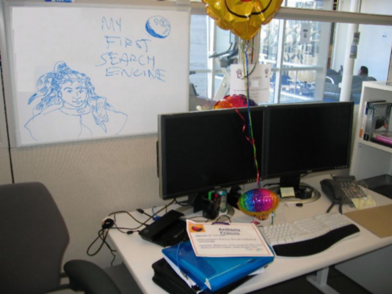
My first job working for a search engine company was as a consultant for the ELITE project, an innovative federated search engine design out of Emory University that was far ahead of its time. The ELITE vision - to enable all sites to both contribute to and benefit from search by making them both publishers and clients in a hierarchical chain of search engines - has still not been realized, resulting in massive inefficiencies and redundancies throughout the web as search engines process and regurgitate what web sites ought to be telling us directly.
The next was as one of the founders of Enkia, an applied artificial intelligence research company that turned its eyes to the web with a search product, Enkion, based (in part) on my thesis research and commercialized by the hard work of a team of sharp guys from Georgia Tech and elsewhere. The Enkion found information relevant to your immediate context, using feedback from what you were doing. We did well, even landing one big contracts before the Internet was pulled out from beneath us. Oh well.
SO I spent some time in industry ... first in police software, then in public health. All that was well and good, but I wanted to get back to research. Back to information retrieval. Back to artificial intelligence. Which led inevitably forward, to some search engine company that starts with a G. Will we be able to make a difference this time? Will we be able to make an advance that will stick?
Hey. Third time's the charm.
-the Centaur
Labels: Webworks
Comments:
Saturday, December 03, 2005
What do you know? Al Gore DID invent the Internet.
"No other elected official, to our knowledge, has made a greater contribution over a longer period of time ... As far back as the 1970s Congressman Gore promoted the idea of high speed telecommunications as an engine for both economic growth and the improvement of our educational system ... Our work on the Internet started in 1973 and was based on even earlier work that took place in the mid-late 1960s. But the Internet, as we know it today, was not deployed until 1983. When the Internet was still in the early stages of its deployment, Congressman Gore provided intellectual leadership by helping create the vision of the potential benefits of high speed computing and communication ... No one in public life has been more intellectually engaged in helping to create the climate for a thriving Internet than the Vice President."
I suppose this is old news to most people. But I still got a chuckle when I ran across this site yesterday ... and learned that the "Al Gore Invented the Internet" story was cooked up by a historian and reporter and blown out of proportion by the media, and in the end is a bigger fabrication than what he actually said on March 9, 1999:
I'll be offering my vision when my campaign begins. And it will be comprehensive and sweeping. And I hope that it will be compelling enough to draw people toward it. I feel that it will be. But it will emerge from my dialogue with the American people. I've traveled to every part of this country during the last six years. During my service in the United States Congress, I took the initiative in creating the Internet. I took the initiative in moving forward a whole range of initiatives that have proven to be important to our country's economic growth and environmental protection, improvements in our educational system.
Now is that "a whopper of a tall tale in which he claimed to have invented the Internet," or a simple statement that was grossly distorted? You decide.
-Anthony
Labels: Webworks
Comments:
Friday, December 02, 2005
Things just get easier and easier...
...though Bloglines users are reporting problems with the fanu fiku atom
feed. More in a bit.
-the Centaur
Labels: Webworks
Comments:
Wednesday, November 30, 2005
Congratulations! This is a valid Atom 1.0 feed.
http://www.fanufiku.com/atom.xml. Some interesting programming lessons were learned during this. More in a bit.
-the Centaur
Labels: Development, Webworks
Comments:
![]()
 By day, Anthony Francis makes computers smarter; by night he writes science fiction and draws comic books. He lives in San Jose with his wife and cats but his heart will always belong in Atlanta.
Comments: