
Wednesday, February 10, 2010
Jesus Comes Through Again
So what can you do? Work harder, work smarter, ask for help from those more experienced - and there are probably a dozen blogposts I could write on how I've improved my process during all this - but sometimes that's not enough. So you come in early, stay up late and stress your body out until you're so sick you have to call in and work from home because work-related stress is tearing up your guts so much you can't eat or sleep and you just want to GET this DONE. And still sometimes that's not enough - so you keep pushing harder.
Or, you can pray.
I'm not a "Bible believing" Christian. To me, that's almost an oxymoron - Jesus Christ was a real person and what the community of faith that he founded wrote down about him is a pale and often misleading substitute. But a Christian has to take the Bible as the first primary source about Jesus - Scripture is what we've got, and Tradition and Reason have to take it as it is. But even as Reason speaks quite loudly that we can't take Scripture literally as history ... it also speaks loudly to ask us why the Church that Jesus founded was inspired to collect those books in the first place. Just because the Israelites and the early Church didn't have modern standards of evidence, we still have to ask: what experiences did they have that prompted the writing of these books, and what lesson did the collators of the Bible want us to learn?
Turn to the Old Testament. During much of the latter half of Exodus through the Chronicles, the authors of the Bible depict the Israelites committing shocking acts of genocide against the native peoples of Caanan - as a friend of mine said, it would suck to have been an "-ite" in the days of Joshua. But did the Prince of Peace really want those stories recorded as an example of how Christians should behave? Not for the genocide, surely, and even in the Old Testament text when the Commander of the Armies of the Lord speaks to Joshua son of Nun, he does not take sides even as the Israelites are about to attack Jericho and destroy it. I think instead it's to demonstrate why we should put our faith in the Lord. Again and again through the Old Testament, the Israelites are shown failing on their own merits and succeeding when when they put their faith in the Lord: overcoming giants, huge armies, and even toppling the walls of Jericho. Whether or not the battle of Jericho happened as depicted in the Bible is beside the point - the meaning of the story is that people can tackle impossible odds if they put their faith in the Lord.
Case in point: my Jericho, that massive data collection problem that I've run rings around for months. I literally made myself sick last night staying up super late to get the evaluation done and, while I produced some approximate estimates, I still had many problems. I worked from home all day, again literally fading in and out of productivity and half-conscious stupor, until finally I'd done all I could do. I tossed my estimates "over the cube wall" via email, grabbed some dinner, and went to Writing Group. On the way home, slightly rested and refreshed, started thinking about the problem again. There were a few minor things to try but the very next step was starting over from scratch. I thought back about the power of prayer, about recent sermons I'd heard and readings I'd read, and I turned to Jesus (not theologically, I've already done that, I mean, once again, literally here, I think of him riding in the seat next to me in the car, or exercising on the next treadmill when I'm working out) and said: you can solve this, can't you? Because I can't do this on my own.
When I got back to my home office and opened my email, my feature had been approved for launch.
Nothing supernatural is required here, if you're not inclined to believe. I know that. I'd worked hard, reduced the data load of my feature, produced a new set of estimates, and even though this class of estimates had previously been deemed unsatisfactory, the new load was low enough for approval to be granted. You might think it was weird that the approval came on the heels of the prayer, but a proper skeptic, thinking it through, should say that there was nothing mysterious about it: even the timing of the prayer was only to be expected given how long I'd been working on it. (And even if you are NOT a skeptic you need to learn the mental discipline to realize that these things CAN just be coincidences, or you're going to go crazy and turn yourself into a nutcase seeing miracles where there aren't any). So ... was this simple response to a long period of hard work designed to produce that exact outcome an actual miracle? Not necessarily. Almost surely not.
Mmm-hmm. Suuure. You go on believing what you want. As for me? Thanks, Jesus, for coming through again.
-the Centaur
Labels: Development, This Guy Called Jesus
Tuesday, February 02, 2010
Compline: iPad Edition
Woman #1: And did you hear about the iPad?For the record, I know a lot of people interested in an iPad, I'm very impressed by the drawing features ... and I'm not going to get one as I do not buy closed platforms. (My Mac has a UNIX command line, thank you very much, and no dang App Store is needed to put software on this thing).
Woman #2: Oh. My. God. That has to be the stupidest name.
Woman #1: I know. Don't they know what it sounds like?
Woman #2: I think their brains must have been off for the entire development process.
Woman #1: And what gets me, there was a Mad TV skit about the "iPad" like two years ago.
Woman #2: Don't they know people are making fun of it? Don't they care?
Woman #1: Maybe they think at least someone's talking about it.
Woman #2: I dunno. It seems so ... useless. Who's going to carry that?
Woman #1: It's like a giant iPod you can't talk on.
Woman #2: Might be good for some people. At $499, maybe for my nephew?
I'll be buying a Spring Design Alex to help my favorite bookstore Borders and my favorite phone OS Android ... assuming that Steve Jobs doesn't crush his enemies, drive their tablets before them, and hear the lamentations of their programmers.
Good night.
-the Centaur
Labels: Compline, Development, We Call It Living
Comments:
Monday, February 01, 2010
Dakota Frost Reloaded

Dakota Frost in the ink, if not the flesh. Changes include a new face, facial tattoos fixed, left hand enlarged.
-the Centaur
P.S. And have I mentioned I really love my little "imagelink" program that automatically formats HTML inserts for images just the way I like them? Latest tweak is to copy it to ~/bin/ so I can run it anywhere I'm working at the command prompt.
Labels: Artworks, Dakota Frost, Development, Dragon Writers
Comments:
Saturday, January 30, 2010
I'm very depressed...
This one, the one I post on the most, won't. And there's no good workaround yet, though I am looking into it.
*sigh*.
I'm pretty sure I *can* do this - keep the Library of Dresan site completely static HTML pages so that there's no software on it to hack - but the existing FTP blogging clients seem pretty niche. And using WordPress or MovableType in this mode will, as I understand it, require that I set up WordPress on my laptop or desktop and write some software to rewrite the files and FTP them up to the site. You know, the feature Blogger handled automatically for me.
*sigh*
-the Centaur
Labels: Development, Webworks
Comments:
Wednesday, January 27, 2010
Blogger FAIL
In evaluating the investment needed to continue supporting FTP, we have decided that we could not justify diverting further engineering resources away from building new features for all users. For that reason, we are announcing today that we will no longer support FTP publishing in Blogger after March 26, 2010. We realize that this will not necessarily be welcome news for some users, and we are committed to making the transition as seamless as possible.Looks like it's time to find a new blogging provider.
-the Centaur
Labels: Development, Webworks
Comments:
Saturday, January 23, 2010
Rise, Lolho the Squamous!

If the world didn't have enough evil already, dedicated computer engineers have figured out how to put it on tap. Behold the terror that is the Lovecraftian Name Generator! Go on, click on it, see what I'm talking about.
Back? Ok, I admit, "Lolho" and "Ual'ke" aren't the scariest Lovecraftian names. But it's programmatic. You can create more than one. The current limit is 25, but by the unholy names of Anai, Bbhaaat, Bosaush, Cazagorarl, Ch-yos, H'eligthorteg, Han-dha, Ibhagugu, K'zaru, Kephoital, Mazazho, Mephangos, Mmililog,Nacharsar, Nali-yatl, Naquggo, Niquggolo, Phomasothugn, Ralellosaq, Rhub-harny, Rlakibha, Uga-urshu, Uggugakithu, Ygg-cyo and Yishotha, not even in Lovecraft's coldest visions of an indifferent universe could he have imagined you'd be able to create an entire pantheon with the click of a button!
Even worse, that limit is no doubt arbitrary, designed to protect their computing infrastructure if not the fabric of space-time. A truly evil black-hatter could use a sequence of queries to generate matched sets of Cthulukin at the upper limit of the QPS (queries-per-second) their servers could handle! Hopefully they have some kind of DoS (Denial of Shoggoths) throttling on their servers to protect humanity. If not-
the mind reels.
-the Centaur
Labels: Development, Hard Science, The Dread Plush Cthulhu
Comments:
Thursday, January 07, 2010
Just found a short between the keyboard and monitor...
Trying to install a new device, wasn't working, and the reason was I never applied the firmware upgrade that the instructions clearly said had to be required. Anthony's nth (7th?) law:
If you don't follow all of the instructions, you won't finish in the goal state.(*)(*) Except through dumb luck, or just possibly deep knowledge. Did I have deep knowledge in this case? No. So if you're doing voodoo, try, perhaps, following the complete recipe before you complain your zombie isn't coming back to life as advertised.
-the Centaur
Labels: Development, We Call It Living
Comments:
Wednesday, January 06, 2010
3:30am - pager duty suuuuuuuucks EOM
Here's the presentation: http://short/url EOMTechnically I guess that means the EOM in the header is not an EOM, and also by corollary the PS is not a PostScript since it introduces the body of the message.
Labels: Development, We Call It Living
Comments:
Saturday, November 07, 2009
Latest Spam WTF
Anonymous has left a new comment on your post "Why I Write":
I can not participate now in discussion - it is very occupied. I will be released - I will necessarily express the opinion. [url=DELETED]acheter levitra[/url] This rather good idea is necessary just by the way
Publish this comment.
Reject this comment.
Moderate comments for this blog.
The deleted URL is to a French eBay site, "acheter levitra" is French for "buy Levitra," which is a brand name of Vardenafil, which is, of course, a Viagra clone. So this is essentially random pseudo-English text with a "buy Viagra" link, depending on the 1% of people who click on such links and the 1% of people who buy to pay for the cost of putting this spam on my blog. Charming.
Comment reeejected.
-the Centaur
UPDATE: I got a similar post of with a less obvious spam form, targeting one of the more popular pages on my blog (can you say pooound cake?):
"I found this site using [url=http://google.com]google.com[/url] And i want to thank you for your work. You have done really very good site. Great work, great site! Thank you! Sorry for offtopic"
But the [url=XXX]TEXT[/url] pattern was a dead giveaway. A search on Google for ["[url=http://google.com]google.com[/url]"] - note that's the '[url.../url]' thing in double quotes; the outermost brackets are the syntax you use to indicate a chunk of text is a query, like [centaur] - SO anyway, a search on Google for that nonsense revealed that the exact text of that comment has appeared elsewhere. So this is just more comment spam, trying to see if comments are unmoderated here.
Comment flattering! But reeejected.
Labels: Development, Webworks
Comments:
Thursday, November 05, 2009
Data Mining for Satisfying the Finicky
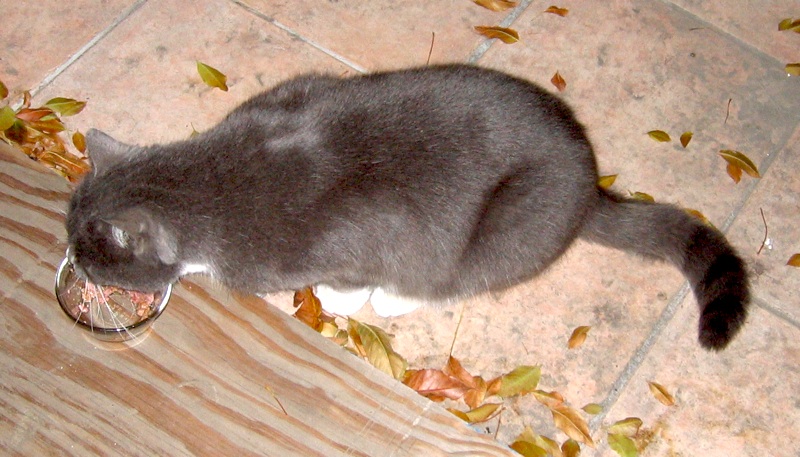 So we have cats. Three, currently - Caesar, a rescue cat, Lenora, a shelter cat and Gabby, a stray cat - out of a lifetime population of five, including Nero, the brother of the rescue cat, who disappeared (probably eaten by coyotes), and Graycat, another stray cat, pictured, who we unfortunately had to have executed by the state (because only I could handle him, using gloves, and we were afraid he was going to come knife us in our sleep).
So the three remaining cats are somewhat finicky. There are foods they will love, foods they will grudgingly eat, food they will eat but puke up, and food they will (quite literally) try to bury as if it is crap. So I've been meaning for a long time to keep up a diary of the food choices and their reactions to find out what we can feed them.
Data mining researchers claim that getting high-quality input data is the hardest part of a machine learning problem, so I started off with some exploratory data collection in Excel. After letting (thoroughly washed!) cans pile up for a week in two bins, I entered these into a spreadsheet and started to figure out how the data should be represented. I ended up with these columns:
- Brand: Fancy Feast, Nutro, etc.
- Type: Regular, Max Cat Gourmet Classics, etc.
- Flavor: Savory Salmon Feast, White Meat Chicken Florentine with Garden Greens, etc.
- Consistency: Flaked, Pate, Grilled, etc.
- Target: Adult or Kitten
- Package: Can, Tray or Packet
- Ratings: +1 or -1
After collecting this data, I started to analyze it. First I sorted the data. Then I eliminated duplicates and added a Servings, AggregateRating and Average column, summing up the Ratings into the Aggregate so that if something got two +1 and one -1 rating it would get 3 Servings and a AggregateRating of 2. This I used to compute an Average, which I used to resort the table to see which brands worked best.
The problem is, this Average wasn't that meaningful. One vote for a flavor isn't as meaningful as three, because the cats aren't consistent. This is the inverse of the Law of Large Numbers: you need many ratings to generate a meaningful result in the presence of noise.
I decided to set the number of ratings I cared about at 3, based on anecdotal comments by Roger Schank, my thesis advisor's thesis advisor - who reportedly said you need to visit a restaurant three times to give it a fair rating, because a restaurant could have one off day or great day and you needed at least 3 ratings to get an idea of their consistency.
At first I decided to track this using a smoothed average, AggregateRatings / (Servings + 3), but this depressed the all-positive and all-negative scores more than I liked - that kind of smoothing function works only well if you have very large ranges of values. So I chose a simpler max-based approach of AggregateRatings / Max(Servings, 3), so that one serving would get a 33% positive or negative rating but three or more could max it out to 100% if they were consistent.
That enabled me to make some findings, but then I realized I'm an idiot. I'd picked up the smoothed average idea from Empirical Methods for Artificial Intelligence, a book any serious computer scientist should read. And I'd edited my data in the spreadsheet so I could compute that average. But what I should have been thinking about was The Pragmatic Programmer, specifically the tips Keep Knowledge In Plain Text and Use Source Control.
Why Keep Knowledge In Plain Text? The cats aren't just finicky; their tastes change, especially if you overfeed them one thing. So the date at which a cat turns on food is important. By entering it into Excel, I first had to have a computer on hand, which encouraged to let the cans pile up; so I lost both the date information and some of the rating information - a coarse grained +1/-1 rather than "Ate Instantly"/"Ate Completely"/"Left Unfinished"/"Refused or Puked Up"/"Tried to Bury". A superior strategy would have been a pen-and-paper notebook where I recorded the cans a few hours after they were eaten. This could be entered into a text file a few days later, and if it is tab or comma separated Excel could easily import it. Then, with that data, I could even have applied other techniques from Empirical Methods for Artificial Intelligence, like using a sliding time-series window to ensure I'm analyzing the cat's current tastes.
And why Use Source Control? Because I edited my Excel file, dummy, not even versioned with v1 v2 v3 like I do with documents. So I actually entered this data in two phases and some of the temporal information I could have recovered has been lost.
So I'm going to improve my procedures going forward. Nevertheless, I did get some nice preliminary data, which jibes well with the observations Sandi and I had made informally. I'm going to hold judgment until I have more data, but so far Fancy Feast is the best brand, and Cod, Sole and Shrimp Feast and Savory Salmon Feast are the winningest flavors. Newman's Own Organics and Halo Spot's Stew were the worst brands - the cats refused to even touch them - which is odd, because Newman's Own makes great human food (try Newman O's) and Halo makes great dry food the cats love.
More results as the votes continue to trickle in...
-the Centaur
Labels: Development, The Cats
Comments:
Tuesday, November 03, 2009
Best. Dongle. Evah.

Recently, work was getting more hectic and family matters required more travel, and I was getting frustrated going out to coffeehouses and delis just to get wireless Internet. So, signed up for an AT&T wireless data plan, complete with a little dongle by Sierra Wireless that actually does the job of connecting to the Internet.
I refused to get the two year contract just so I could get the dongle for free, because I was burned this time last year getting a two year contract just so I could get a cheap smartphone ... right before the Search Engine That Starts With A G bought all of its employees Android smartphones.
SO I opted to instead to pay month to month, and as a consequence I had to pony up two hundred dollars for that little dongle. Because of the monthly fee, and how the math worked out, I stupidly did not spend the extra $5 bucks a month insuring the damn thing.
I say stupidly, because I left it in my pocket and put my pants in the wash.
My heart fell when I saw the cap of the dongle tumble out as I was emptying the clotheswasher. Sure enough, I found the dongle in the pocket of a pair of pants. Sadly, I took it to my Mac and plugged it in. The lights flickered for a moment, but did not come on. Just to be sure, since the Mac's two USB ports are not equivalent, I switched it to the other side.
The lights flickered ... and then the power light turned blue, while the connection light turned red. Hoping against hope, I hit "Connect" on the Sierra Wireless Watcher control panel. The connection light began flashing ... and a minute later, it connected.
Since I knew that liquid in electronic devices can sometimes cause problems down the road, I disconnected it, unplugged it, and put it front of a spaceheater to dry out more thoroughly, then a fan to cool it off. One day later, I'm writing this blog entry using this same dongle, and it's doing fine.
Go Sierra, and go AT&T for picking a quality parts supplier.
-the Centaur
Labels: Development
Comments:
Wednesday, October 28, 2009
Randomness, my friends...
Labels: Development
Comments:
Wednesday, October 14, 2009
Fast Push That Emergency Fix
The problem, for those of you who browse the site in standards-compliant browsers, was that the last column of the Library's three-column layout was not showing up in Internet Explorer - and only Internet Exporer, one of the world's most popular and, unfortunately, least standards compliant browsers.
The solution: make the layout wider, so the max image width used in the blog does not cause the first column to widen.
In the top half of the picture, you see Firefox 3.0.14 on the Macintosh running the (corrected) version of the Library of Dresan home page. In the bottom half, you see Internet Explorer 7 on Windows Vista, running in a VMWare partition on my Mac, from approximately the same position on the same page. From a graphical and typographical perspective they're both doing a fairly creditable job of rendering the layout. Everything looks roughly OK.
However, they're not doing the same job interpreting the width of the layout. I haven't debugged the precise problem in detail - this is a voodoo quick fix - but essentially Internet Explorer interprets the widths of the columns and their spacing and padding different than Firefox. The result: images, which on Library of Dresan blogposts are always a maximum of 600 pixels wide, roll over the end of the column, also 600 pixels wide, making it jog out. You can see that in the stairstep on the second half of the image.
Part of this is my error; prior to my quick fix all browsers were showing at least slight stairstepping. But all browsers I tried - Firefox on the Mac, on Windows, and on Linux; Chrome on the Mac, on Windows, and on Linux; and even Safari on Mac and Windows - handled this correctly except IE, which widened the whole column. This made the three columns wider than the whole width of the container, and the third column had to jog halfway down the page so that it could fit, effectively becoming invisible to people just entering the site, unless they were willing to scroll a lot in the hope hidden features would leap up at them.
Now, I could have dug into CSS manuals and tried to fix this the "right" way, and indeed I plan to. However, there was a quicker, better, way: experimentation. Before I even knew for sure what was the problem I browsed to the front page of the Library on a Windows machine, downloaded the page to a local HTML file, and started hacking out parts of the file until something changed. I was very quickly able to show that there was nothing wrong with the right column itself; even reduced to a few lines and an image it wasn't showing up.
So I then went to my test file, research, which I had gotten to work in IE before I launched the style change to the whole library. One difference between that page and the broken page I immediately noted was the fact that the images were smaller; then I started to suspect the stairstepping phenomenon. That needed a fix on all browsers, so I simply made the content column slightly wider - from 600 to 610 pixels, fixing a gaffe I shouldn't have made in the first place - and widened the overall page from 1000 to 1024 pixels.
The result: it worked, in all browsers I have available to me right now. And, because my buddy Nathan had impressed upon me the importance of using CSS stylesheets, I was able to push the fix by simply uploading the revised stylesheet to the Library and reloading the page.
Shouldn't have happened - I shouldn't have made the column too narrow, Internet Explorer shouldn't be misinterpreting the white space, I shouldn't have pushed the template without testing it on Internet Explorer, and Blogger should have a better preview function so I could have tested it successfully offline without pushing it to the entire blog. But a quick fix was possible, because I used reasonably good site design practices, the scientific method, and a healthy supply of beans and vinegar.
-the Centaur
Labels: Development, Webworks
Comments:
Curse you, Internet Explorer...
Grrr...
UPDATE: The template looks as intended in Firefox AND Chrome for Mac AND for Windows AND for Linux, and for Safari for Windows and Mac as well. Grrr...
Labels: Development, Webworks
Comments:
Launch early, launch often
I realized that I was waiting until the overhaul was "perfect" and that was putting the overhaul on hold. I've read too many things recently - about the telegraph, the transcontinental railroad, even about creation of Google - in which immense success came from plucky people who didn't wait until things were perfect, or even necessarily known to be possible, before they threw their ideas up on the wall to see if they stuck.
So, I know my new template is not done, but it looks better than what I had before, and more importantly is more navigable. More work to do ... but for now, complain, and I'll fix it.
-the Centaur
Labels: Development, Webworks
Comments:
Sunday, July 26, 2009
I can be an idiot sometimes

I can be such an idiot sometimes ... or, put in other words, the right way to solve a problem is often much, much easier than the wrong way.
For example, if you're doing woodworking, you may use a modern steel clamp to hold a part tight to work on it. That sounds good and does the job. Of course, when you need to change the position of the part you must unscrew it, reposition the part and rescrew the clamp.
So far, so good ... but, according to David Petersen, the author of Mouse Guard, there is a better way. Petersen researched medieval woodworking equipment for his Eisner-award winning comic and found there was a simpler scheme involving a foot pedal and a lever, which had equal gripping power but could release and reapply pressure in seconds just by lifting your foot.
Moral: newer and more complex is not always better.
Fast forward eight hundred and fifty years. Robert Kroese, a colleague at the Search Engine That Starts With A G, has his own book that he's working on, and an associated web site Mercury Falls. On that site he has a form to enter an email list, and I thought, what a great idea! I should have a form where someone can send me an email list on the Dakota Frost site.
So I started looking into it. To make the form work, you need not only a web form, which is easy to set up, but also some kind of server program on the back end which can accept the results of the form and a database to store it.
Historically, I've had bad luck with scripts and databases on my web sites: Earthlink / Mindspring basically welched on the scripting features of their web hosting that I was paying for, and my next provider, Tophosting, screwed up one of my databases.
So I was hesitant, and I started thinking. Then it hit me...

... there was a simpler way.
Instead of creating a form and the backend plumbing that goes with it, I should use the existing plumbing I had to achieve the same effect. What plumbing was already in place? A web site, a hosting provider, an ability to forward emails to a given address ... and a mail client with filters.

To make this work, I went to the GoDaddy control panel for Dakota Frost and set up a forwarding email: contact at dakota frost dot com. I had that sent to one of my catchall email accounts, and in Gmail I then set up a filter which collected all those email addresses into a single folder. Bam: problem solved.
Even if I want to do something more complex, this solution still works, as long as I keep looking at simple tools that are already available. For example, if I want an official email address list as a separate file, I could always download those email messages to the mail client of my choice, filter the messages to a folder, and grep over the email addresses in the file. For the scale at which I need to do it right now, the problem is still solved.
Moral of the story: the more you overthink the plumbing, the easier it is to stop up the drain. Keep it simple, and things should just keep flowing without effort.
Or, to translate this back into development speak: there are two kinds of solutions: solutions which are easy to think up, but take a lot of coding effort to make work, and solutions which require thought, but which can be implemented in staggeringly small amounts of code.
In this one, we have an extreme example: to make this problem work the "no thinking way" would require an HTML form, a CGI script, a database, and considerable configuration on the server side of my hosting provider. To make this problem work the "no effort way" required some thought, but in the end less configuration of my hosting provider and a few minutes setting up some email filters.
You see the same thing in software libraries: really good libraries don't take a lot of code, but that doesn't mean that they didn't take a lot of work. What happened behind the scenes was a lot of thought, wherein the library author searched the space of possible designs until he found a great one before ever publishing the library. You as the consumer don't see that effort, no matter how short or long it took: you only see the pure, parsimonious, elegant efficient piece of code that remains.
If you don't put thought into what you're doing, you might try it sometime. You'd be surprised how little thought can get you substantially improved results.
-the Centaur
Labels: Dakota Frost, Development, Webworks
Comments:
Sunday, May 31, 2009
Why Are Norton Products So Terrible ... Now?
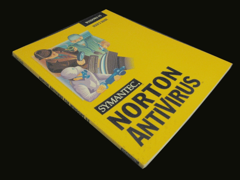
Not that that's the problem - even though I once had to pay for Symantec's Antivirus suite twice on my wife's computer because of an unresolvable error with the antivirus subscription. The problem wasn't so much the Product Activation per se, but that the software got into an unstable state which prevented it from accepting the subscription - which I could prove that I paid for - and eventually the only way to fix it was to nuke the site from orbit, reinstall everything, and pay again.

And therein lies the kernel of the problem: it's so easy for Symantec (née Norton) products to get into an unstable state, activation or no. There's the antivirus issue I mentioned. I once installed Norton Antivirus on a PC with Zone Alarm installed, and the two products got into a death match over which one was the "real" firewall even though I was not trying to install Norton's firewall features. There have been several other instances, most with Norton 360 Premier Edition, and now this:

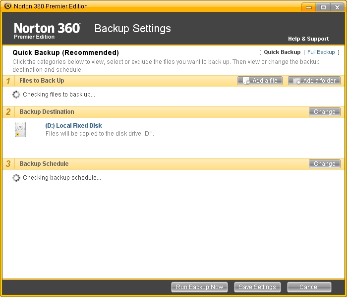
You can't see it in the picture, but Norton 360 is frozen like a Canadian lake in winter. Recently our main backup drive for our Windows workstation died, and I replaced the old Maxtor with a larger Iomega drive. However, when I went to change the backup to point to the new drive, Norton locked up trying to determine ... what, I don't know. Files to back up? Looking for backup locations? It isn't clear. On the first try of this, it appeared to be frozen checking backup schedules:
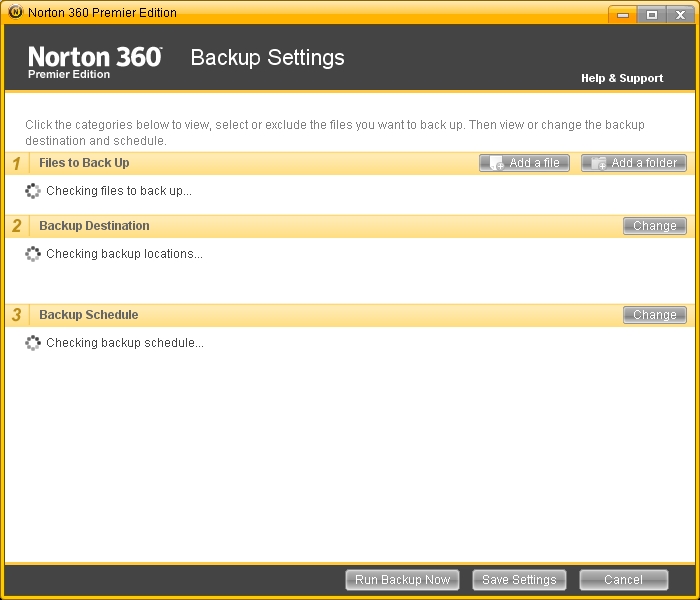
It stayed there the whole time I was working on this article (up to this point). Right around the time I wrote that sentence, I finally killed Norton and restarted ... no dice. Now it can't even find the backup locations:
There is no excuse for software to be written this way by a professional company with collectively over 30 years experience. This is the kind of crap I write the very first time I whip together a utility for a new operating system, before I learn where the blocking calls are. A program should never block on a dialog finding something as simple as a list of backup schedules, much less files or anything else. Modern computers have millions of cycles a second available to realize a call is taking a long time, present the list of items found so far, and give the user the opportunity to do something - which, in this case, would be me telling it to forget the old backup location and to try the new one. Instead, I get this, still frozen trying to find a list that could be easily cached, interpolated, discarded, supplanted, SOMETHING:
This goes to my overall rant on what's wrong with disk and networking software. Modern web applications like GMail have vast abilities to cope when servers are offline. Networking and disk operations, in contrast, are either blindingly fast, or pause for minutes or even hours, obviously befuddled but never bothering to pass that information on to the user. Someone, I can't remember who, wrote an article about this a few years back, pointing out that it was all related to design decisions we'd made early on in computing that are wrong. He sketched out how you could design a computer to never effectively lose data, even if you powercycled in the middle of writing an essay, by changing how we think about saving data. I'll dig up the essay, but for right now, we STILL have THIS, frozen in the same place:
At the time of this writing I've spent almost THIRTY MINUTES waiting on Norton to perform what should have been a two minute operation: changing a backup disk and starting the new backup. This makes my problems with Apple's Time Capsule look trivial. By the way ... Time Capsule is working perfectly now. Time to switch my wife to the Mac?
-the Centaur
Postscript: we went and worked out, and this window was still up, an hour and a half later. I took the pictures I needed for this article; then, I did what I hate to do: asked my wife to log out (in her session, she was working on proposals and had half a dozen windows open) and rebooted the machine. When we returned, Norton worked just fine. I started this article feeling nostalgic for Norton/Symantec's older products; well, Norton gave me what I wanted, and took me all the way back to 1995, when you had to reboot to do anything.
It's all right, Peter. We still love you. This isn't your fault, nor is it necessarily something that the hardworking people at Symantec could have fixed in this instance. But if I don't complain, you'll never know anything was wrong.
Labels: Development, Gripes
Comments:

Saturday, May 30, 2009
I figured out why my computer's not working...
More seriously, this is why when you really want to film something you need two or three different cameras. This really cried out for three: one closeup on the computer, one long shot on the shooting range to see it fly in the air, and one on the shooters.
-the Centaur
UPDATE: I had a discussion with friends, and there are at least two things the people in this video are doing that make them a hazard to themselves and others:
- They're TRAP shooting with RIFLES!
From one friend: "This will probably surprise everyone, but in my opinion these guys are complete morons because they are endangering others. They are "trap shooting" with rifles! I think I saw one shotgun in the whole video. I'm sure my gun enthusiast friends will agree with me that unless these guys are at least 3 miles from any other people (and even in the deep woods of Tennessee, you can't possibly be sure of that) they are endangering others by firing high-powered rifles into the air. As an example, a 30-06 rifle aimed at a high elevation can fire a round about 2.5 miles. Interestingly, the maximum range occurs at about 35 degrees elevation, not 45 degrees as one might think. When the round returns to earth, it's still moving at around 500 fps, which is fast enough to kill someone." - They have NO IDEA of EXPLOSIVE SAFETY:
After reading that, I remembered something else bugging me and I went back and found it. Watch the video again closely for the following gem around 1 minute in: The guy fills the test chamber with explosive and a fuse, he tamps it in with a stick and wooden hammer, then he puts his body over the chamber when putting the books on it. Now, the first time that I watched this, I thought he tapped the whole wooden shaft into the hole, but you can see it lying on the ground later. Regardless, he's putting himself in the line of fire with no thought of what might go wrong. From the other poster: "Yeah, I noticed that one too. I bet if it blew and tossed him into the air, his buddies would instinctively start firing until the smoke cleared and they realized it was him!"
I certainly would agree about the trap shooting and with the care needed with black powder and fuses. There is no way to know, of course, but the woods in the background look pretty dense. If it's all private property it could go for miles. Still I wouldn't do that stuff with my rifles.Ok, it's all fun until someone loses a loved one. Be safe, all.
Labels: Development, Moving Pictures, Superior Firepower
Comments:
Monday, April 27, 2009
Just a little bit harder...

Earlier I blogged about how to succeed at work or life you need to work just a little bit more than you want to. I mean that 'little bit' literally: not working yourself to death more, not a whole lot more, just that little bit more that can turn your day from one of frustration and failure into one with a concrete achievement.
Your mileage may vary, of course, but for me the point when I really want to give up is frequently just before I am about to reach one of my goals. All I need to do is hang on just a little bit longer, keep working just a little bit harder, and very frequently I'm rewarded by more than I could have expected.
Today this was once again confirmed. I got in late today and decided to work until 7, which was coincidentally what I felt was a good solid workday and about the time I would need to leave to make sure I can get some dinner and writing done.
But work was slow going: I'd recently switched to a new project but was stuck with some old tasks, and the mental gear switching, combined with some syrupy new software on my workstation, kept dragging me down. On top of that, one of my collaborators dropped in with a request for assistance putting together an evaluation, and since I owe him a few I worked on a scripting job for him while I was between compiles of the unit tests of my main task for the day.
7 rolls around, and I'm just about spent. I decide to call it a day, start to pack things up, and begin thinking of where I can go for dinner and what I need to be working on: my new novel, an illustration for my last novel, my web site.
And then I remember that blog post, and decide to push just a little bit harder.
In just 23 minutes, I got both the unit tests to pass on my main task AND finished a first trial run of the scripting job, complete with an automatically generated HTML page. With that, I was able to find a 'problem' with my script, spent about 20 more minutes debugging it, verified it wasn't really my script's problem, and fired off an email to my colleague telling him where to find the HTML for his evaluation, and asking him had he ever seen an error like that and did he happen to know how to fix it?
By 7:45, I'd closed up, walked out, and headed for Panera Bread. By the time I was done with my sandwich, I'd gotten an email back from my collaborator suggesting an easy workaround for the problem that I can implement with a one line change. I might even be able to start it up tonight to run overnight - meaning that, God willing, I will have completed by Tuesday morning a task I told my collaborator I couldn't even start until maybe Wednesday.
YES! By working just a little bit harder, I turned a frustrating day into a complete success - and freed my mind this evening to work on more creative tasks. I recommend it to all of you.
-the Centaur
Labels: Development, Philosophy
Comments:
Saturday, April 25, 2009
Not enough hours in the day, redux...
Recently I started work on redesigning the templates for the Library, and in my giant Mongo death Todo list I have an entry "blog updates to library". But I never got around to writing the article, because I kept on getting confused about what to write first.
Then I realized that's part of my problem. The point of blogging the redesign of the Library was to expose the thought process that normally goes into the redesign of any web site, rather than hiding all of the hard work behind the covers, springing it fully formed onto the world, and proclaiming: "See! Doesn't it smell better?"
So here's the thought process that was blocking me from writing articles on the Library:
- Anthony looks at Todo list, sees entry "Blog Update" and tries to figure out what to do with this horribly underspecified action item with no clear next action. Somewhere out in cyberspace, David Allen kills himself, then spins in his grave.
- Anthony decides "I've got a prototype for the new design of Library now! I just need to post the darn thing and get on with it!"
- Anthony starts work on cleaning up his Blogger template. During this process he finds he needs to figure out precisely what his Blogger template is doing, as he no longer remembers and the code is poorly documented.
- Anthony comes up with a clever way of visualizing how his Blogger template works which itself is probably worth blogging about.
- Then Anthony realizes that he doesn't know whether the design works well with Internet Explorer on Windows, or Chrome, or on small screens (notwithstanding my desire to support only large screens), or on super large desktop screens with different sized fonts.
- This leads to more questions: What browsers should this work well on? How should I test this? What if there are fundamental incompatibilities between IE and Firefox?
- Well, shazbot. I decide, screw it, let's just fix a small page somewhere and update that. So I update the Research page, which already needed an overhaul of its research statement.
- Anthony finds a system to help him test and prototype his content which is worthy of blogging about in its own right.
- The textual update goes swimmingly, but updating the CSS and HTML proves more of a bear, especially comparing Internet Explorer and Firefox.
- Anthony's system for updating the content starts to show failures which are worthy of blogging about in their own right.
- Well, shoot, now what do I do?
But the point of this blogging exercise is NOT to go off and hide and try to figure these things out, then come back smiling with a solution. Instead, when I get stumped, that is a serious decision point in the development process and I'm SUPPOSED to write an article which says, here's what's on my plate, and boy did I get stumped.
So this is that article. And just articulating the things going through my mind gave me a sequence of things to do: now I can blog each of the elements on that list and show how I encountered the problem, how I tackled it, and how I got to a solution.
-Anthony
Labels: Development, We Call It Living, Webworks
Comments:
Monday, April 20, 2009
Podmena Traffica Test?
Finally I decided to track it down, and while I don't know for sure I've now heard a good hypothesis:
There seem to be some strange spam emails doing the rounds, with a body text of "podmena traffica test".. what gives? It makes a bit more sense if you transliterate it into Cyrillic, which leaves you with a Russlish phrase "подмена трафика тест" and that simply translates as "spoofing traffic test".
Trying to verify his logic: Romanizing "podmena traffica test" gets me "подмена траффица тест", as predicted, and translating that back to English gets "substitution traffitsa test" which is close enough.
The specifics of the message I'm seeing don't match the description in that blog post, but it's enough to make me think that the author has nailed it: it's a Russian spammer testing out addresses and more importantly web servers.
Mystery solved! Now quit it, spammer guys.
-the Centaur
Update: I keep getting this spam. I have now received this spam almost 60 times in the last month, according to Gmail.
Labels: Development, Webworks
Comments:
Sunday, April 19, 2009
Why I Use Transparent Terminal Windows
Combined with the microscopic fonts I like, this makes my screen hard to read for others; one of my collaborators used to insist I make the windows opaque and increase the font size so he could see them. So why do I do this? Even the Mac OS X tips page that tells you how says it "has no serious purpose" except to make your windows look pretty.
Well, I beg to differ. This screenshot shows why:
Here, I'm working on some Python code to automatically generate a list of labels for my web site. I've never used the Python ftp library before ... so I just Google'd the Python ftp protocol, found the Python doc page, and began prototyping my code straight at the Python prompt, looking through the terminal window to see the sample code beneath it.
Mmmm. Composity goodness, captured via Mac's Command-Shift-3 screenshot keystroke and edited with Preview. If you program at the command line you should try it - your eyes train up pretty quickly to ignore whatever's behind the terminal unless you need it.
-the Centaur
Labels: Development, Webworks
Comments:
Sunday, April 12, 2009
How Wide Should Your Website Be?
I remember reading an article (I don't remember where) that pointed out with browser sidebars and chrome, the width of the page could be far less than monitor width. I measured it on my circa-2000 screen and I found that I had about 800 pixels of width for the web page. So that led to the design of the Library: 800 pixels of width, 600 for the main content and 200 for the sidebar. The banner itself was a little over 1000 pixels so that it didn't end abruptly if the user made their screen wider.
But that was almost ten years ago. Does that logic still hold?
Many people view the web on laptops and phones. Dealing with phone resolution will require more than just dealing with screen widths, so I'll return to it in a later article when I tackle the CSSification of the Library. But a quick search suggests that typical laptop screen widths range from the 1024x768 XGA standard to the 1440x900 WXGA+ widescreen standard. There are some people who have smaller laptop screens, of course, but they are in the minority. Conversely, screens do get larger: for example, for many years I owned a glorious Toshiba Satellite laptop with a 1600x1200 screen. But on those larger screens users often use smaller windows for their browsers: for example, on this MacBook Pro, with a 1440x900 screen, I'm only using a little more than 1200 pixels for the browser window - and typically I use narrower windows.
So something more than 800 and less than 1400 appears to be a good guess. Discussion on the web seems to indicate people are starting to give up on the 800 width and moving to 900 or more, but rarely more than 1024.
Digging around, I found more articles with the same idea - Mario Sanchez argues the goal of web site width is to avoid horizontal scrolling, and recommends you design your web site for 800 pixels, with a layout that works well at 1024. Jacob Nielsen recommends straight out to optimize your site for 1024, but not to design for a specific size and let your layout be "liquid", changing width for your users's monitor sizes. Personally I think this breaks down if you have images to display, though I reserve the right to be convinced otherwise by CSS wizardry at a later time.
All of the above are opinions, of course; what about the evidence that they're based on? The Steam Hardware Survey put out by Valve Corporation suggests that 95% of users use screens of 1024 pixels or wider, with fully 50% at 1024x768, 1280x1024, or 1440x1900. Similarly, the Browser Display Statistics analysis by W3 Schools indicate 36% of users have a display resolution of 1024x768 ... and 57% have higher. Update: I checked the Library's own stats, and found that Google Analytics does indeed track screen resolutions. Less than 5% of all users had a resolution less than 1024x768, and only 1.5% had a resolution less than 800x600. Of that, 0.5% were listed as no resolution, leaving 1% at 640x480. Those numbers will come back later...
Take all that with a grain of salt given that some significant percentage use browser screens larger than their monitor resolution - Nielsen points out in the same article I mentioned above that as resolutions get staggeringly large (he predicts 5000x3000 in the future) users begin to display multiple side by side windows. True enough, at the Search Engine That Starts With a G, all of my officemates have dual monitors with aggregate resolution of 2400x1920, but none of us typically displays a browser window larger than half the screen - 1200 pixels, minus chrome or subtracted width to see other windows underneath.
So that leaves me with the feeling that Nielsen and Sanchez are essentially right. My personal take on it for the Library is:
- Your website should display well in no more than 1024 pixels of width. You may use a "liquid" layout that can expand to use more space, but it should not require more than 1024 pixels to display.
- The essential content of your web site should fit into the leftmost 800 pixels of width. If you are displaying graphics or images or have a lot of site widgets, some of these features may scroll off to the right on an 800x600 screen. Don't put anything essential on the right. Your mileage may vary if you are creating a web site for right-to-left languages, of course.
- Make sure your "liquid" layouts don't break down on very wide or narrow screens. A user who displays a very wide window on a 2400 pixel wide screen should not see all your paragraphs turn into long marching lines of text - these can become hard to read. Similar problems can happen when a screen is squeezed very small - for example, Wikipedia used to display terribly on certain mobile phones, creating vast blank spaces for the user to navigate through.
The new design for the Library uses around 1000 pixels, with the leftmost 600 for text (to satisfy the 1% of people who are still stuck at 640x480), the next 200 for site navigation (for the less than 5% stuck at 800x600), and the remaining 200 for everything (and everyone) else: search boxes, author pictures, and Flickr badges; in short, anything less important than the articles and navigation features. Technically this is not a "liquid" layout, but hopefully this will be something the vast number of users can enjoy with little scrolling, and something that other users can appreciate without feeling left out.
-the Centaur
Labels: Development, Webworks
Comments:
Sunday, March 29, 2009
Renewing the Library
Recently I started to notice that the design of the Library is getting long in the tooth. One friend who was a web designer commented that it looked very "old Internet". I've watched another friend innovate on his blog design while mine was staying still. Work on my wife's web site made me revisit some of my choices, adding a description and picture but making few other changes. I know the site needs a redesign because I have a lot more material coming out soon, but the final trigger was when I couldn't attend a talk and looked up one of the authors to learn more about their work - I think it was Oren Etzioni - and I was struck by his straightforward site design which enabled me to quickly find out what he was working on.
SO, I'm redesigning the Library.
I'm an artist in addition to an author and researcher, so simply gutting the site and making it simpler wasn't my goal: I have specific ideas about what I want the site to look like, and I started designing a new one. Partway through that redesign, I noticed that I was doing a fair amount of research work - examining other blogs that I admired, investigating blog widgets, investigating CSS and HTML advances, researching color theory and design principles - but not blogging any of it. In fact, come to think of it, typically when people redesign their sites they put all their work under a bushel, trying to hide their planned change until the last possible moment, possibly exposing it to a few trusted users in beta or with an alternate link prior to springing it on the world as if freshly formed and fully new.
Well, phooey on that. The thought process that a web designer goes through producing a web site is interesting (well, to other web site designers, anyway) and provides a valuable resource to other designers doing their work. I wished that other people had blogged the process that they went through and the alternatives they explored, as it would help me make my own choices - but you know what? I don't control other people. I only control me. And if someone else hasn't filled the gap, then it's my own responsibility to come up with something to meet my needs.
SO, I'm going to blog the redesign of my blog. How "meta".
There's far too much to put into a single blog entry, so I'll start off going over the thought process that led to the design in more detail, then explain my strategy. The first thing that I did was look at other web sites that I admire. Earlier when working on my wife's web site I found a number of beautiful looking blogs, but when I started the redesign, I started my search over, focusing on sites of artificial intelligence researchers, bloggers, writers, and artists, trying to find ones I instinctively admired with interesting ideas, features or appearances that I could steal. Some of these included:
- Oren Etzioni's Home Page: Quickly Present What You Are Doing
An "old school" (not that there's anything wrong with that) web site from an academic researcher, it has an "old style nav bar" up top that quickly tells you how to find his publications. Below that is text which points you to his research projects and most cited publications. From this I gleaned:- Organize your work into logical areas
- Make navigation between areas easy
- Put things people want up up front
- Rough Type by Nicholas Carr: Put Your Content Front and Center
Featuring a straightforward design that gets you straight to his content, Rough Type also has an author blurb and a pointer to his most famous article, "Is Google Making Us Stupid?" and his book "The Big Switch" The key points I gleaned from the site:- Get your content out front and center
- Tell people who you are
- Point them to your best work
- Vast and Infinite by Gordon Shippey: Show the Author, Try Fun Features
Written by an old buddy from Georgia Tech, Vast and Infinite isn't that different from Rough Type. However, he's constantly innovating, adding a site bio and author picture, tweaking his banner, adding shared items and flickr gadgets and more, whereas my blog tends to stand still. The lessons from this:- Show people your picture
- Keep your content front and center (sound familiar?)
- Trying out new technologies generates interest in the site
- Home Page of Jim Davies: Show the Author, Organize Your Site Logically
Jim Davies is another academic researcher, with a much more modern site. Like Oren Etzioni, he has a navbar, but also a large picture, a more detailed description, and links to his art, store and blog. Unlike Oren, each area of the site seems a little more organized, without the duplicated links to publications and the odd inclusion of news articles in his personal page. Jim takes this further by having extra blogs just for rants and links. My takehomes were:- An academic site can have a modern design
- Showing people your picture creates interest
- Don't be afraid to segregate content into areas
- Marvin Minsky and John McCarthy: Tell People About Your Work, and Share It
Two of the greats in artificial intelligence have interesting sites filled with lots of content. Both start with a description of them and their work and then continue with many, many links to their most prominent work. Minsky puts up chapters of his most recent book; McCarthy includes a lot of narrative that gives context. What I like:- Tell people what your site is about using narrative
- Put work you are interested in front and center
- Fill your site with lots of content
- Greg Egan's Home Page: Fill Your Site With Lots of Content, and Share Your Research
Greg Egan is an author I admire primarily for his novel Permutation City and his short story Dark Integers, though I have more of his books in the queue. His site's layout is a little harder to read than some of the others, but it is filled with pointers to all of his work, to the research that he did to create the work, and applets and essays related to his work. The takehome from this firehose is:- Fill your site with lots of content
- Share the research you did on how you produced your work
- Don't be afraid to promote your work by showing it to people
There was one more site that kicked this all off, which I will hold in my pocket for a minute while I talk about opinions.
Unlike Jacob Nielsen, I don't have research backing up these conclusions: they're really just guesses about what makes these site work, or, worse, just my opinions about what it is that that I like about these sites. What's dangerous about opinions is that recent scientific work seems to indicate that they're often post-hoc explanations of our instinctive reactions, and they're often wrong. So, to combat this tendency, I looked at other resources that specialize in information about good design of web sites to try to get information about what I "should" do. I don't pretend I've absorbed all the information in these sites, but am simply including them to show you the kinds of things that I looked at:
- Jacob Nielsen's UseIt.com: Make your site fast, simple and standards based
Jacob Nielsen's site on web site usability is so simple it hurts my eyes. I don't like to actually look at it, but I do like the ideas. He's got a breakdown of recent news on the right and fixed web site content on the left; the idea of the breakdown is good but seems opposed to my goal to work with Western left-to-right reading. Jacob points out that he uses no graphics because he's not a graphic designer, and that's fair; but since his site is unpleasant for me to read I only loosely follow his recommendations. But one cool thing about his site: if I resize the browser his content stays divided more or less the way he's put it because the structure is so simple and well designed. - But What Are Standards? W3C and Webmonkey
The W3C is the official source of standards for the web like HTML and CSS, but I've always found their standards hard to read (and I've read many, many of them over the years). The new site redesign they're testing seems to make it easier to navigate to find things like the CSS Standard, but it is still hard to read and lacking the practical, let's get started advice that I want. Back in the early days of the web, I used Webmonkey as a source of good tutorials, but the site seems crufty and broken - trying to narrow in on the CSS tutorials got me nothing. I have a number of offline books, however, and am a whiz at reverse-engineering web pages, so when I get to the CSS articles I will detail what I learn and what sources I use. - CSS in Practice: FaceFirst.us and CSS Zen Garden
I know the designer of FaceFirst.us, a social networking site, and in exchange for me beta testing his site he turned around and gave me a tutorial on how he uses CSS in his process to ease his site design. In short, like Nielsen, he recommends separating the "bones" of the site from the content using CSS id's and classes. One example he showed me was the CSS Zen Garden, which has fixed content that is modified radically just by stylesheets. - But What Did Your Thesis Advisors Do? Ashwin Ram and Janet Kolodner
I also dug into what Ashwin Ram, my thesis advisor, and Janet Kolodner, a member of my thesis committee and my original advisor, did with their web pages. Both Ashwin and Janet have profile pages back at the College of Computing, but they also have richer pages elsewhere with more detailed content. I have no intention of slavishly copying what my thesis advisors are doing, but as far as the research part of my web is concerned they're similar people solving similar problems whose solutions are worth looking at and adapting for my own use - why, yes, my Ph.D. was in the case-based reasoning tradition, why do you ask? On that note, it occurs to me to look at other colleagues' web sites, like Michael Cox's site.
Standards, shmandards, cool sites and web lights - all well and good. My brain exploded, however, when I saw Warren Ellis's web site (billed as a blog for mature adults, so it's occasionally NSFW - be warned). In my mind, Warren's site had a number of great features:
- Show the Author's Name:
The author's name is hugely printed across the top - so you immediately know who this is, as opposed to say my dumb blog where my name is printed in 2 point type. And Warren's domain name is also his own name plus dot com, so that he can actually show his name and site name in the same logo. - Keep the Text to the Left:
The text of all the articles is corraled to the left margin so they can be PRINTED, aligned to the top of the page so it dives into the header and is immediately visible. Almost as if Warren's site was designed knowing that the majority of the people who read the English language read it from left to right, therefore the text should appear where their eyes go. This pattern, plus the pattern of the rest of his design, is consistent with putting the good stuff in the F-shaped heat map that typical users eyes take when scanning your page. - Use the Middle of the Page:
There is a bar of links in the MIDDLE of his page, immediately to the right of the articles, which puts it close to the golden ratio of the horizontal space of his site design (as viewed on my monitor). This "linkbar", held in place by CSS wizardry and a black magic compact with the Old Ones, contains permanent site features that most need to be linked - message board, mailing list, comics, his novel, his agents, and his bio inline. Think of it as sexier version of Jacob Nielsen's "Permanent Content" box. - Put Sparkly Things to the Far Right:
Beyond the linkbar are all the cool fun site features like a search bar, podcasts, images and other nonsense, which are fun to look at but less important. On my site, some of these are on the right, or even at the very bottom of the page; on other people's sites they appear on the left, distracting Western readers from the article and possibly shoving the right ends of the articles over the printable width of the page. Ellis' contract with Cthulhu and the hellish powers of the W3C enable him to safely corral these fun elements to the right where they belong.
The linkbar was the most mindblowing thing. It eats into the banner. It's readily visible. It leaves the text on the left, but it's close enough to be visible on most monitors. The whole site is 997 pixels wide, so it will fit on a typical 2009 web screen, but if your screen is smaller, first you lose the fun sidebar, then the important linkbar, and only then do you lose the text. Even better, since the linkbar CSSes its way into the banner, the size of the site is controlled by the header image so it won't get wider. So your Nielsen-style variable content is always visible on the left, and your important fixed content is always on the right, and God willing it will never get hosed by someone resizing their window. Once I saw that, I decided I'd done enough work researching, and it was time to start redesigning.
SO my first step is to unashamedly steal Warren Ellis's linkbar.
Immediately I sent out my secret agents out to download his HTML and CSS and transport it to my secret lab so I can take it apart piece by piece until it has no secrets left. Of course, some of Warren Ellis' choices won't work for me, so I will have to do a lot to adapt the ideas he and his team used in his site design. And simply imitating the form of Warren's site won't be successful, any more than just making a movie just like Star Wars called Sky Battles would be immediately successful. (Battlestar Galactica fans, take note: while I loved the show, I think it's fair to say that it took the reinvention of the show to really produce a success, which was based on making the show interesting in its own right and not copying Star Wars).
The outer form of his site is the product of his inner success - he is a popular, prolific author with a message board, mailing list and weekly online comic he uses to promote his other writing and books, which makes the prominent placement of the message board agents and books highly important in the linkbar. Starting a message board and getting an agent won't help me. I, in contrast, am a jack of all trades - developer, researcher, writer, artist - using this blog as a tool to force me to stop being a perfectionist, complete my work, and put it out in front of people. So my goal is to make sure this website displays my content, prominently surfaces the areas of interest I work in, and has a few flashy features to attract attention to individual items of more permanent interest.
In upcoming articles I will detail my original constraints for the blog version of Library of Dresan and why those constraints failed as the site evolved over time, my goals for the new site design, what I think I understand about how wide to make your web pages and where to put your content (and where I got those crazy ideas) my move to the use of CSS and my attempts to make the site work well on screen, on printers and phones, my attempts to better exploit Blogger, Flickr and other web gadgets, and the work that I'm doing investigating color theory and generating the new art assets that will make up the site.
Hopefully you'll enjoy the process, and when it's done, that you'll enjoy the site more.
-the Centaur
Labels: Development, Webworks
Comments:
Wednesday, December 03, 2008
Google Knows Everything ... about Windows XP SP3
The simple solution? Boot in safe mode and delete the offending file. There are other solutions, which I found at this blog by a Microsoft expert, which I found via this eWeek article, which I found via a Google search for [ windows xp sp3 problems ]. Now, I had tried Google searches the previous night at umptynothing in the morning, but when I sat down with my I-wuv-my-Mac laptop in front of the dead computer, logged on to the home wireless network, and banged out that new query fresh, it worked, first link, first time.
So it's true: Google Knows Everything.
-the Centaur
P.S. The previous article is my own personal opinion and does not reflect the opinions of my employers at the Search Engine That Starts With a G. Or, hell, maybe it does, but I was using that phrase even back when I worked for the Search Engine Company That Started With an E.
Labels: Development
Comments:
Have I mentioned I hate Windows XP Service Pack 3?
In more detail, I just upgraded the hard drive on my wife's computer. It took quite a bit of doing - the original two methods I used to copy the old HD to the new HD failed, even my beloved PartitionMagic, because Windows XP would not learn to boot from the new hard drive. It's not that I haven't done this trick a half dozen times before with laptops, including my most recent Windows XP laptop, and after immense effort I could never find out what was wrong or fix it. However, eventually I found a cheap but effective program called Disk Copy and Clean by Avanquest that did the trick, and got the drive copied last night, Windows XP booting, took the old drive out, and closed up the case.
Then like an idiot I installed all the software updates that were pending.
One of those was apparently Windows XP Service Pack 3, whose main feature is locking the computer in an endless cycle of reboots. You can boot to safe mode, which means this problem is just enough different from the other similar problems I've been able to find online that I doubt any of those fixes will work. I'll try, of course, but in the end ... isn't it nice I have yesterday's hard drive, pre-Windows-XP-SP3?
I've said it before, I'll say it again: I wuv my Mac and its crappy user interface(1), because it just works.
-the Centaur
(1) No, that isn't sarcasm ... Windows has a better user interface, nyahh nyahh nyahh, all you Mac lovers --- and I switched anyway, because (a) I love the Unix command line and (b) my computer has to work. Shockingly, the Mac actually functioning reliably most of the time beats the many ways in which common user interface operations are faster and easier to use on Windows. You may feel like snarking that the Mac UI would be easier if I'd used it longer, and I'll just snark back that I've been using Macs since roughly 1990, and I've had no problems moving between the various editions of UNIX, Linux and Windows over the same time frame while the Mac has always felt like the odd man out. Ultimately, the gloss, great graphic design, and sheer reliability of the Mac OS X family outweighed any number of minor interface quirks.
Labels: Development
Comments:
Saturday, October 25, 2008
One more followup on the Time Capsule
So back in June I purchased a Time Capsule from Apple, a one-terabyte wireless hard drive. It's supposed to make backups painless, happening in the background over the network. Initially I had a lot of trouble getting it to work with my wireless network, having to hard-reset it so many times I eventually recommended "don't buy it". Sometime in September Apple updated the firmware, and I recommended that it was worth trying out.
I didn't follow up with any further recommendations because for a while, it just stopped working again. Well, this time it was not the Time Capsule's fault: the wireless network it was connected to was having difficulties. These were orthogonal to the earlier problems, in which the Time Capsule couldn't even see the network no matter what I did; this time, after restarting the wireless router, the Time Capsule has been working swimmingly.
So, really, now you can get yourself a Time Capsule. Seriously. It's already saved my butt more than once, having files backed up every hour that my laptop is on my home network; I've already used the Time Capsule to recover earlier versions of a variety of files, rather than recreate them. (I am obsessive-compulsive about saving many versions of a file, but having it happen automatically is even better than me manually having to remember to save a file with a new version number hanging off the back end - not that I've stopped doing that.)
-the Centaur
Labels: Development
Comments:
Monday, September 15, 2008
Ok, So NOW You Can Buy a Time Capsule
Apple updated the drivers on the Time Capsule, and for the past ~month it has done a good job of backing up my Mac. I was waiting to tell you guys because previously if you looked at the Time Capsue funny it broke down. But it survived the acid test: I went on a trip to Atlanta, and when I came back the backups resumed with no hiccups.
It still took me a whole evening's worth of work to get it running, but it is running. So you can go get one now, if you have a Mac and want trouble-free backups happening without you even having to think about it.
-The Centaur
P.S. In the first version of this post I called it a "Time Machine" ... that's actually the backup/restore software that writes to the Time Capsule. My bad.Labels: Development
Comments:
Monday, June 23, 2008
Do Not Buy A Time Capsule
Labels: Development
Comments:
Friday, June 20, 2008
Initial Reactions...
MacLife magazine for July 2008 has an article on "The 30 Best Mac Apps You've Never Heard Of". Out of these, three really stood out:
- Witch corrects Mac OS X's crappy alt-tab behavior. Thank the Good Lord!
- Celtx so far looks like a fantastic scriptwriting app for comics and video and it's totally crossplatform. Yum.
- Twitterific is a neat way to quickly send Twitters and to visualize your friend's Twitters using Growl ... but it somehow blew me past 70 requests to Twitter just after I turned it on. Not boding well, but this may be a startup issue thing. Doesn't appear to have broken posting to Twitter, just the reading of what's posted via itself. Hm...
More news as I know how well these work...
-the Centaur
Labels: Development
Comments:
Friday, May 30, 2008
For the time being...
... we're going back to the setting that makes Qumana put in extra line breaks.
Because if I leave that setting on, apparently Blogger reformats all of my old articles, removing the line breaks.
Not good enough. Not good enough at all. It's easier to fix the twenty or so Qumana articles and to use shift-breaks in future to accomplish my will than reformat all 200 previous entries in my blog, so Blogger wins.
Labels: Development, Webworks
Comments:
Me too me too
So my buddy Gordon has beat me to the punch (yet again) by finding the site FaceStat, which does wisdom-of-the-crowds rating of pictures. His came out pretty good; I used one of my favorite pictures of myself, which turned out ... not so much.

Ok, so I already knew my beloved missing cat is more attractive than me. But did the crowds in their infinite wisdom have to put down "repulsive" for my level of attractiveness? Sure, maybe they're referring to the prominent surgery scar on my arm. But that doesn't explain why the crowds thought I was "definitely not to be trusted."
Stupid crowds. I didn't want your wisdom anyway.
-the Centaur
Labels: Development, Webworks
Comments:
2. On the trustworthiness issue: covering your face (even with a cat) is a grade-A sign of deception. Post a Comment
Wednesday, May 21, 2008
Time Capsule One-Point-Oh'd a Little Too Early?
SO I'm running out of [backup] hard disk space at home now that both my wife and I are computing, and I splurged and got a Time Capsule, Apple's svelte new wireless hard drive, on the theory that I could attach it to my existing wireless network but keep the physical box in a different room so it would be less likely to be stolen if we had a break in. After all, "you can rest assured that it works with other certified 802.11n draft 2.0 products. And it’s compatible with Macs and PCs that use 802.11a, b, or g technologies."
So,what's the problem? It doesn't work, that's the problem. The wireless part, that is. The Ethernet works fine, the hard drive works fine, the blinking light work fine ... except they picked amber and green as the working/not working colors! Gee, thanks, guys! I know those colors are supposed to be ok for most color blind people but really they look the same! You obviously three bulbs behind the light (amber, green, blue) ... would it have killed you to give all three their own window?
Fume ... so ANYWAY, the Time Capsule gives you three options: take over your wireless network, join an existing wireless network, or go wired. Well, I couldn't put it in a different room with option 1, and option 3 meant that I would physically have to be able to connect my laptop to the Time Capsule, so I went with option 2.
And every time I set it up on the network, the Time Capsule disappears.
After repeated retries, hard resets, and careful readings-over of the manual, the PDFs (identical) and the Apple support site (containing the identical PDFs) I figured out that if I hooked the Time Capsule up via Ethernet, I could still access it and debug the problems. And then I found that there were many problems, but that the software would not actually allow you to correct them - that is, you could change the settings of the Time Capsule in the Air Port Utility, but Air Port Utility would not actually communicate them to the Time Capsule when you tried to apply them; instead it would claim the problem was unresolved. So there was no way to actually fix the problems ... you could only hit Ignore instead.
Upon some more digging, I found this tidbit on the Apple web site:
Time Capsule doesn't like being part of an existing network (despite what the manual and online material suggests). I've just spend ages, including 75 minutes on the phone with Apple Support to finally work out that Time Capsule simply won't join my existing Apple Extreme network.
I'm lifelong Mac user. This is the first time I've been really disappointed by a Mac product... the product ships with out of date software, does not set up easily, and simply won't do what it says it's supposed to.
If it's not too late for you... don't buy one!
Half a dozen other messages seem to confirm that this is a real problem. Charming. If only I had listened to Tim Bray:
I ran out and bought a 1TB Apple Time Capsule, breaking a self-imposed rule: Never buy release 1.0 of anything from Apple. Now I’m being punished.
Well ... at least it has 1 terabyte of storage, and Time Machine, the accompanying backup software, appears to run flawlessly (not that I've tried it yet, so how would I know? But it looks pretty!)
[fixed forced grin]
-the Centaur
Labels: Development
Comments:
Wednesday, May 14, 2008
No Joy of Xi
The idea, you see, was to start a GNU Screen session on your workstation. Screen is a terminal based program which lets you "attach" to a running command line prompt, so you can start Screen at work, go home and pick up right where you left off. I used to run the editor XEmacs inside Screen, so I could go to a talk and resume my editing session on my laptop. However, this means running XEmacs in no-window mode, where it loses many features.
The first brainflash was to use XEmacs' gnuclient utility, which also lets you "attach" to another program from the command line, this time to a running (x)Emacs. Normally this pops up a new window, but I found a version of gnuclient for XEmacs which lets me run in no-window mode. So I now start XEmacs, start Screen, run gnuclient, and now I can connect to the same editor anywhere.
The next step was to set up scripts that run these with the configurations I want - myscreen, myxemacs, mygnuclient; not strictly necessary but I can wrap the programs with a little sugar so they always run the right way, do the right thing, and fail with graceful error messages. I'd done this first with myx11vnc, which has odd and weird options I can never remember.
But I digress ... and I'm still short of my real goal. You see, other than losing features in XEmacs in command mode, one thing that was really bugging me was that I continually switch back and forth between vi and Emacs at the command line. I prefer Emacs, but vi is faster to load and type, so I use it for quick jobs ... but it has an almost entirely different set of control keys, which can get confusing. The problem has gotten worse since I've temporarily retired the use of Eclipse at work until some bugs are worked out in a new loader system ... so now I just use XEmacs and vi, without the palate cleaner of a CUA-compatible editor ... and thus end up really confusing myself.
What I really want is an Emacs as easy and convenient as vi, so I can run it anywhere. Gnuclient is about that fast since you don't need to open an Emacs, but typing mygnuclient is painful and can't even be done with tab completion with half a dozen my* programs sitting around in my bin directory.
But wait ... why not call mygnuclient ... 'xi'?
Well, I can, and do. And the result is now I have a fullfeatured Emacs-compatible editor at the command line, fast to type and fast to load as vi, with the added bonus of all my Emacs macros, all my open files, and the history of whatever I was working on. Calloo, callay, he chortled in his joy.
But a lot of the particular details of this depend on my work setup. And I don't blog about the details of my work. (Note no code samples.) So I started to replicate this behavior on my new Mac OS X laptop with Aquamacs so I could show you how this is done without giving away any proprietary trade-secrety things.
But Mac OS X is not Ubuntu, and Aquamacs is not XEmacs. Aquamacs is a version of Emacs, as it turns out; and Steve Yegge's delusions aside, Emacs is perennially just a bit behind of Emacs in all the features that matter to me. No, Steve, I don't care what your experience is; all I know is that in my experience Emacs keeps on leaving me twisting in the wind so I've learned NOT to rely on it, not when I've got XEmacs - but Aquamacs' slick Mac OS X changed that equation.
I really like Aquamacs; it uses the Mac-only command key for all the typical Mac keyboard shortcuts, and the remaining option keys for Emacs. It really is the best of both worlds, and I wouldn't want to give that up ... but Aquamacs isn't compatible with gnuserv. It's version, emacsclient, does not have a no-window mode because Emacs's multiple TTY support is less well developed than XEmacs. There's a patch, but it isn't here yet, and I'm pretty sure it's only compatible with vanilla Emacs, not the Aquamacsy goodness I want. So no 'xi,' not on my laptop yet.
None of this is unsolvable. I'm convinced I could make it work. But not the easy hour or so of hacking it took to make this work on the Ubuntu version, and not in the time available to me to make my "every day in May" blog posts. So you'll have to wait a while to hear the Joy of Xi told properly, in all its grody, replicable detail.
-the Centaur
Labels: Development
Comments:
![]()
 By day, Anthony Francis makes computers smarter; by night he writes science fiction and draws comic books. He lives in San Jose with his wife and cats but his heart will always belong in Atlanta.
Comments: