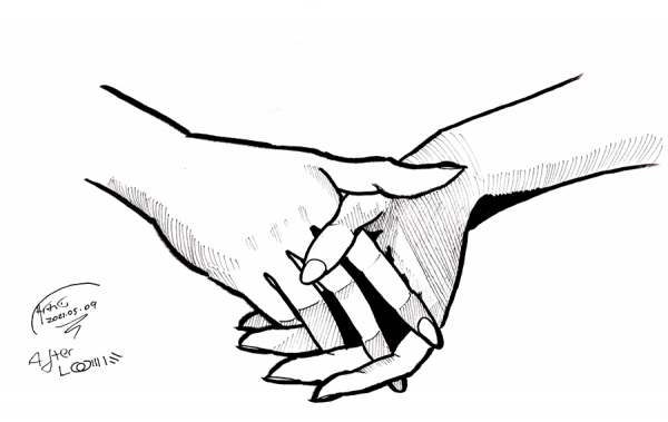
Clasped hands from the title page of Drawing the Head and Hands by Andrew Loomis. While this was from a full drawing after pencil roughs, I did simplify the rendering to use just five primary levels of value (white, black, two levels of crosshatching, plus the ink outlines of course) to make it easier on me.
The outcome: not … terrible, but not great. I’m not going to include a scan of the original as it is inside the book, but for comparison, here’s my attempt at this drawing from two and a quarter years ago:
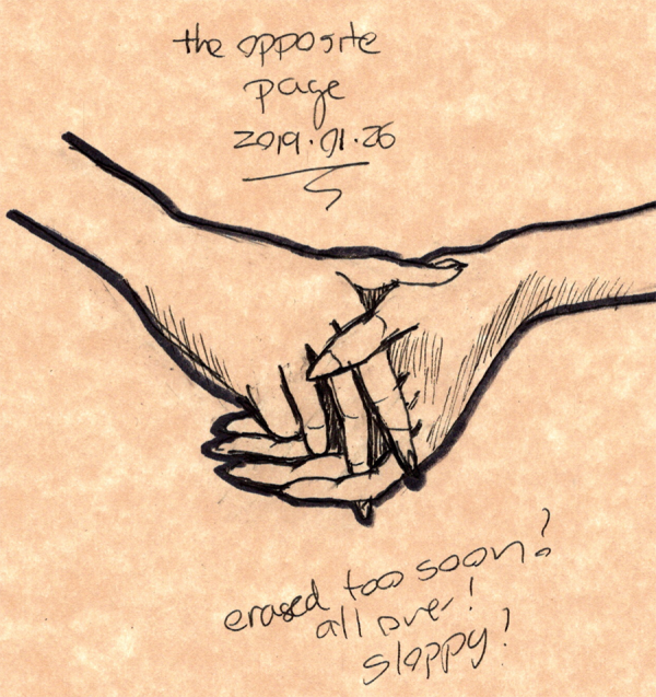
Admittedly, this drawing was much smaller than the new one, but the old one is still pretty sloppy. It does have a nice energy to it, and the dark outlines I use as a crutch make the old drawing pop.
Still, both of these fail to catch something about the barely visible palm of the left hand (in this picture, the left hand is on the right side of the drawing, and the palm is just barely visible at the edge of the index finger) which shows up perfectly fine in Loomis’s drawing with just a few lines. This is definitely one of those times where flipping the drawing 180 makes it easier to see the true shape.
Maybe that’s a sign of a really good drawing: it can look better when rotated or mirror reflected than the original. I sure have a long way to get there.
Drawing every day.
-the Centaur.