
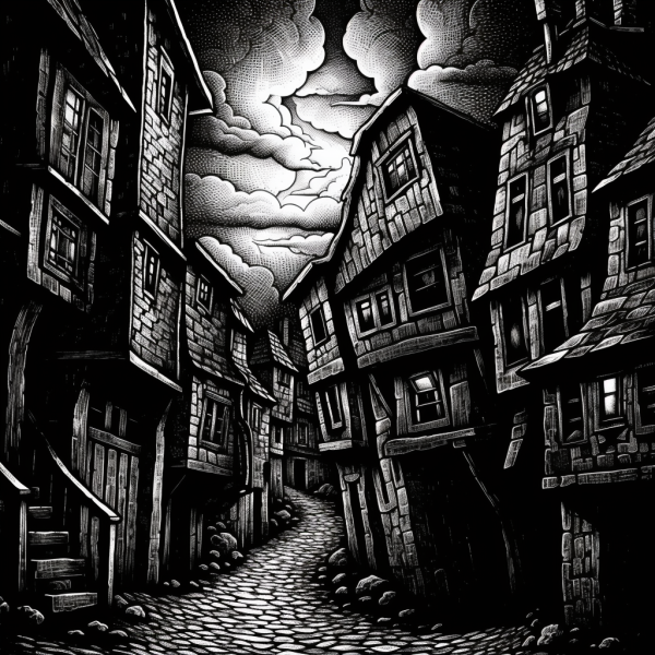
Another Photoshop study, of a chocolate shop in Oakland. Here's the original:

Pity that most chocolate isn't vegan, but it sure is a nice storefront with the chocolates and the origami.
-the Centaur
Words, Art & Science by Anthony Francis
Another Photoshop study, of a chocolate shop in Oakland. Here's the original:
Pity that most chocolate isn't vegan, but it sure is a nice storefront with the chocolates and the origami.
-the Centaur

I'd gotten out of the habit of doing these quasi-comic style art pieces based on photographs, but I've taken a few really good candidate pictures with the right layout for it, so I hope to get back into doing that. This is a picture of one of Sandi's art pieces she completed this weekend at Silicon Valley Open Studios, and it will now be on display at Kaleid Gallery in San Jose. Neat fact: this little guy is actually a cabinet!

Still, he's a little guy.

-the Centaur
Pictured: One of Sandi's sculpture cabinets, to be on display at the Kaleid Gallery.

Digging through my photos, looking for things I had forgotten to blog, I found some nice pictures of some cherry blossoms, and decided to Photoshop-rendition them into an illustration.
Please enjoy this bonus illustration!
-the Centaur
Pictured: Um, I said it already, cherry blossoms, seen through a window, then Photoshopped. This is about 8 layers of perspective tweaks, color / tone / contrast adjustments, filters, masks and layer effects.
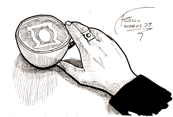
A barista noticed my Green Lantern ring, and gave me a Green Lantern mocha. :-D

-the Centaur
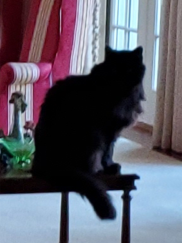
Loki, trying to pull off his best Le Chat Noir:

He moved before I could get a good closeup, though, because Loki is a cat.
-the Centaur
If you want to get better at drawing, you really need to treat it like any other skill, and practice ahead of your performance. We may learn by doing, but you don't get enough learning time or variety just from actually performing the task. Basketball players need to cross-train in addition to shooting hoops - not just play games. Chess masters practice with coaches. Writers scribble in their notebooks. And artists sketch.
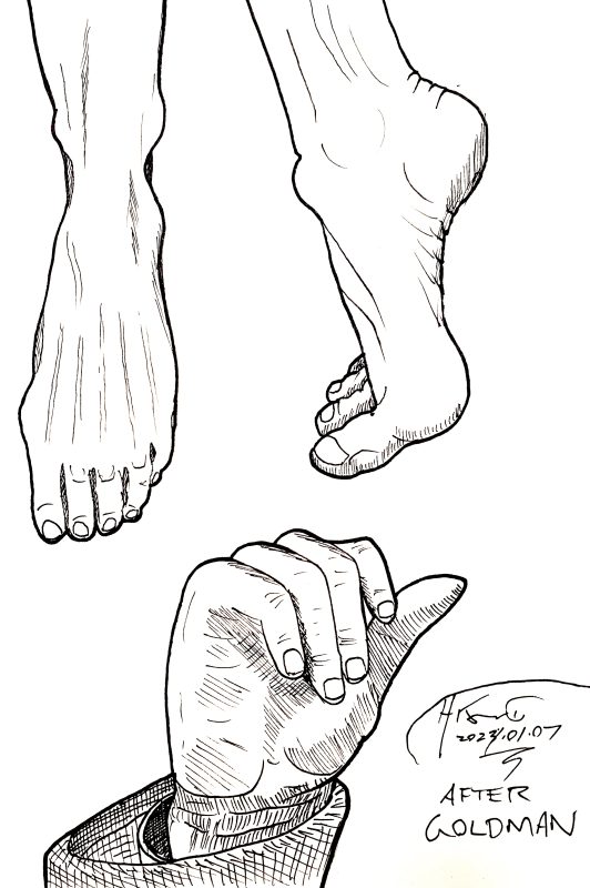
My horse drawing book was too big to fit in my bookbag, so today's exercise is from the cover of Drawing Hands and Feet by Ken Goldman.
-the Centaur
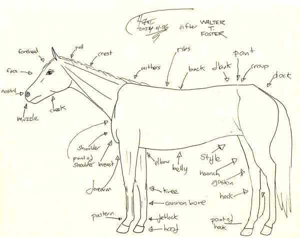
More practice from Foster's book. I was shy on time, so I didn't start with the proportions diagram, but with the parts diagram, and therefore the proportions of my parts are a bit off. But, it's a step.
-the Centaur
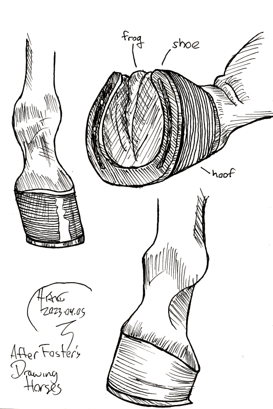
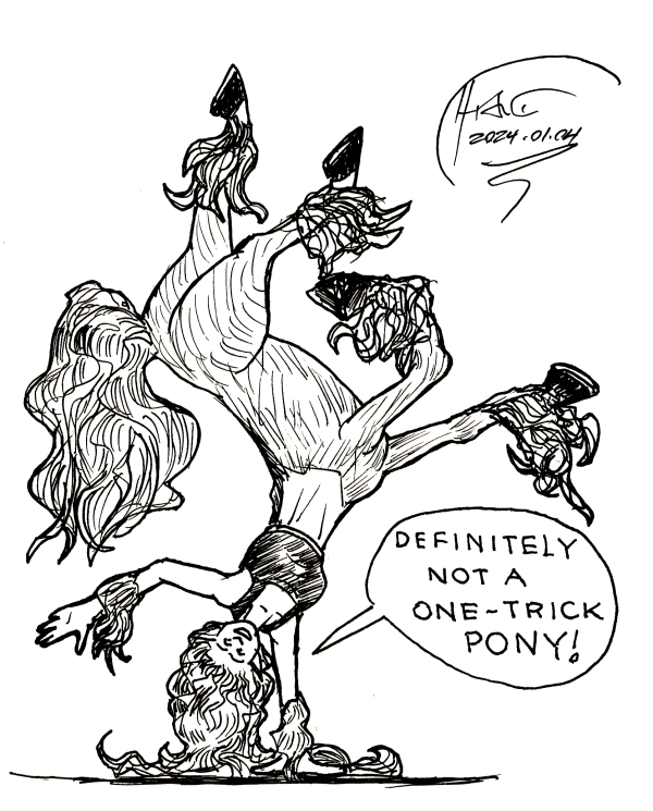
Well, logically speaking, if I want to "plan for success" in my art, and I've drawn a centauress with some hooves that I don't like, I should focus on getting better at drawing hooves. From Foster's "Drawing Horses" book, sketched in my little "One Trick Pony" sketchbook.
-the Centaur
P.S. I am totes going back and renaming the last art post "a second pony trick".
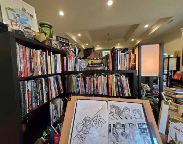
One of the productivity tools I use is a technique called "plan for success." I mostly use it for todo lists, and for that topic it's worth a blog post of its own, but, briefly, when taking on a task, I like to start off with a "plan for success" sheet where I list:
Once I have that, I start listing todo items, then categorizing them into the four Stephen Covey quadrants - Urgent and Important, Not Urgent yet Important, Urgent yet Unimportant, and Not Urgent and Not Important. Making sure that the "Not Urgent yet Important" stuff gets done is the hardest part, so I usually tranche the TODOs into "do immediately, do today, do before I leave".
But the whole "plan for success" idea came from an artist - I don't remember who - talking about the difference between professionals and amateurs. An amateur may produce great art, they said, but on accident, even if they're skilled, because they don't know how they're doing what they're doing. A professional, on the other hand, makes a plan to ensure that their art piece succeeds. They may not always succeed at it - plenty of professional artists have to start pieces over - but they don't paint themselves into a metaphorical corner as much because they've taken steps to ensure the piece comes out well - for example, by getting reference art, doing perspective or construction lines, or practice drawings.
I wonder if this idea also works for learning art? Let's find out.
-the Centaur
Pictured: My drawing desk and books on drawing.
Let's see you do that, ChatGPT / DALL-E! Wait, what happens if we try it?
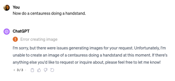
Ha-ha! Three strikes, you're out! (ChatGPT tried and failed three times to generate this image). DALL-E may be a better renderer than me, but it isn't better at imagining the things that I want to imagine.
No plans on giving up drawing soon.
-the Centaur
P.S. This is Porsche the Centaur again, this time with construction lines drawn in pencil, later erased. The upside-down nature made it hard to get the hooves right, and I didn't want to re-draw it, so it could have come out better. But! It went much faster practicing in the smaller "One Trick Pony" notebook. Onward!
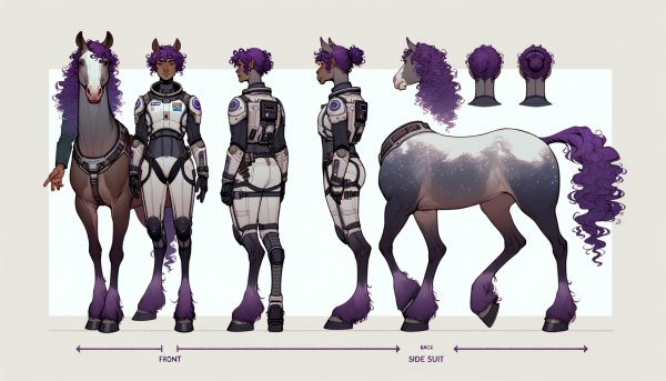
Okay, I'm going to start out with the best of the images that I produced trying to create Porsche the Centaur using ChatGPT's DALL-E interface. The above is ... almost Porsche, though her ears are too high (centaurs in the Alliance universe have ears a little more like an elf, but mobile like a dog's). And, after some coaxing, the ChatGPT / DALL-E hybrid managed to produce a halfway decent character sheet:
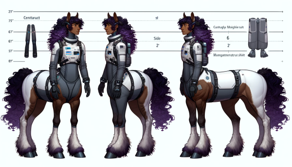
But both of these images came after several tries. And when I tried to get ChatGPT / DALL-E to generate a front and back view of the same character sheet, it just disintegrated into random horse and human parts:
Similarly, the initial centaur image came only after many prompt tweaks and false starts, like this one:
There are legitimate questions about whether the current round of AI art generators were trained on data taken without permission (they almost certainly were), whether they could displace human artists (they almost certainly will), and whether they will have destructive effects on human creativity (the jury is out on this one, as some forms of art will wane while new forms of art will wax).
But never let anyone tell you they've worked out all the bugs yet. These systems are great renderers at the image patch level, but their notion of coherence leaves a lot to be desired, and their lack of structural knowledge means their ability to creatively combine is radically limited to surface stylistics.
One day we'll get there. But it will take a lot of work.
-the Centaur
Drawn from a paused frame of "The Church on Ruby Road", the first full episode of the 15th Doctor.
-the Centaur
P.S. I apparently was wrong: I thought I had kept up Drawing Every Day for 103 days in 2021, but actually it was 205 days that started in late, late 2020, with a brief spurt in 2023. So this is the third time I've tried it! Best of luck Dr. Francis on beating your past winning streak.

Just Loki, on the back patio, looking at a leaf ... with a little added magic (full size).
Producing this relatively simple image actually involved a fair number of Photoshop tools, several of which are new "generative AI" tools, but many others of which are just plain old machine vision magic:
I like how it came out, especially given how it started:
I looked at that and thought, "You know, that's almost a Mondrian backdrop" and I was right!
-the Centaur
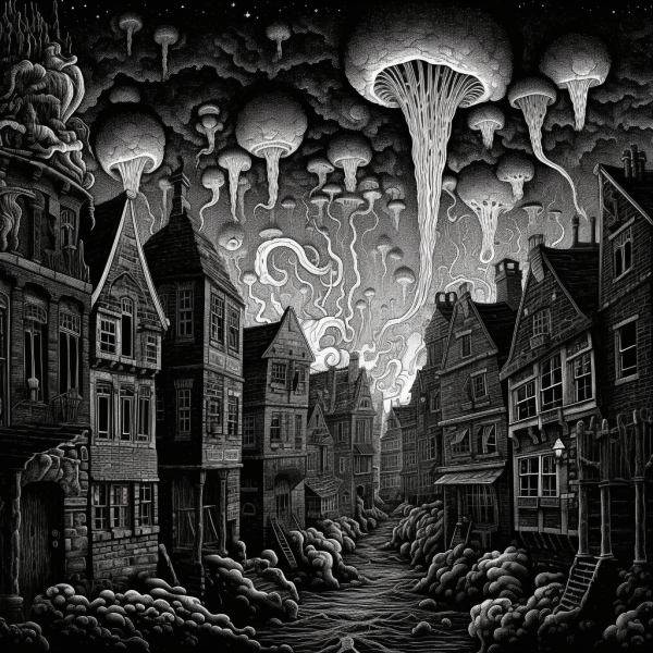
I still have misgivings about using AI-generated art to create final designs without human intervention, and I think AI art needs to address the copyright issue in a meaningful way, but speaking as an artist into cosmic horror, it sure can create some creepy images that are great food for thought. Here's a couple of cool ones from a recent project that I've been working on - great design concepts, whether or not they get used.
Bonus points if you can guess which work this art is designed to illustrate.
-the Centaur
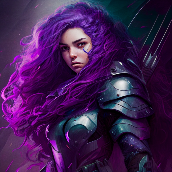
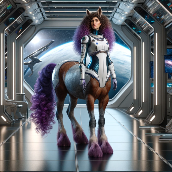
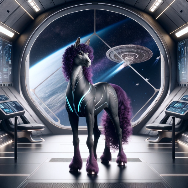
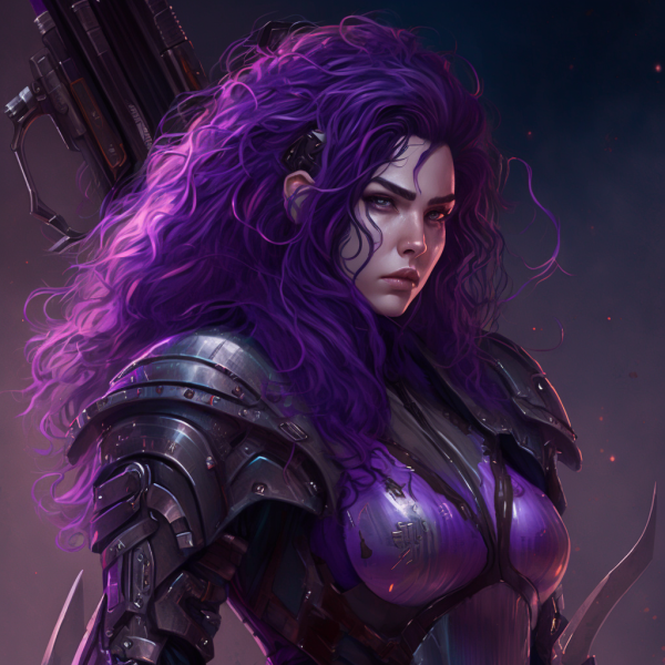
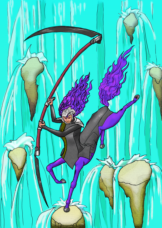
SO, one of my favorite characters is Porsche, a centauress warrior from the thirty-first century who populated many of my first tranche of as-yet-unpublished science fiction stories. (I think she only appears in one published story, "Stranded" in the anthology of the same name, and even that, just as a cameo). And while I have worked a lot to improve my art, I wondered what Midjourney could do. And I got the above result from the following prompt:
a centauress with long, rich curly purple hair, very beautiful, with half-asian, half-english appearance, and pointed ears, wearing an armored space costume like a combination of ghost in the shell and star trek, and bearing a double-bladed scythe with black glowing blades
- the Centaur
Wow. This is really spot on. Her hair is right, her face is right, her skin tone is right, her armor is right ... heck, even her slightly haunted look is right, and to go beyond even that, one of the variants looks like a slightly older, more grizzled variant, which completely checks out with her storyline:
Kudos to you, Midjourney, except ... she's not a centauress. She's just a person, a fetching one, I admit, but not a half-woman, half-horse creature with the pointed ears and black twin-bladed scythe of the prompt.
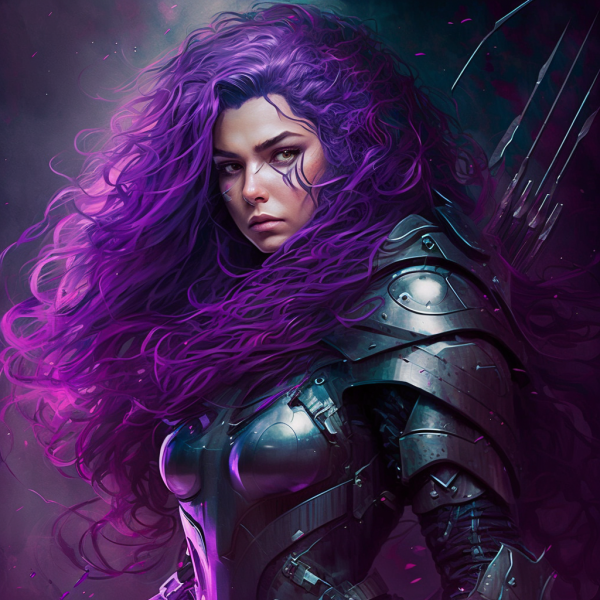
Well, shoot. What if we look at some of the other variants?
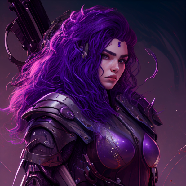
This one is creepily good in a sense ... it's got her forehead dot (she's a First Contact Engineer, and wears a pheromone bead she used to communicate with a scent-based alien hive species) and even hints of her mechanical arm and possibly ear. But this is just coincidence. Look at this other variant:
What appears is just chance. Here, her ears are rounded, the dot's gone, and the weapon looks even less on point. A lot of what looked right to me is just random features onto which I was projecting, like cloudbusting.
Well, double shoot. What if we refine the prompt? What do we get?
a centauress (a creature with the upper body of a woman and a lower body of a horse) with long, rich curly purple hair, very beautiful, with half-asian, half-english appearance, and pointed ears, wearing an armored space costume like a combination of ghost in the shell and star trek, and wielding a scythe with black glowing blades
- the Centaur
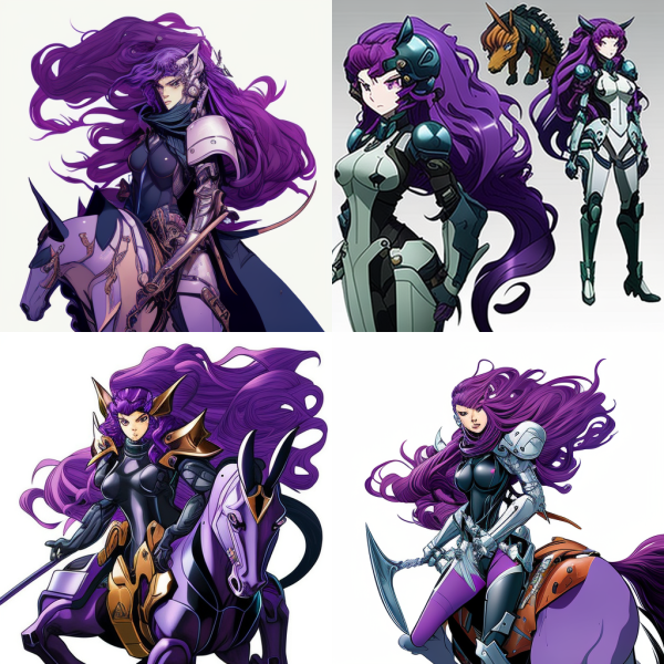
Yerk. That's ... just jumbled nonsense. Tweaks to the prompt to make it simpler just produced women on horses. Midjourney does not apparently understand the concept 'centaur' in any meaningful sense. I tried just the prompt "centaur", and ... um ... yeah ... no, I'm not going to show you those. They're just a guy with a horse, or sort of on a horse, or ... sort of ... in a horse? A centaur as envisioned by The Thing.
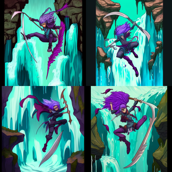
Okay, one last try. What if I give it one of my pieces of art, and then ask it to render it anime style? Let's hold that piece of imagery till the last, but the prompt is:
an anime style centauress with purple hair and a double-bladed scythe jumping in front of a waterfall
--the Centaur
Oh, lordy. And I'm not going to show you the one it tried to generate from the prompt "anime style".
Oh wait, I am!
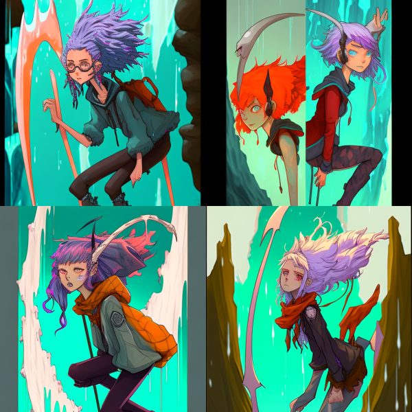
Wow. Evocative - the top left reminds me of Cinnamon Frost - but it has little to do with the image I put in, and the attempt in the top right especially is nonsensical.
I am inspired by Midjourney. It's definitely a better renderer than me, and has good ideas about composition which I have already used in my artwork.
But I stick by my comment that it is an amateur which has taught itself to render very well, and cannot take meaningful art direction. As limited as I am, I'll stick with my own drawing, thank you!
Like this one, the image I gave to Midjourney above. It's not perfect, it's not well rendered ... but it is mine:
And she has four legs, a scythe, and pointy ears, dag nabit.
-the Centaur
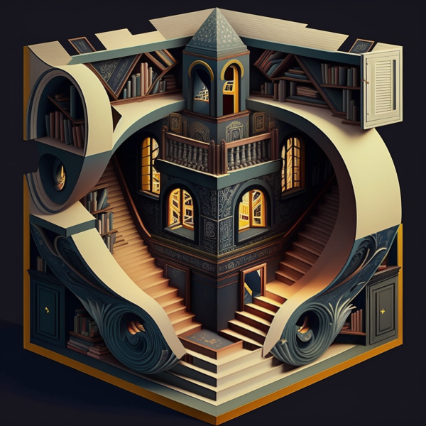
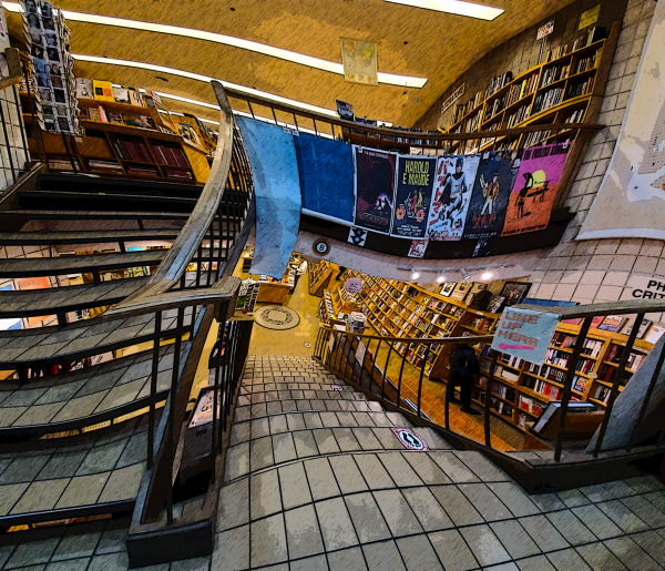
SO automatic image generation is a controversial thing I think about a lot. Perhaps I should comment on it sometime. Regardless, I thought I'd show off the challenges that come from using this technology using a simple example. If you recall, I did a recent post with a warped bookstore picture, and attempted to regenerate it using generative AI with Midjourney. Unfortunately, the prompt
a magical three-dimensional impossible bookstore in the style of M.C. Escher
me
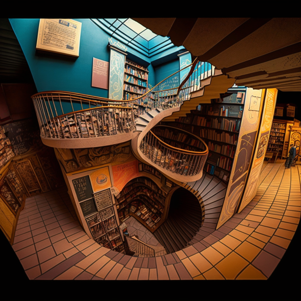
failed to pick up the image for some reason. After a few iterations with the Midjourney Discord interface, I got the very nice, but nonsensical and generic, AI generated image you see up top. After playing around with the API, I realized that I likely had formulated my prompt wrong, and tried again to include this image:
On the second pass, I got another, more on-point, yet still nonsensical image as you see below:
These systems do LOOK impressive. But they work like ... amateurs who've learned to render well. They can produce things that are cool, but it's very hard to make them produce something on point.
And this is above and beyond the massive copyright issues that arise from a system that regurgitates other people's copyrighted art, much less the impact on jobs, much less the impact on the human soul.
-the Centaur
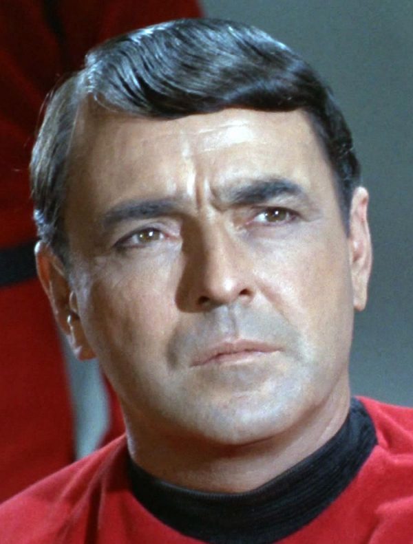
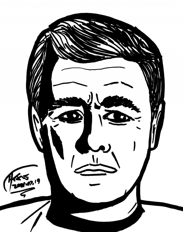 Day 206, a sketch of Montgomery Scott from Star Trek:
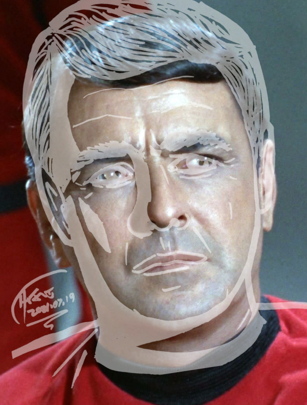
 How ddid I do? Still can't seem to draw a correctly tilted head, and face to hair proportions continue to be off:
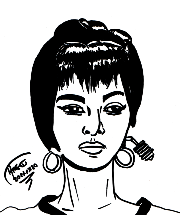
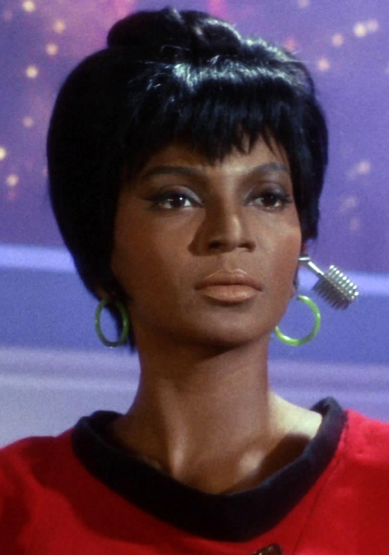
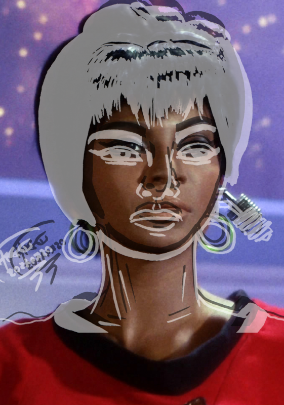
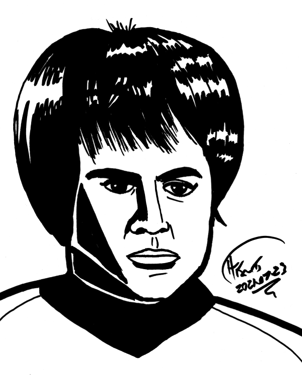
 Day 207, Nyota Uhura:
 Umn, well, it is the same person, sort of, but she's looking down, and the original, up:
 So, no real way to make these line up, but it isn't totally terrible:
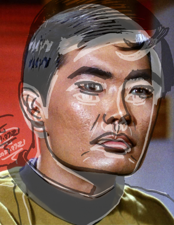
 Day 208, Hikaru Sulu:
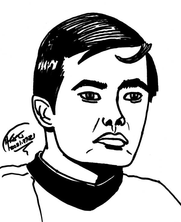 Again, more or less the same person, but I made him look down, and what happened to his chin?
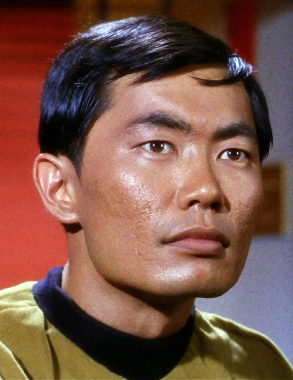 Overall comparison cannot be made to line up:
 Day 209, Pavel Chekhov. I don't have the original reference on this computer, but I'm sure a comparison would be equally terrible to all the others, if not worsee.
 Drawing every day, posting when i get to it.
-the Centaur
Drawing every day, posting when i get to it.
-the Centaur
 The back of Cinnamon Frost, after a painting by my wife. Drawing every day, even if I wasn't posting.
-the Centaur
The back of Cinnamon Frost, after a painting by my wife. Drawing every day, even if I wasn't posting.
-the Centaur 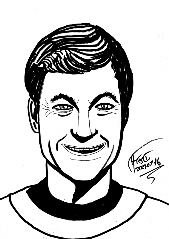
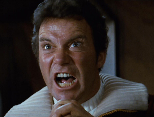
Day 203: Damnit, Jim, I'm a sketch, not a headshot!
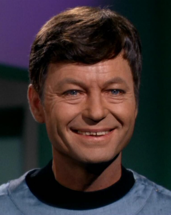
Let's see how I did:
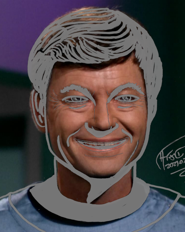
Huh ... not entirely terrible, though it needed stretching horizontally.
What about Day 204? A quick sketch of Dakota Frost:
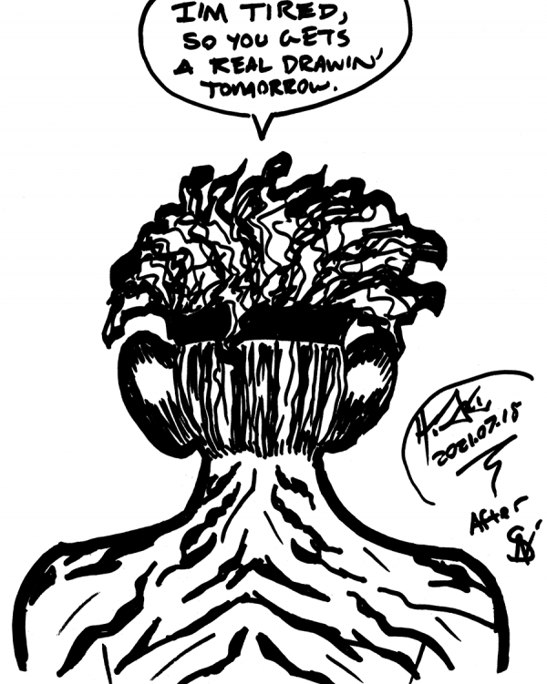
Day 205 apparently hasn't been cleaned up, so we'll return to that.
Drawing every day, posting when I get to it.
-the Centaur
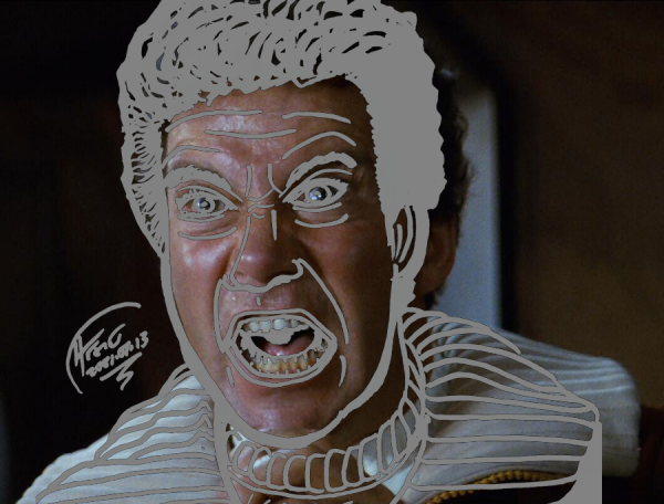
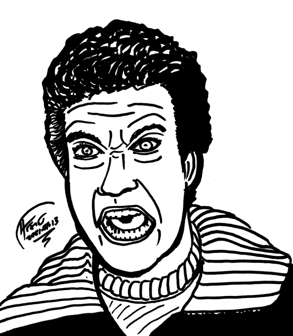 Day 200 - Khaaan! Let's see how I did:
 Meh. Head not wide enough.
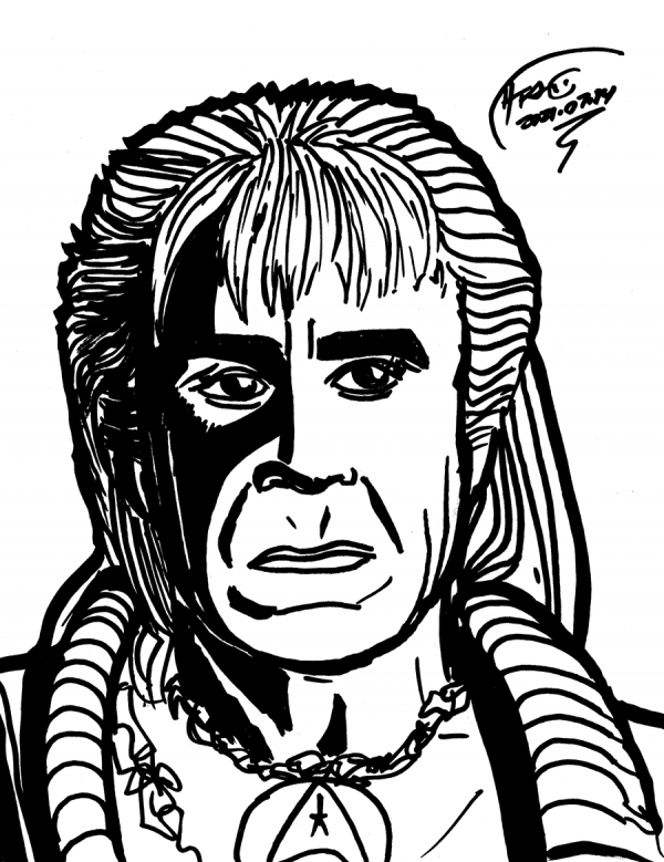
 Day 201 - Khan, the man himself:
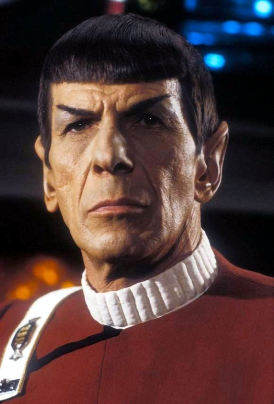
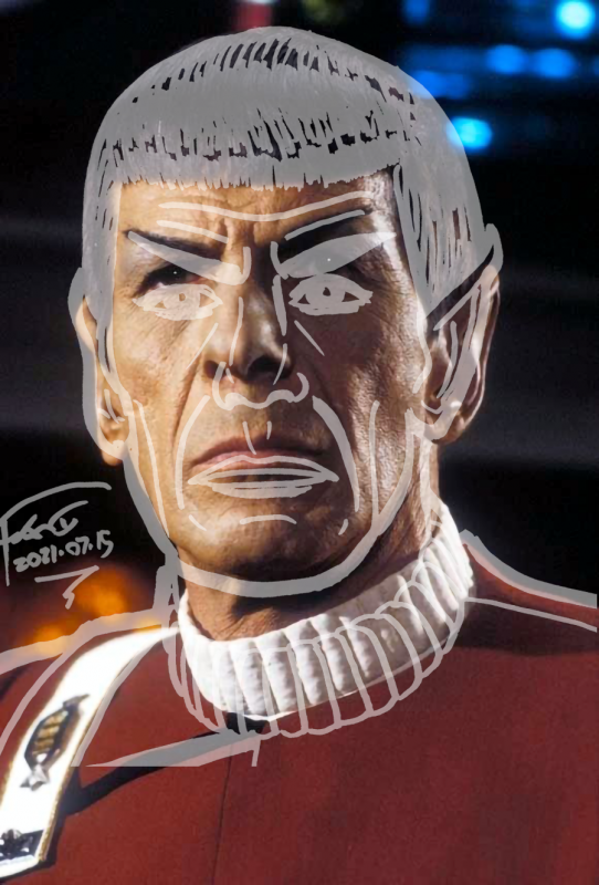
 Day 202 - Spooock!
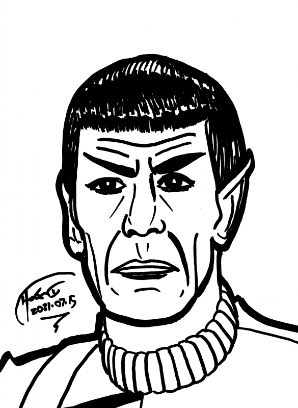 Let's see how I did:
 As I recall, there was no good way to line up the face and the hair.
 Drawing every day.
-the Centaur
Drawing every day.
-the Centaur 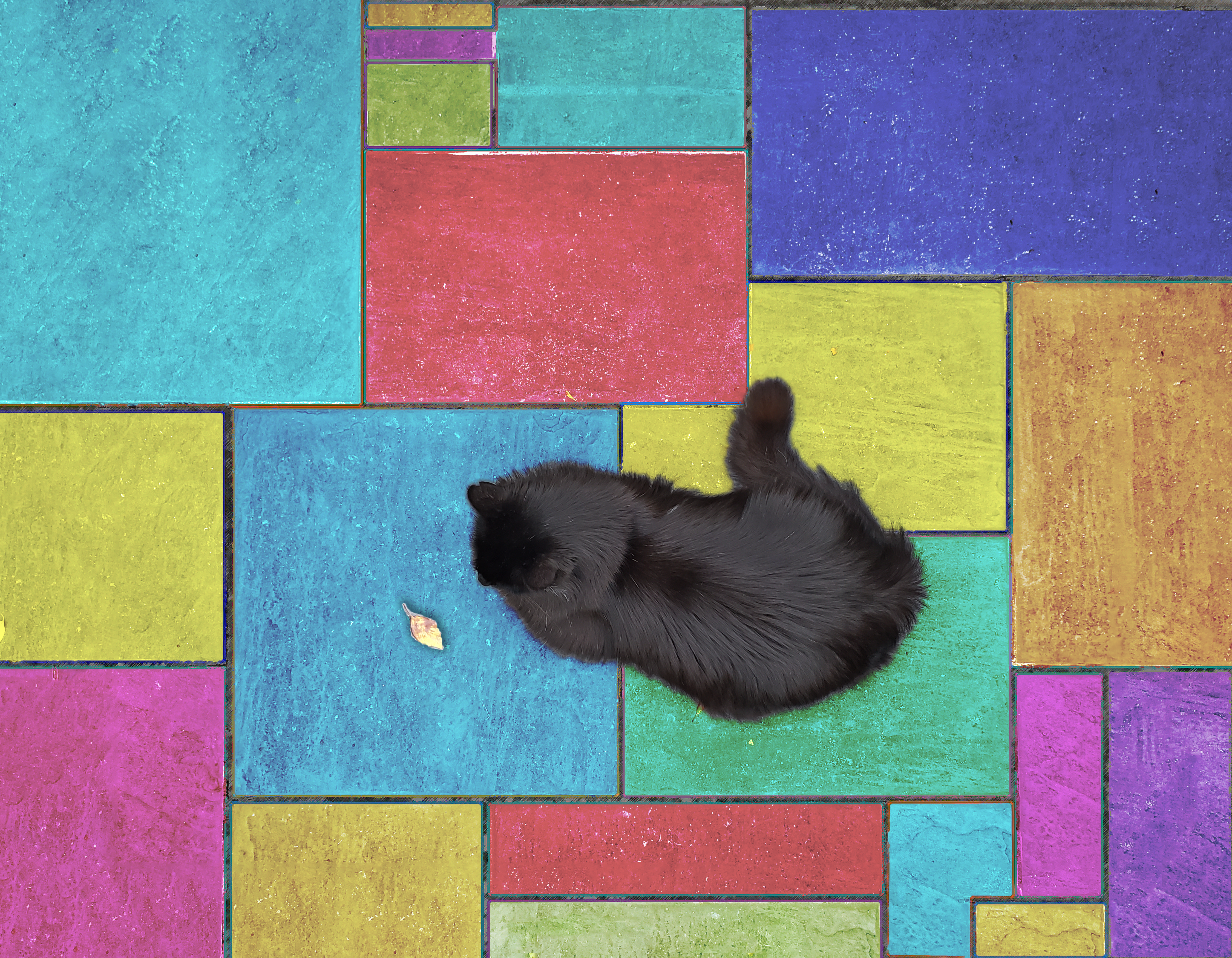