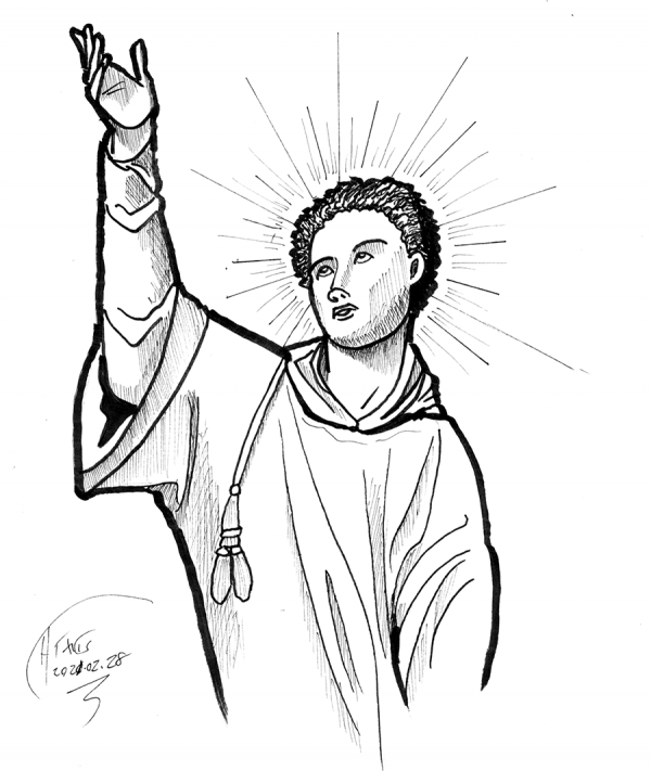
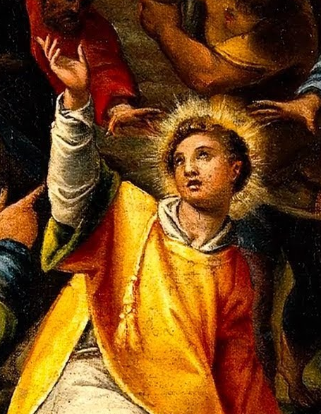
 Saint Stephen, proto-martyr. The face is a bit weird, but, in fairness, the original's face is a bit weird too. I forgot to do the thing where I rotate the picture 180 to see if the shape is right.
 Drawing every day.
-the Centaur
Drawing every day.
-the Centaur Words, Art & Science by Anthony Francis
Saint Stephen, proto-martyr. The face is a bit weird, but, in fairness, the original's face is a bit weird too. I forgot to do the thing where I rotate the picture 180 to see if the shape is right.
Drawing every day.
-the Centaur  It's late and I'm tired, so you get a quick sketch of David Wolpert today and a real drawing tomorrow. Inked no-regrets straight on Strathmore 9x12, no roughs whatsoever, using only a Pigma Micron 1 for lines and a honking Sharpie for the black areas. Mostly good, but, comparing with the original photo I used for reference, it looks like I broke his nose:
 Still, drawing every day.
-the Centaur
Still, drawing every day.
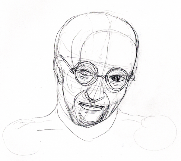
-the Centaur  Andrey Markov, roughed with a 2B pencil on Strathmore 9x12. I then rotated the drawing and the reference photo 180 to correct errors, over a couple of quick passes, before inking directly on the paper with Sakura Pigma and Micron pens. Not completely terrible, but I still need to practice drawing eyes.
 Drawing every day.
-the Centaur
Drawing every day.
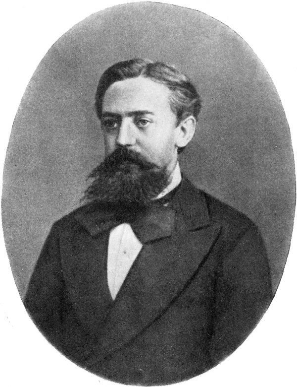
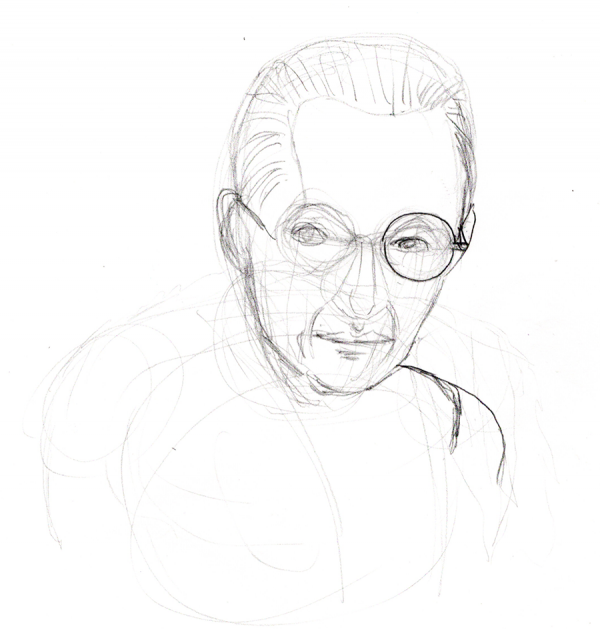
-the Centaur 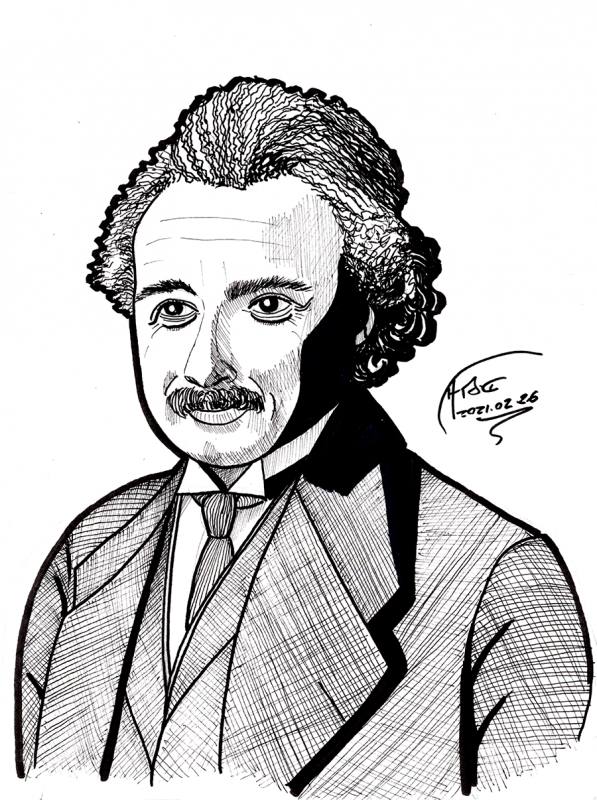 Einstein on Strathmore 9x12. First roughed with a #2 pencil, again using the trick of rotating it 180 so that I could force myself to see and draw what was there, not a caricature of a face. This came out good enough that I half-erased it, finessed the lines, and half-erased again, tightening up, before inking with Sakura Pigma and Micron pens. As for whether the face looks like a face ...
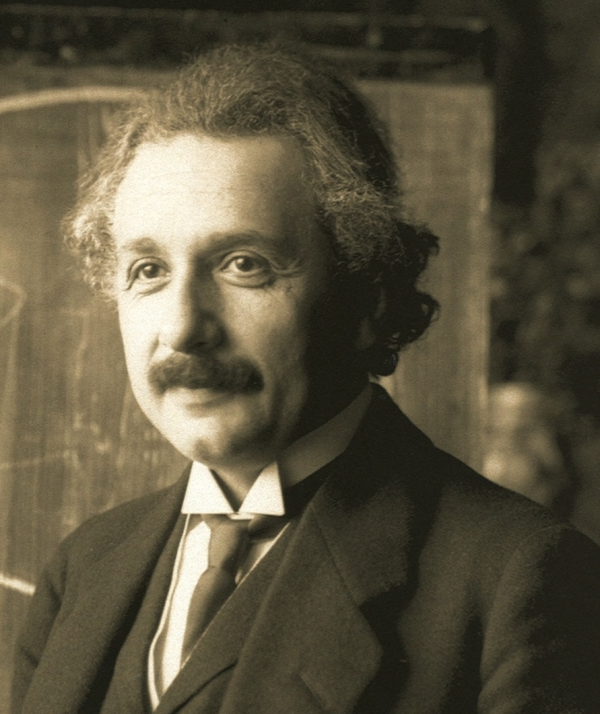 ... I do see things to fix, but I am not so unhappy with this one. I put special focus on the relative position, shape, and direction of the eyes, and cross-correlated with the mustache, hair and ears; a few more tweaks to the eyes, eyebrows and lip direction, plus the eye direction, really brought out the smile.
Drawing every day.
-the Centaur
... I do see things to fix, but I am not so unhappy with this one. I put special focus on the relative position, shape, and direction of the eyes, and cross-correlated with the mustache, hair and ears; a few more tweaks to the eyes, eyebrows and lip direction, plus the eye direction, really brought out the smile.
Drawing every day.
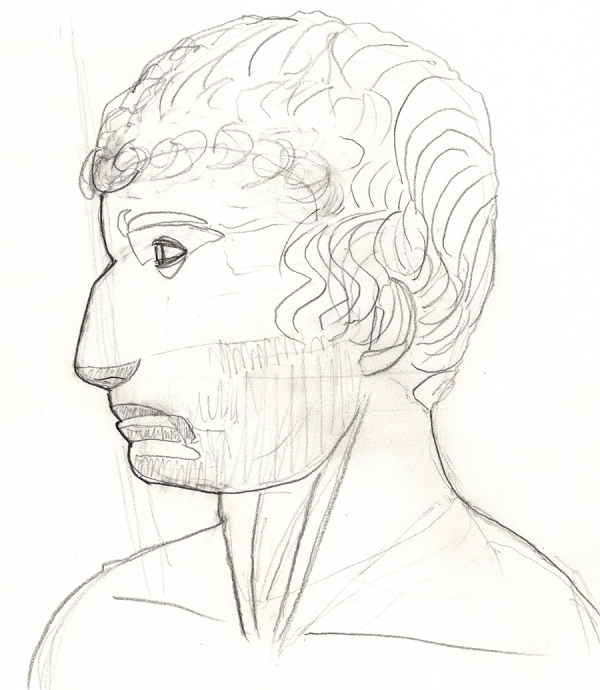
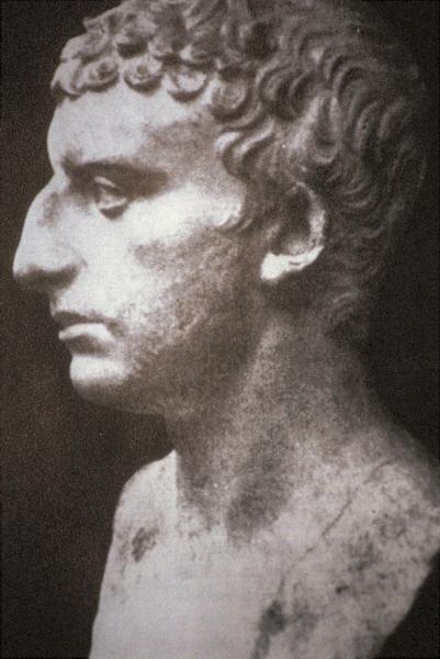
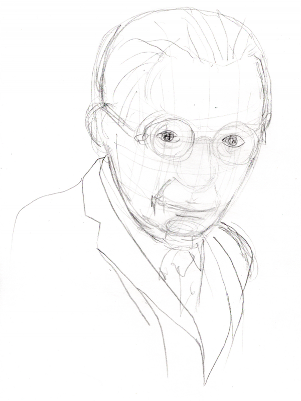
-the Centaur  A sketch of Josephus the historian on tracing paper using Sakura Pigma and Micron pens. I started sketching with a Winsor-Newton 2B pencil on Strathmore, but the face wasn't coming out quite right. To correct it, I opened Google Meet - yes! - which mirror-reflects the images it presents of yourself (so you see what you normally see in a mirror and aren't weirded out). I already had Josephus's bust up in a Preview window, so I mirror-reflected that horizontally and compared them, trying to make fixes.
Mirror reflecting a drawing helps you see flaws in it, and that helped, but on the fine details of the face, it's really hard for me to draw things like lips and noses as what is there, rather than what my mind caricatures, so I eventually flipped the drawing back to normal and rotated it 180, so I would not see the stereotypes and instead had to focus on the shapes.
And when I was done with all that, I decided that it was still off, and I needed to start over.
A sketch of Josephus the historian on tracing paper using Sakura Pigma and Micron pens. I started sketching with a Winsor-Newton 2B pencil on Strathmore, but the face wasn't coming out quite right. To correct it, I opened Google Meet - yes! - which mirror-reflects the images it presents of yourself (so you see what you normally see in a mirror and aren't weirded out). I already had Josephus's bust up in a Preview window, so I mirror-reflected that horizontally and compared them, trying to make fixes.
Mirror reflecting a drawing helps you see flaws in it, and that helped, but on the fine details of the face, it's really hard for me to draw things like lips and noses as what is there, rather than what my mind caricatures, so I eventually flipped the drawing back to normal and rotated it 180, so I would not see the stereotypes and instead had to focus on the shapes.
And when I was done with all that, I decided that it was still off, and I needed to start over.
 Since it's late and I'm tired, I pulled out my tracing paper and attempted to correct the drawing by tracing over my own roughs, below. The advantage of this approach is that I can change anything, or even neglect to trace something which was done correctly on the previous level, so, best of both worlds. I think I did pretty OK, though I had not noticed that I'd exaggerated the vertical height of his nose.
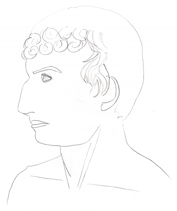 Compared to the original ... well, yeah, Josephus has a heck of a schnoz, but I made it like 10-15 percent too tall, and missed the straight line on the hair on the bottom back of his head.
 Otherwise, a ... not completely terrible rendition?
Drawing every day.
-the Centaur
Otherwise, a ... not completely terrible rendition?
Drawing every day.
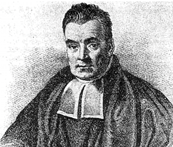
-the Centaur  It's late, and I'm tired. Here's an alleged sketch of an alleged picture of Thomas Bayes.
 Eyes are off (more visible if you mirror flip the sketch). And I still am making heads too fat.
Still, drawing every day.
-the Centaur
Eyes are off (more visible if you mirror flip the sketch). And I still am making heads too fat.
Still, drawing every day.
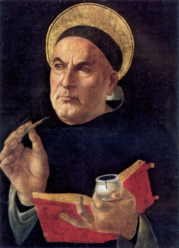
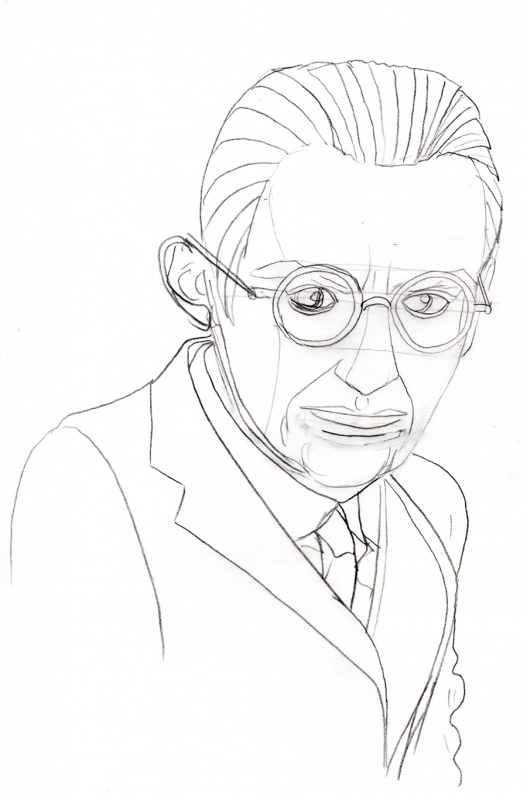
-the Centaur 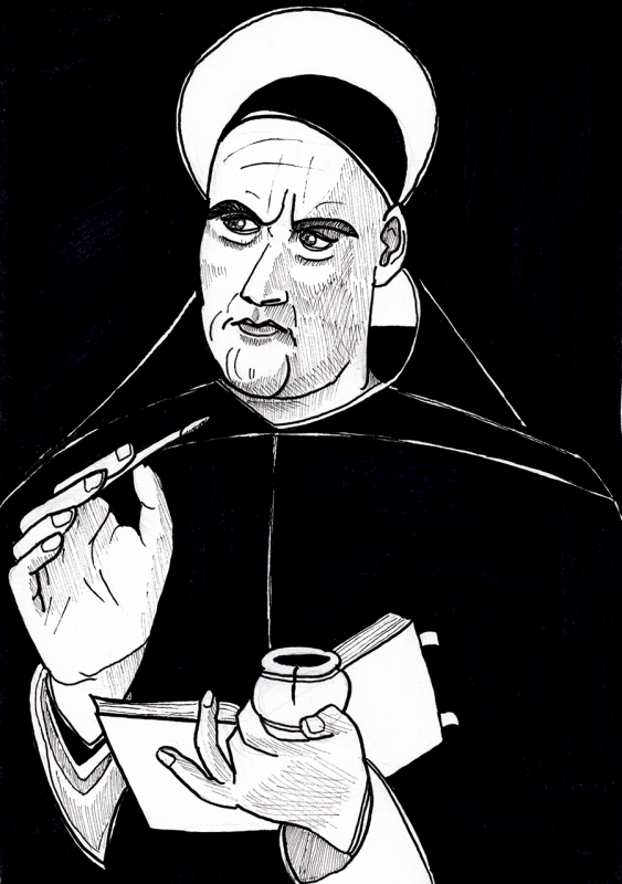 A drawing of St. Thomas Aquinas, trying to make faces look like faces. I don't think I made his face quite fat enough (an opposite problem from previously), and while the relative positions of the eyes are OK, they seem tilted in place. Also, I think I can do better on the ink rendering, in part with better technique, in part by taking more time - though I did deliberately skimp on the time spent on rendering a bit so I could get to bed at an earlier hour tonight - as Saint Aquinas might have said, nothing overmuch!
 Ah well. The fix is ... to keep drawing every day.
-the Centaur
Ah well. The fix is ... to keep drawing every day.
-the Centaur 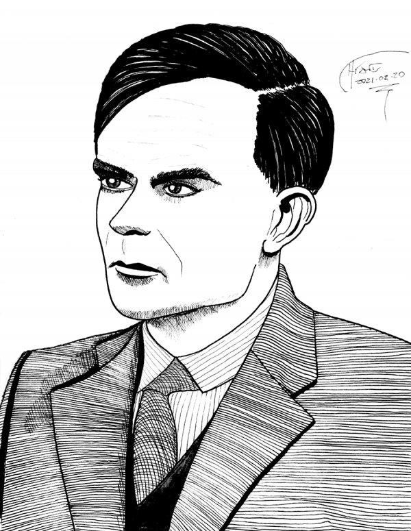 Alan Turing, rendered over my own roughs using several layers of tracing paper. I started with the below rough, in which I tried to pay careful attention to the layout of the face - note the use of the 'third eye' for spacing and curved contour lines - and the relationship of the body, the shoulders and so on.
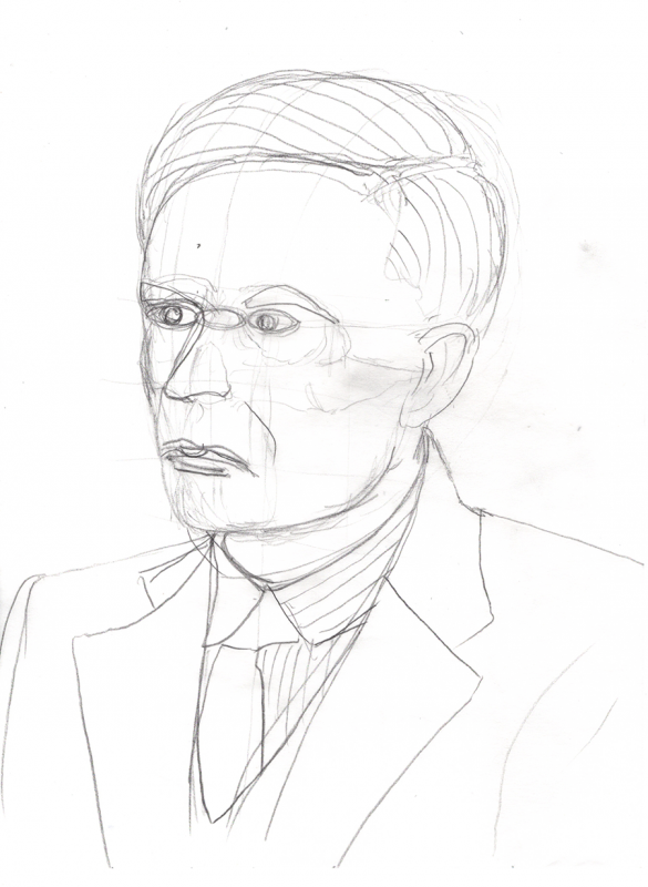 I then corrected that into the following drawing, trying to correct the position and angles of the eyes and mouth - since I knew from previous drawings that I tended to straighten things that were angled, I looked for those flaws and attempted to correct them. (Still screwed up the hair and some proportions).
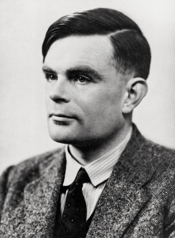
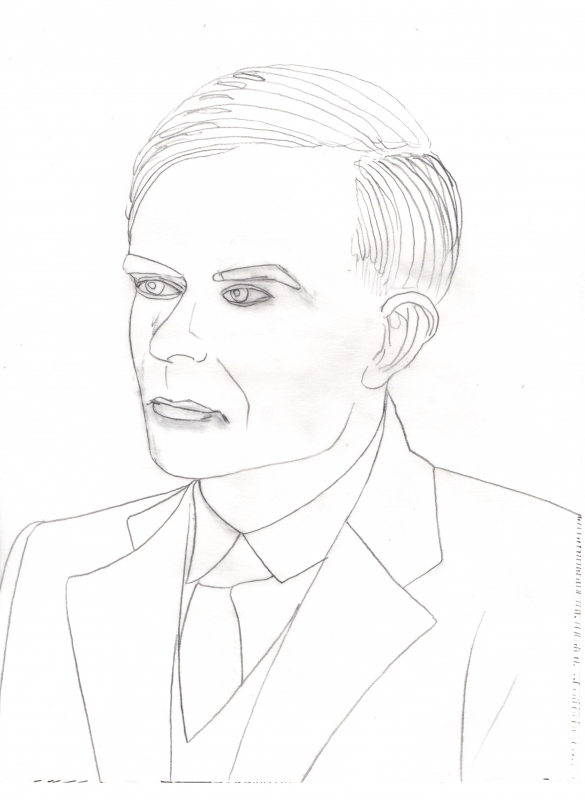 This was close enough for me to get started on the rendering. In the end, I like how it came out, even though I flattened the curves of the hair and slightly squeezed the face and pointed the eyes slightly wrong, as you can see if you compare it to the following image from this New Yorker article:
 -the Centaur
  Full drawing of Kurt Gödel from today's Lent entry. Like previous exercises, I traced my own roughs, using a variety of Micron pens. As for whether the face looks like a face ... ehh, mostly? Though I am still apparently inflating noses and cartoonishly exaggerating heads with respect to bodies, making Kurt here look like an extra from Men in Black (thinking of Tommy Lee Jone's comically oversized head).
Where I departed here was throwing out several intermediate roughs, as I did on Day 054. I started off with a normal 2B pencil sketch on Strathmore and quickly decided that it was going nowhere:
Full drawing of Kurt Gödel from today's Lent entry. Like previous exercises, I traced my own roughs, using a variety of Micron pens. As for whether the face looks like a face ... ehh, mostly? Though I am still apparently inflating noses and cartoonishly exaggerating heads with respect to bodies, making Kurt here look like an extra from Men in Black (thinking of Tommy Lee Jone's comically oversized head).
Where I departed here was throwing out several intermediate roughs, as I did on Day 054. I started off with a normal 2B pencil sketch on Strathmore and quickly decided that it was going nowhere:
 Rather than starting over on Strathmore, I switched to tracing paper and tried the following. In some ways I like this drawing more than some of the later sketches - it captures a bit of Gödel's distinctive face - but I rapidly realized I'd again got the macro-architecture of the sketch wrong, shoulders ending up in the wrong place and such. Also, though you can't tell from this crop, it was too small on the page.
 So I started over, producing the following sketch. The face is a bit off here, too wide, looking something like a cross between Mr. Magoo and Joe Biden (if either wore glasses). But I could tell the overall layout was good this time - things were roughly in the right place, and could be corrected with some effort.
 I traced the following directly over the previous sketch, correcting for the shape of the nose and face, but keeping the parts that seemed like they were a good fit. This sketch wasn't perfect either, but it was close enough for me to get started - I had blogposts to write! - and led to the drawing at the top of the page, which I traced over the below drawing, making a few more corrections and allowances for rendering.
 The original? Below, from a Nature article (Credit: Alfred Eisenstaedt/ LIFE Picture Coll./Getty).
 My drawing ... sorta looks like the guy? I still think I can do better, particularly in making faces longer and narrower (a problem I had with the Eleventh Doctor as well). But still ...
Drawing every day.
-the Centaur
My drawing ... sorta looks like the guy? I still think I can do better, particularly in making faces longer and narrower (a problem I had with the Eleventh Doctor as well). But still ...
Drawing every day.
-the Centaur 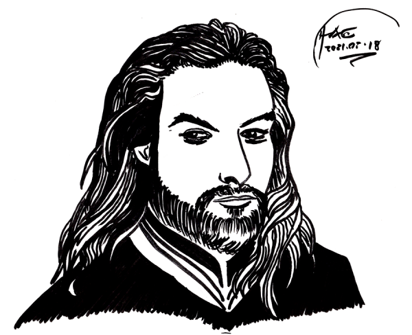 Quick sketch of Jason Momoa, the reference for my Jesus sketch earlier. That sketch I started from scratch and only loosely used Momoa's mug to touch up some details; it still didn't come out great. Also, I sketched it on the Cintiq in Photoshop. This is also a quick sketch, but on Strathmore 9x12 with a Faber- Castell "B" Pitt Artist Pen Brush - and just that. Given that it was pushing 4am, I wanted to try using a simpler technique, to see how much I could extract out of just one pen (well, brush) for the render. As for how much the face looks like a face ...
 Not ... terrible, but the proportions are still off, and my sketch gave him way too big a schnoz. Jason Momoa is a good looking guy, and unfortunately my sketch makes him look more like a rejected villain from the Princess Bride. Ah well. Perhaps I'll eventually be able to sketch good looking superheroes ...
... if I keep drawing every day.
-the Centaur
Not ... terrible, but the proportions are still off, and my sketch gave him way too big a schnoz. Jason Momoa is a good looking guy, and unfortunately my sketch makes him look more like a rejected villain from the Princess Bride. Ah well. Perhaps I'll eventually be able to sketch good looking superheroes ...
... if I keep drawing every day.
-the Centaur 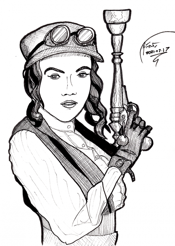 So, today's exercise was something very difficult for me: abandoning a failed rough and starting over.
You see, many artists that I know will get sucked into perfecting a drawing that has some core flaw in its bones - this is something I ran into with my Batman cover page. I know one artist who has worked over a handful of difficult paintings for literally 2-3 years ... but who can produce dozens of new paintings for a show on the drop of a hat. But it's hard emotionally to let go the investment in a partially finished piece.
This is tied up with the Sunken Cost Fallacy Fallacy, the false idea that if you've decided a venture has failed you should cut your losses despite your prior investment in it. This is based on the very real ideas of sunk costs - costs expended that cannot be recovered - which should not be factored into rational decisions the same way that we should prospective costs - costs that can be avoided by taking action. The "Sunken Cost Fallacy" comes in when people don't cut their losses in a failed venture.
The "Fallacy Fallacy" part kicks in because in the real world costs do not become sunk as a result of your decisions. When a self-proclaimed "decider"(1) chooses to proclaim that a project is a failure, the value invested in the project doesn't magically become nonrecoverable based on that decision and the classical Sunken Cost Fallacy does not apply. I have seen a private company literally throw away a two million dollar investment for a dollar because the owner didn't want to deal with it anymore.
Fortunately, most artists are better businessmen than that. Deep down, they know any painting could be the ONE that gets them seen; deeper down, each painting is an expression of their creativity. Even if the painting has flaws, one never knows whether the piece will be fixable, even ultimately excel. I have seen paintings go through years of work and many difficulties, only to finally turn up amazing. Drawings, paintings and novels are like investments in that way, always tantalizing us with their future potential.
But, deep down, I feel like it's possible to do better than that. That by painting or drawing more, and being more ruthless earlier in the process, that it's possible to recognize wrong turns and truly sunken costs and to start over. Once a huge canvas has covered with paint over many months, or a large manuscript has been filled with words over an equal period of time, it represents an investment in images and ideas that can potentially be salvaged ... but a sketch or outline, now, that you can throw out straightaway.
You may not get the thirty minutes doing the sketch back, but at least you'll be starting in a better place.
In my case, I was starting here, the cover for Steampunk Gear, Gadgets and Gizmos I had lying about:
So, today's exercise was something very difficult for me: abandoning a failed rough and starting over.
You see, many artists that I know will get sucked into perfecting a drawing that has some core flaw in its bones - this is something I ran into with my Batman cover page. I know one artist who has worked over a handful of difficult paintings for literally 2-3 years ... but who can produce dozens of new paintings for a show on the drop of a hat. But it's hard emotionally to let go the investment in a partially finished piece.
This is tied up with the Sunken Cost Fallacy Fallacy, the false idea that if you've decided a venture has failed you should cut your losses despite your prior investment in it. This is based on the very real ideas of sunk costs - costs expended that cannot be recovered - which should not be factored into rational decisions the same way that we should prospective costs - costs that can be avoided by taking action. The "Sunken Cost Fallacy" comes in when people don't cut their losses in a failed venture.
The "Fallacy Fallacy" part kicks in because in the real world costs do not become sunk as a result of your decisions. When a self-proclaimed "decider"(1) chooses to proclaim that a project is a failure, the value invested in the project doesn't magically become nonrecoverable based on that decision and the classical Sunken Cost Fallacy does not apply. I have seen a private company literally throw away a two million dollar investment for a dollar because the owner didn't want to deal with it anymore.
Fortunately, most artists are better businessmen than that. Deep down, they know any painting could be the ONE that gets them seen; deeper down, each painting is an expression of their creativity. Even if the painting has flaws, one never knows whether the piece will be fixable, even ultimately excel. I have seen paintings go through years of work and many difficulties, only to finally turn up amazing. Drawings, paintings and novels are like investments in that way, always tantalizing us with their future potential.
But, deep down, I feel like it's possible to do better than that. That by painting or drawing more, and being more ruthless earlier in the process, that it's possible to recognize wrong turns and truly sunken costs and to start over. Once a huge canvas has covered with paint over many months, or a large manuscript has been filled with words over an equal period of time, it represents an investment in images and ideas that can potentially be salvaged ... but a sketch or outline, now, that you can throw out straightaway.
You may not get the thirty minutes doing the sketch back, but at least you'll be starting in a better place.
In my case, I was starting here, the cover for Steampunk Gear, Gadgets and Gizmos I had lying about:
 I started what I intended to be a quick sketch, and got partway into the roughs ...
 ... when I decided that the shape of the face was off - and the proportions of the arm were even further off. I started to fix it - you can see a few doubled features like eyes and lips in there - but I decided - ha, decided - no, stop, STOP Anthony, this rough is too far gone.
Start over, and look more closely at what you see this time.
That led to the drawing at the top of the entry. There were still problems with the finished piece - I am continuing to have trouble with tilting heads the wrong way, and something went wrong with the shape of the arm, leading to a too-narrow, too-long wrist - but the bones of the sketch were so much better than the first attempt that it was easy to finish the drawing.
And thus, keep up drawing every day.
-the Centaur
(1) I'm not bitter.
... when I decided that the shape of the face was off - and the proportions of the arm were even further off. I started to fix it - you can see a few doubled features like eyes and lips in there - but I decided - ha, decided - no, stop, STOP Anthony, this rough is too far gone.
Start over, and look more closely at what you see this time.
That led to the drawing at the top of the entry. There were still problems with the finished piece - I am continuing to have trouble with tilting heads the wrong way, and something went wrong with the shape of the arm, leading to a too-narrow, too-long wrist - but the bones of the sketch were so much better than the first attempt that it was easy to finish the drawing.
And thus, keep up drawing every day.
-the Centaur
(1) I'm not bitter. 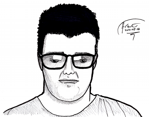 Sketched faces from tonight's Write to the End session. No comparison photos, because my fellow writers deserve their privacy (especially since I used a screen shot which caught one of them in a scowl and the other while speaking), but I know enough to rate this as "meh". The face above expands the hair and squashes the lower face - same mistake from Spock yesterday, so it wasn't just head tilt - and a little of that's going on with the face below, though the biggest problem there is the mouth is too narrow.
 The ultimate goal of these drawings is to rekindle my love of my art and to sharpen my abilities to the point where I can once again resume f@nu fiku, finish my science fiction comic projects, and move on to other comic ideas I have scattered through my notebooks.
My inspiration for this project comes from a young psychology student who took a drawing class just as he was about to graduate, and, inspired, put off medical school with a crash course to break in to the comics field in just one year. He succeeded, and his name is Jim Lee, now Publisher of DC Comics.
I don't expect success in a year - I have a day job and a novel-writing career, not to mention a family - nor do I want to be Jim Lee. But I do want to be Anthony Francis. And Anthony Francis, by day, builds intelligent machines and emotional robots, and by night writes science fiction and draws comic books.
I've built intelligent machines. I've worked on emotional robots. I've written and published science fiction. But the comic books, other than my short stint on f@nu fiku, have eluded me. Connecting thoughts and images is a huge part of my creative expression, yet I seem to have let it fall by the wayside.
But I'm bringing it back by drawing every day.
-the Centaur
The ultimate goal of these drawings is to rekindle my love of my art and to sharpen my abilities to the point where I can once again resume f@nu fiku, finish my science fiction comic projects, and move on to other comic ideas I have scattered through my notebooks.
My inspiration for this project comes from a young psychology student who took a drawing class just as he was about to graduate, and, inspired, put off medical school with a crash course to break in to the comics field in just one year. He succeeded, and his name is Jim Lee, now Publisher of DC Comics.
I don't expect success in a year - I have a day job and a novel-writing career, not to mention a family - nor do I want to be Jim Lee. But I do want to be Anthony Francis. And Anthony Francis, by day, builds intelligent machines and emotional robots, and by night writes science fiction and draws comic books.
I've built intelligent machines. I've worked on emotional robots. I've written and published science fiction. But the comic books, other than my short stint on f@nu fiku, have eluded me. Connecting thoughts and images is a huge part of my creative expression, yet I seem to have let it fall by the wayside.
But I'm bringing it back by drawing every day.
-the Centaur
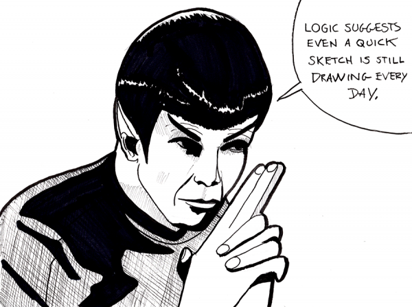 As Spock says: it's 2am, but if it was an hour earlier I'd have done another whole sketch before rendering. The side to side tilt is right, but I've leaned his head way down from what it is, making his face look bashed in. This is sort of the opposite problem from what I was having earlier, so ... yay?
 One of the things about learning is that regular, immediate feedback is important for progress. That's why, when I have reference material for what I'm drawing, that I post both of those here so I can compare and judge what I've done, looking for things to improve.
Drawing every day.
-the Centaur
One of the things about learning is that regular, immediate feedback is important for progress. That's why, when I have reference material for what I'm drawing, that I post both of those here so I can compare and judge what I've done, looking for things to improve.
Drawing every day.
-the Centaur 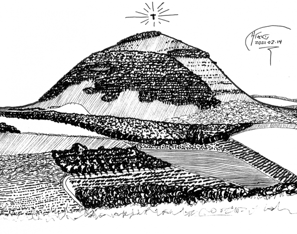 Mount Tabor, sketched to commemorate the transfiguration of Jesus, that moment when Jesus is transformed on a mountaintop as he communes with Moses and Elijah, and Peter somehow loses a screw and decides it's a great time to start building houses. As Reverend Karen of St. Stephens in-the-Field and St. John the Divine memorably said in today's sermon, this was the moment that the disciples went from knowing Jesus only as a human teacher they admired to seeing him as touched with divinity. (And speaking as a religious person from a scientific perspective, this is a great example of why there always will be a gap between science and religion: even if the event actually happened exactly as described, we're unlikely to ever prove so scientifically, since it is a one-time event that cannot be probed with replicable experiments; the events of the day, even if true, really do have to be taken purely on faith. This is, of course, assuming that tomorrow someone doesn't invent a device for reviewing remote time).
Roughed on Strathmore, then rendered on tracing paper, based on the following shot taken in 2011:
Mount Tabor, sketched to commemorate the transfiguration of Jesus, that moment when Jesus is transformed on a mountaintop as he communes with Moses and Elijah, and Peter somehow loses a screw and decides it's a great time to start building houses. As Reverend Karen of St. Stephens in-the-Field and St. John the Divine memorably said in today's sermon, this was the moment that the disciples went from knowing Jesus only as a human teacher they admired to seeing him as touched with divinity. (And speaking as a religious person from a scientific perspective, this is a great example of why there always will be a gap between science and religion: even if the event actually happened exactly as described, we're unlikely to ever prove so scientifically, since it is a one-time event that cannot be probed with replicable experiments; the events of the day, even if true, really do have to be taken purely on faith. This is, of course, assuming that tomorrow someone doesn't invent a device for reviewing remote time).
Roughed on Strathmore, then rendered on tracing paper, based on the following shot taken in 2011:
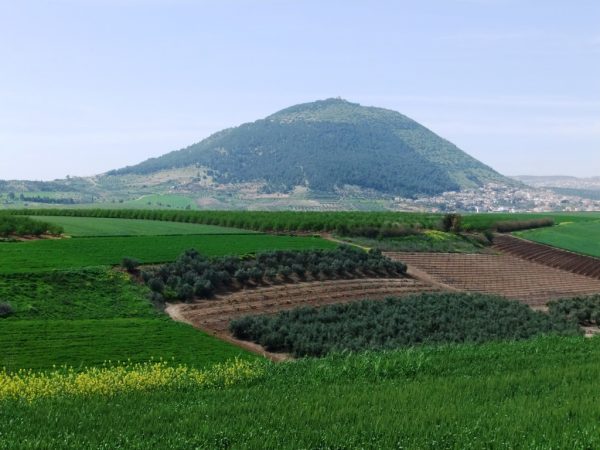 צילם: אלי זהבי, כפר תבור, CC BY 2.5 , via Wikimedia Commons (Author: Eli Zehavi, Kfar Thabor)
I mean, look at that. That mountain is just begging for God do something amazing there. And if God doesn't want it, the Close Encounters mothership and H.P. Lovecraft are top of the waitlist.
It really is proving useful to ink my own rough sketches by hand, then to trace my own art. It is interesting to me though how I vertically exaggerated the mountain when I drew it, which probably explains why a few things kept not lining up the way that I wanted them to. Still ...
Drawing every day.
-the Centaur
P.S. And yes, I accidentally drew the Ascension rather than the Transfiguration, which I guess is fine, because the Mount of Olives looks harder to draw. Check out that 2,000 year old tree though.
צילם: אלי זהבי, כפר תבור, CC BY 2.5 , via Wikimedia Commons (Author: Eli Zehavi, Kfar Thabor)
I mean, look at that. That mountain is just begging for God do something amazing there. And if God doesn't want it, the Close Encounters mothership and H.P. Lovecraft are top of the waitlist.
It really is proving useful to ink my own rough sketches by hand, then to trace my own art. It is interesting to me though how I vertically exaggerated the mountain when I drew it, which probably explains why a few things kept not lining up the way that I wanted them to. Still ...
Drawing every day.
-the Centaur
P.S. And yes, I accidentally drew the Ascension rather than the Transfiguration, which I guess is fine, because the Mount of Olives looks harder to draw. Check out that 2,000 year old tree though. 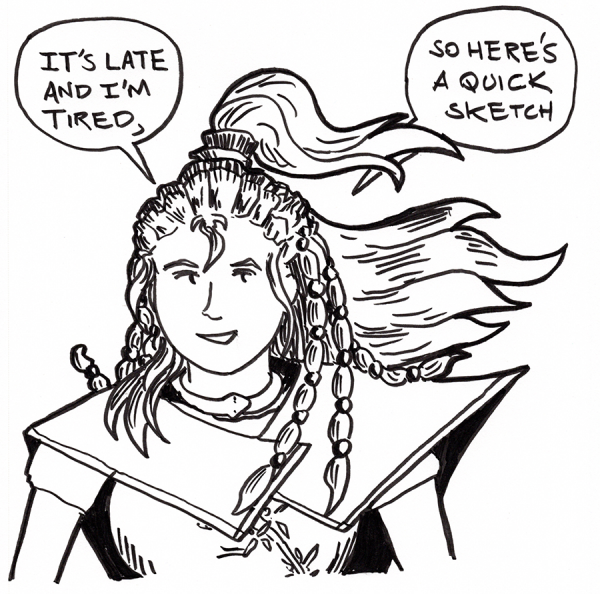 As it says on the tin: a quick sketch of Xiao from f@nu fiku, my quasi-defunct webcomic. I forgot how complicated her character design is, and I left out a lot of it. I mean, I had forgotten that she carries a damn water bottle with her. Knowing the comic, that was probably meant to be plot significant:
 I didn't make her easy to draw, and her outfits only get more complex as the series progresses.
Ah well. Here's hoping those sketches and thumbnails once again turn to webcomic pages.
Drawing every day.
-the Centaur
I didn't make her easy to draw, and her outfits only get more complex as the series progresses.
Ah well. Here's hoping those sketches and thumbnails once again turn to webcomic pages.
Drawing every day.
-the Centaur 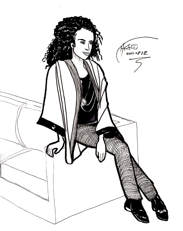 Today's exercise: since I am more comfortable inking, what if I did my pencils IN ink, using tracing paper rather than the tedious erasing of pencils? I think it turned out rather well, though there's an error in the face shape I caught a bit too late and could not fully correct without starting over. Nevertheless, it's not bad. What I started with was this picture, from a local fashion catalog which came to our house:
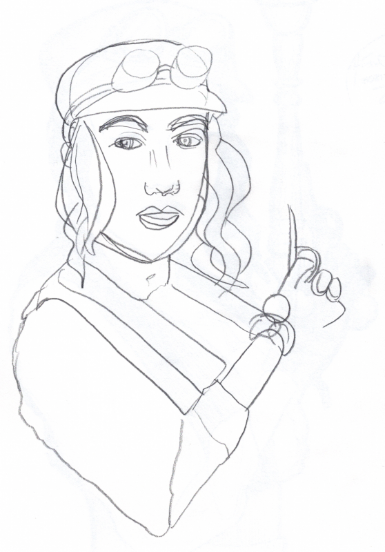
 This I roughed - not traced, roughed by hand - on one sheet of tracing paper:
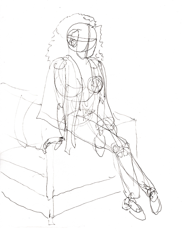 Then, I corrected and tightened this drawing on a second sheet of tracing paper:
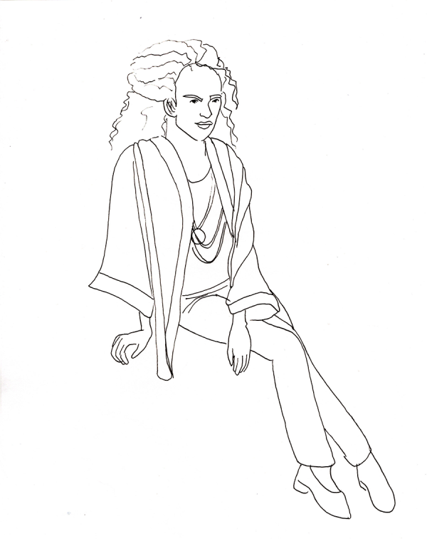 Finally, I corrected and rendered this drawing on the third sheet of tracing paper that started the blog. If this wasn't a drawing every day exercise, I'd have started over on the face, as it was out of proportion and angle to the original reference. I think I have a tendency to straighten up heads, which makes faces that are at an angle look very weird unless I work hard to correct it.
Still ... drawing every day.
-the Centaur
Finally, I corrected and rendered this drawing on the third sheet of tracing paper that started the blog. If this wasn't a drawing every day exercise, I'd have started over on the face, as it was out of proportion and angle to the original reference. I think I have a tendency to straighten up heads, which makes faces that are at an angle look very weird unless I work hard to correct it.
Still ... drawing every day.
-the Centaur 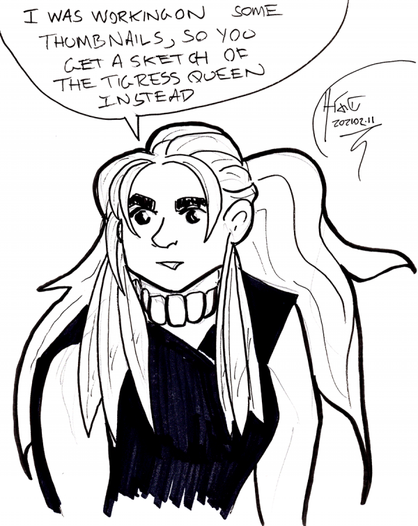 As it says on the tin: I've been trying to improve my artwork by studying how other artists plan for success with technique and thumbnails. The author of Tigress Queen (it's great, it's my latest fave after Kill Six Billion Demons, you should go read it, heck, go read KSBD too) has a Patreon where she posts thumbnails of upcoming pages. What I love about seeing these is that she explicitly draws not just the panels and characters, but parts of the shading and spaces for the word balloons.
I think part of my artistic problem is that I rush and skip steps. Outlining is difficult since I typically do narrative outlines in my novels, so I skip to thumbnails; but pencil sketches don't look right to me, so I move too quickly to drawing inks, and thus my thumbnails aren't at a high enough level themselves to serve as useful thumbnails. Combine that with not enough practice with faces, figures, hands, and feet, and it's hard to get the needed structure in place to make the art come out as success.
Again, I keep coming back to, the solution is ...
... drawing every day.
-the Centaur
As it says on the tin: I've been trying to improve my artwork by studying how other artists plan for success with technique and thumbnails. The author of Tigress Queen (it's great, it's my latest fave after Kill Six Billion Demons, you should go read it, heck, go read KSBD too) has a Patreon where she posts thumbnails of upcoming pages. What I love about seeing these is that she explicitly draws not just the panels and characters, but parts of the shading and spaces for the word balloons.
I think part of my artistic problem is that I rush and skip steps. Outlining is difficult since I typically do narrative outlines in my novels, so I skip to thumbnails; but pencil sketches don't look right to me, so I move too quickly to drawing inks, and thus my thumbnails aren't at a high enough level themselves to serve as useful thumbnails. Combine that with not enough practice with faces, figures, hands, and feet, and it's hard to get the needed structure in place to make the art come out as success.
Again, I keep coming back to, the solution is ...
... drawing every day.
-the Centaur  Who's that? Another exercise in trying to make a face look like a face. This is a new set of techniques based on Erica Henderson of Guilded Age and The Unbeatable Squirrel Girl. According to Wikipedia (original article here) she sketches on a Cintiq using Paint Tool Sai, liberally exploiting the Undo feature to get the sketch right; then she prints this out in blue-line and inks over it, exploiting the ability of Photoshop to remove the blue-lines once scanned.
I tried the same thing here, using Photoshop rather than Paint Tool Sai, and using both Undo and Puppet Warp on various layers to move things around until I had a good sketch, which I printed in blue (greyscale lines below were removed prior to printing, this just shows the evolution):
Who's that? Another exercise in trying to make a face look like a face. This is a new set of techniques based on Erica Henderson of Guilded Age and The Unbeatable Squirrel Girl. According to Wikipedia (original article here) she sketches on a Cintiq using Paint Tool Sai, liberally exploiting the Undo feature to get the sketch right; then she prints this out in blue-line and inks over it, exploiting the ability of Photoshop to remove the blue-lines once scanned.
I tried the same thing here, using Photoshop rather than Paint Tool Sai, and using both Undo and Puppet Warp on various layers to move things around until I had a good sketch, which I printed in blue (greyscale lines below were removed prior to printing, this just shows the evolution):
 Actually, I inked this in black, then (roughly) followed the guidance in this YouTube video to first turn one layer to grey, then from grey to light blue. Printing just the blue-lines on 11x17 paper and inking over that gave me a lot of control, and thanks to Graphic Design Stack Exchange I found an easy way to make the blue go away by converting to CYMK, using Curves to push down the Cyan and Yellow layers, then Channels to suppress Magenta and just get the Black channel without the blue lines, which can be copied and pasted into a new grayscale or RGB document for further processing or inking. Levels brought the inks up to the desired level of darkness, approximating the original physical inks.
As for whether it looks like a face ...
Actually, I inked this in black, then (roughly) followed the guidance in this YouTube video to first turn one layer to grey, then from grey to light blue. Printing just the blue-lines on 11x17 paper and inking over that gave me a lot of control, and thanks to Graphic Design Stack Exchange I found an easy way to make the blue go away by converting to CYMK, using Curves to push down the Cyan and Yellow layers, then Channels to suppress Magenta and just get the Black channel without the blue lines, which can be copied and pasted into a new grayscale or RGB document for further processing or inking. Levels brought the inks up to the desired level of darkness, approximating the original physical inks.
As for whether it looks like a face ...
 ... I'm still rating this a "meh". I'm still having trouble landing the overall map of the face - not say the curves at point A or B or even the overall outline, but the relationship of the various parts so they're correctly sized with respect to each other and properly angled with respect to the original.
Still ... drawing every day.
-the Centaur
P. S. Gosh it is drawing a super wrinkly face and making it turn out right. I hadn't realized how much of Reagan's distinctive look was not just the shape of his face, but all those genial wrinkles.
... I'm still rating this a "meh". I'm still having trouble landing the overall map of the face - not say the curves at point A or B or even the overall outline, but the relationship of the various parts so they're correctly sized with respect to each other and properly angled with respect to the original.
Still ... drawing every day.
-the Centaur
P. S. Gosh it is drawing a super wrinkly face and making it turn out right. I hadn't realized how much of Reagan's distinctive look was not just the shape of his face, but all those genial wrinkles. 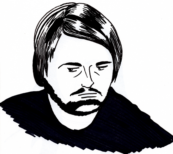
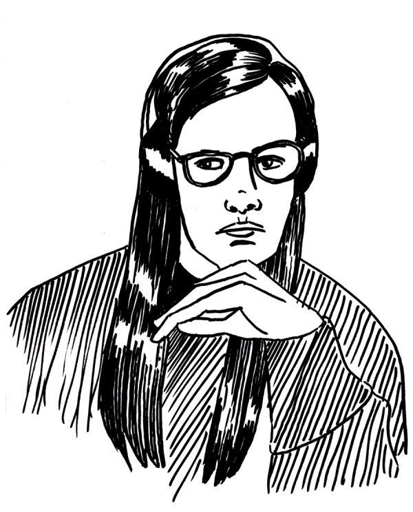
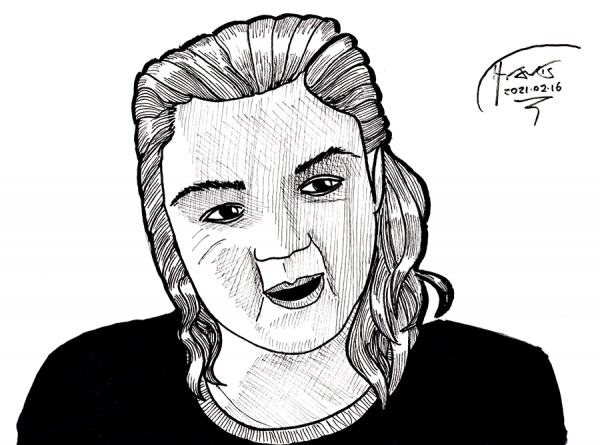
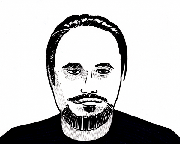 Quick sketches of writers on tonight's Write to the End Google Meet. [Note: because real people reading what they wrote move while they're talking, I took a screenshot, which is why some people are in weird poses, almost as if I caught them in a blink.]
Strathmore 9x12 Sketch paper, Faber-Castell 1.5 Pitt Artist Pen bullet nib to force me to commit to the drawing quickly, blacks with a Sharpie, shading on the last one with a Sakura Pigma Micron 0.3.
As for the faces ... well, I'm specifically pursuing quantity over quality in an effort to get in more practice, but I can recognize the two women's faces, more or less. So ... batting 500?
Drawing every day.
-the Centaur
Quick sketches of writers on tonight's Write to the End Google Meet. [Note: because real people reading what they wrote move while they're talking, I took a screenshot, which is why some people are in weird poses, almost as if I caught them in a blink.]
Strathmore 9x12 Sketch paper, Faber-Castell 1.5 Pitt Artist Pen bullet nib to force me to commit to the drawing quickly, blacks with a Sharpie, shading on the last one with a Sakura Pigma Micron 0.3.
As for the faces ... well, I'm specifically pursuing quantity over quality in an effort to get in more practice, but I can recognize the two women's faces, more or less. So ... batting 500?
Drawing every day.
-the Centaur 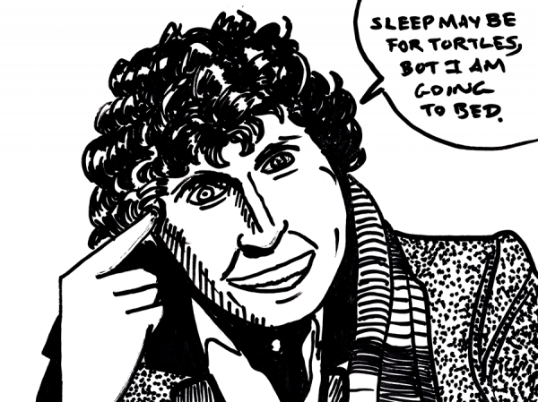 As it says on the tin: it's late, I'm tired, and I have early meetings tomorrow (fine, fine, FINE, 10am Pacific, which is 1pm my time, but it's 3am already) so here's a quick sketch of the Fourth Doctor on Strathmore using a dry erase marker, because damnit, the point is not to perfect the drawings, but to not break the streak. This one could really have used a preliminary sketch and a normal render though:
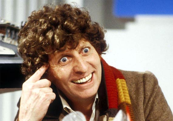 I'm happier with the jaw, but the hair could have extended about another 10%. Another thing to watch out for (though it's easier to get right when you're doing preliminary sketches before diving in, instead of jumping straight out of the airplane with nothing but a dry erase marker and hope).
Drawing every day.
-the Centaur
I'm happier with the jaw, but the hair could have extended about another 10%. Another thing to watch out for (though it's easier to get right when you're doing preliminary sketches before diving in, instead of jumping straight out of the airplane with nothing but a dry erase marker and hope).
Drawing every day.
-the Centaur